-
Notifications
You must be signed in to change notification settings - Fork 4.1k
New issue
Have a question about this project? Sign up for a free GitHub account to open an issue and contact its maintainers and the community.
By clicking “Sign up for GitHub”, you agree to our terms of service and privacy statement. We’ll occasionally send you account related emails.
Already on GitHub? Sign in to your account
Add Box Shadow Component #44651
Comments
|
+1 for this 💯 It should be listed in #33447 too. |
|
+1 |
This comment was marked as outdated.
This comment was marked as outdated.
|
CC: @WordPress/gutenberg-design |
|
Hey Joen. It looks like a good start! |
|
@jasmussen Thanks for the designs. They look great!
I like this idea and I would like to believe, a formula should transform these values to
I would like to imagine shadow presets to behave similar to And a shadow preset could be a combination of multiple shadows that create a unique effect. A theme should be able to define them in Long story short:Because a preset can have multiple shadows and they become preset variables (based on the given slug), the UI experience for them should slightly be different. Following are my thoughts:
This way, a preset shadow can be applied to any block and changing it in the global settings would effect all the blocks. Let me know your thoughts. |
Thank you! If it becomes a headache, don't spend too much time on it, we can start simpler if need be. For example it hits me that it might not be possible to represent all box-shadow configurations with this setup, as the angle+depth components assume that the X and Y values will always be the same. We might need a different angle component, one that's more of a map/grid, for this to work 🤔
Yes.
Thanks for surfacing this shortcoming. I don't think we should make a read-only preset, they should all be editable. But I'll need to think about how to best surface multiple stacked shadows in the panel when applying a preset. Let me return here with some new mockups!
Working on this mockup made me realize a shortcoming of our current global styles. Right now you have Typography, Colors, Layout. Layout includes various values — margin and block spacing for Buttons, and border and border radius for Image. For both Typography and Color, these two blocks (Buttons, Image) have panel counterparts. But there's no counterpart in Global Styles for Dimensions and Border — those are put inside "Layout" instead. And so I'm not sure we should add a new "Shadows" in Global Styles. I think we should either:
We should probably start with 1, as 2 has some compounding effects. What do you think? |
|
Having tinkered a bit with this now, it's clear that approach I had thought of with regards to layered shadows that I was thinking of, inspired by #39427, is unlikely to work for stacked shadows for us. Quite simply, the fact that a preset can contain all stacks, means the UI to control each layer, would need to be surfaced in the flyout. I think I need to explore an entirely different approach to the presets, which as already noted, felt like the weakest aspect. I'll need more time to think on this. One question — I really like this shadow generator, which creates 3 shadows by default. Would it be possible to have something like that for the default editor? Then perhaps we could put advanced editing of each individual layer behind an toggle, that would let you edit each layer individually? Essentially any non-standard preset, such as the sharp square shadow in your example, would then become an "advanced" shadow. |
|
Based on explorations, I have some new concepts to share, that should hopefully be simpler for the first version. I would imagine we could start with a preset-first design:
A followup would be to enable shadows in the post editor:
Not for the first effort, but I think there's a fun opportunity tied to the UI for editing drop shadows. It is possible to create beautiful natural-looking shadows by stacking multiple shadows at various depths, and I would love for us to include an algorithm for doing this, which could potentially be controllable like this: It's not something for the near term, but once you're in the shadow editing control, we might as well provide excellent shadows by default. What do you think? CC: @madhusudhand @scruffian |
|
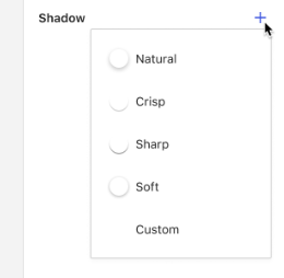
This seems to work well. We could even double-down further on the presets, and save the user a click by surfacing them in the + menu: This may work best with a dedicated section, similar to Figma's "Effects" panel. Perhaps that's worth considering if we intend to support filters and other similar features in the future. |
|
Nice, I can see further simplification work. Though I abandoned the idea of showing a shadow preset in that small 20x20 area in the ItemGroup, it simply didn't have space enough to be legible at that size, and there's a preview above, after all. I'm not sure about the unlink, though: what what would the main action of the ItemGroup be? |
|
This looks really good! |
|
I like the idea of presets as well — we use them for font sizes, spacing, colors... may as well for shadows. Any reason why we wouldn't reuse the existing stepped range control pattern? And if the icon is pressed, you see a detailed edit view of that preset — basically like how border controls work. And second, if we wanted to merge some of these panels, we could package them as tool belt items in an "Effects" panel. Border would fit in well for example. Also it doesn't have to be integer based (maybe the slugs are, but not the label). |
|
I tend to think we should stick to the pattern of ItemGroups opening flyout menus, and since there's a preview in the canvas for the post editor, and in the top right of the inspector for global styles, the simple shadow icon feels like a better starting point to me. But perhaps we can follow the PR and see what feels right as we move closer?
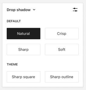
Not sure I understand. Do you mean something like this? While we could have presets inside that flyout, the unique challenge with shadows is that in theme.json you can apply a stacked shadow consisting of multiple separate definitions, and have that be a preset. That's why I ended up thinking the preset-first approach was the simplest way to start. Let me know if I missed a beat here! Another aspect of the preset-first approach, is to enable the more creative uses of drop shadows like this example Madhu shared:
My instinct would be that we need more finegrained control here. That said, I see where you're coming from — each step of the slider could theoretically represent a predefined elevation. It's the same instinct that led me towards this mockup, where I'm picturing each dot on the grid to be an "elevation slot", and then multiple stacked shadows are calculated based on the elevation, light position, and sliders. So you'd still have these predefined steps, but you'd also have directionality in the mix. |
|
Great designs! 🎆 The dropdown of shadow presets is missing the theme presets. And a question on how it should be invoked. Do you suggest to have a |
|
@madhusudhand I'm not convinced we should go with the immediate dropdown, I still think it's best to use the ItemGroup with the flyout pattern that shows "Default" and "Theme" presets using the same buttons as are present in the Styles panel. We can omit the "Settings" icon for now though. That would make the shadow control a single control for now, so not yet any stacked shadows. I'm unsure yet how to best surface such stacked shadows, but I'm leaning towards if we ever do that, it should probably be inside the flyout, because presets themselves can come as stacked definitions. |
That will be a good start from UI perspective. For context, a stacked shadow need not be always from a preset. In the first step, because edit controls aren't there, UI should somehow indicate that a custom shadow is applied, because setting it from Eventually, it should work bi-directional.
I am not sure if it is best to edit the presets (global in nature) from button styles panel. But in other perspective, a user might want to do minor tweaks to the preset shadow, and apply to the button. I am thinking for color, I cannot change default or theme palette colors such as |
I'm assuming this shadow definition would come from theme.json directly? Good question. We probably need an interface for this, but for the near future, would it make sense to add a "Default" button to the "Theme" section, which embodied this?
Oh I'm not talking about editing the presets here, that's probably a separate thing and more related to #44417. Let me know if I misunderstood something here. So that is to say, I can understand we need to be able to both apply a preset to a block, and add an entirely custom shadow to a block, and that we need to be able to do this both locally on a per-block basis, and globally to apply by default across all buttons, for example. Right? |
|
This is looking really good. Here's a few important things to consider for box shadows that I haven't seen mentioned:
This a screen recording of how each is handled in the Blockify theme: box-shadow-hover.movChanging just one of the values will enable a box shadow and inherit the remaining values from the theme. This also applies to the Hover state which inherits from the Default state for values that are not set. We should also consider adding support for Inset values from the beginning too, as that could be difficult to add in the future. |
Thats correct. It would be the final goal. |
|
It remains something we should get to. I would love fresh mockup work, and subsequent dev work, but I will admit it's looking close. |
|
I think it's fine this slips. It's quite contained as-is and not high exposure. |
|
@jasmussen @richtabor cool if I remove this from the 6.3 Project Board? We are virtually out of time for enhancements. |
Sure thing. |
@jameskoster this is a good point . We'd have to do something like Figma which is quite complex for us right now. I'm fine with the "unlink" approach if we can start establishing some guidelines around when to use vs customise. |
|
@jameskoster coming back to this, I think your unlink pattern might be the easiest starting point and lets us move forward. We can revisit the whole unlink vs customise pattern as we expand other tools. @madhusudhand I think we're ok to make progress on this and collaborate while dev is in progress since we would like this for 6.4. |
|
@jameskoster mind updating the design to the latest for what we have in 6.3? For example, here's what we have now: This will help devs move a bit faster and ensure we don't take a step back accidentally. |
|
@annezazu I updated the OP with the latest designs. |
|
To ease the development, the remaining work is split into separate issues. Following is the current status of the work.
|
Status update
Created a PR to test block supports after #57101 is merged: #57982 |
|
Hey folks, Are we looking for more testing or adding in more block supports? I’m also wondering if we could remove the Thanks for the excellent progress. |
We targeted enabling shadow support for more blocks in addition to button block and in block styles. We are addressing some feedback about the placement of the control here |
|
Thank you @carolinan |
|
I updated the 'Design' section of the OP with some updated mockups based on the ongoing work in #57100. |
|
Shadows can now be created/edited in the editor. |
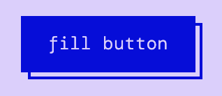


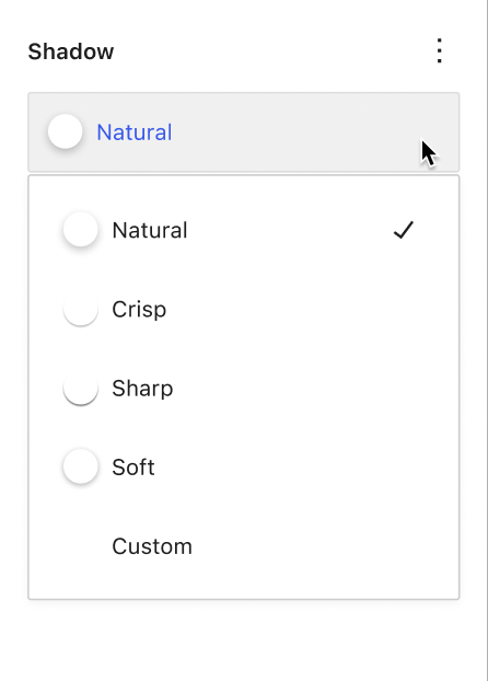
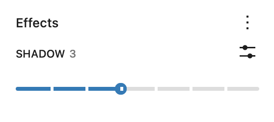
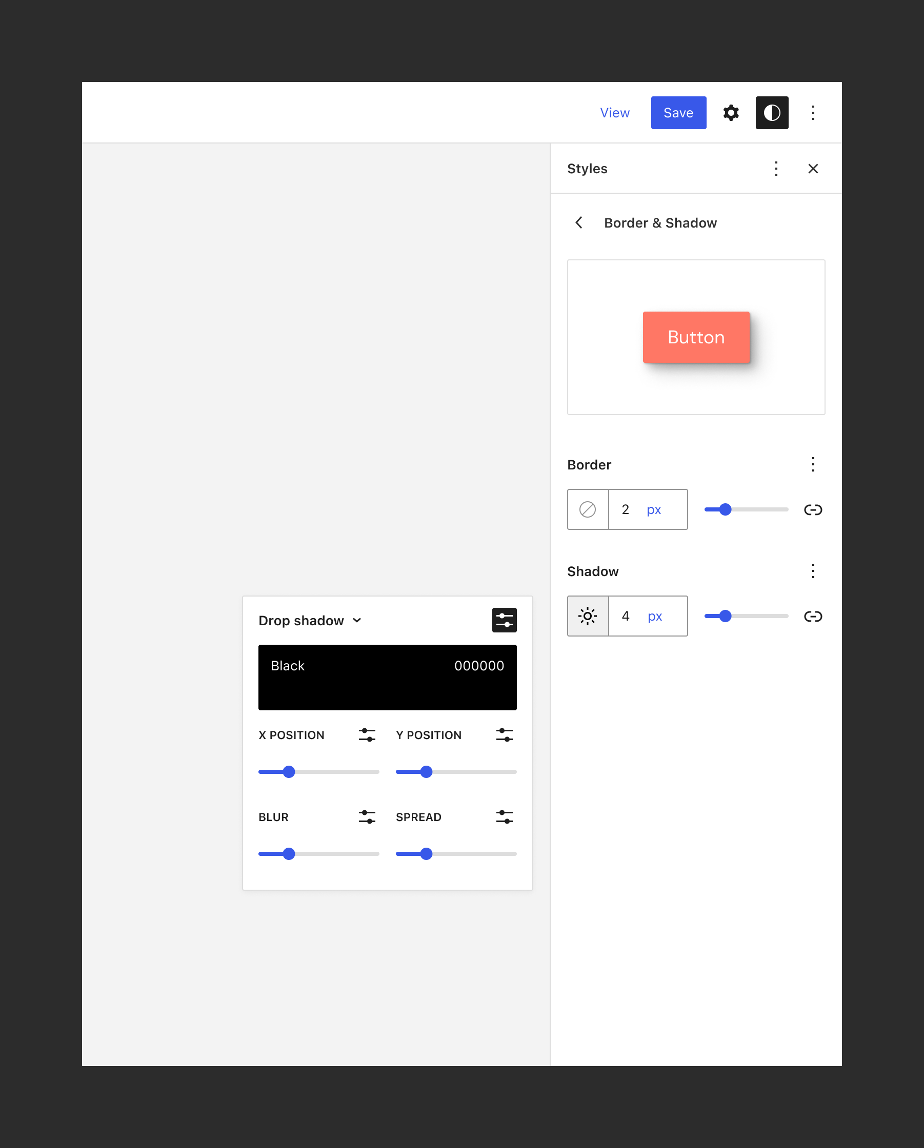


What problem does this address?
So as of Gutenberg 14.1 and in the upcoming WordPress 6.1 release, there will be support added for themes to register box shadows for specific blocks within the theme.json file.
Similar to padding, margin, typography, etc. I feel like it would be beneficial to actually have a box shadow component either for importing from a package for custom blocks or supported in core blocks which would enable users to create the exact shadow effect they are looking for.
What is your proposed solution?
Adding a box-shadow component within one of the packages which can be imported for custom block development or supported in core blocks which would enable users to create the exact shadow effect they are looking for.
Something like the 'Customize shadows' section on the left in this link: (https://box-shadow.dev/)
Including horizontal, vertical, blur, spread, and colour.
I searched issues for 'box shadow' and 'box-shadow' and couldn't find anything on this, however, I know it might already be something being looked at, apologies if so.
Design
+opens a menu where you can choose shadows from three categories:–icon will remove the shadowunlinkicon will detach the shadow properties, essentially switching from the preset to a custom shadow...+will add a new shadow to the stack⋮will allow you to save the custom shadow as a preset for future useTasks
The text was updated successfully, but these errors were encountered: