Skip to content
New issue

Have a question about this project? Sign up for a free GitHub account to open an issue and contact its maintainers and the community.

By clicking “Sign up for GitHub”, you agree to our terms of service and privacy statement. We’ll occasionally send you account related emails.

Already on GitHub? Sign in to your account

Try showing an alignment visualizer when using the drag handle to resize an image block #45056

Closed
wants to merge 20 commits into from

Conversation

talldan
Copy link
Contributor

@talldan talldan commented Oct 18, 2022

What?

See #44357

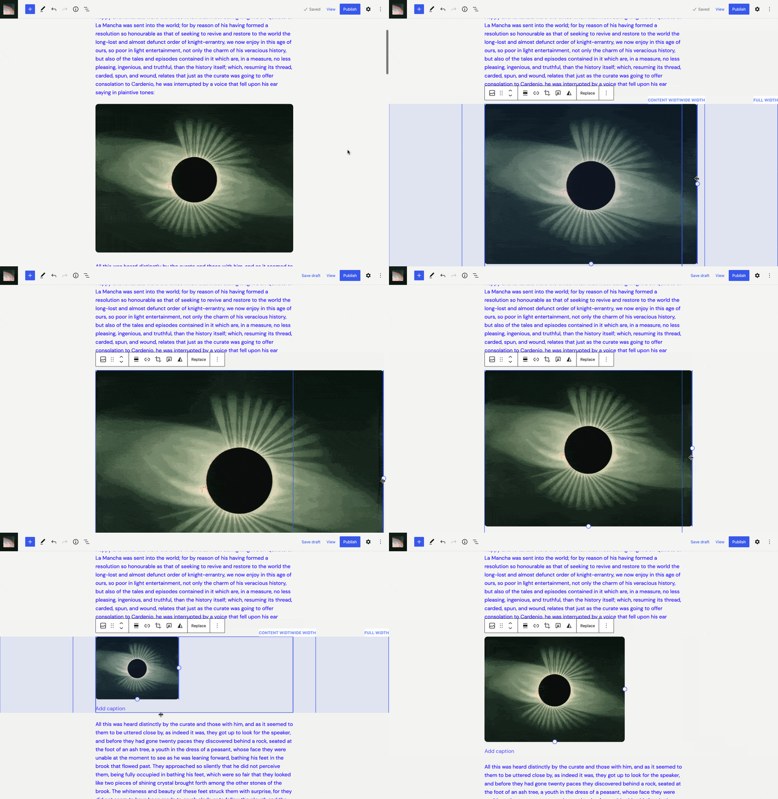
Implements a new feature to help with resizing image to the same widths as alignments.

Given the number of known issues and that some of them are very challenging, I've decided to make this an experiment (it needs to be toggled on via the experiments page), so that this PR can be review/merged without encompassing too many changes.

Follow-up work / Known issues:

  • Known issue: When an image has a natural width that's less than the content width, it can't be set to content width. (this problem also exists in trunk, but is made more obvious by snapping not working)
  • Known issue: Drag interface doesn't track positioning of snapped images, it instead follows the mouse.
  • Known issue: Snapping is a bit jumpy/incorrect when resizing a center aligned image.
  • Known issue: Snapping doesn't work when resizing vertically.
  • Known issue: Images set to wide/full alignments don't have drag handles (this is also a problem in trunk that's hard to solve).
  • Task: Check RTL works as expected.
  • Task: Add a way to disable snapping (e.g. by holding a modifier key while dragging - follow-up PR)
  • Task: Ensure it works correctly for all layouts (at the moment it may not work for some complicated layouts, within lots of nested layout blocks in the site editor):
    • Different content/wide units for both the root layout and a group block
    • Different content justifications for both the root layout and a group block
    • Padding/border on the root layout and on a group block
    • Alignments within a group that itself has an alignment set

Testing Instructions

  1. Enable the Image Block Snapping experiment on the Gutenberg experiments page (wp-admin/admin.php?page=gutenberg-experiments)
  2. Add an image block and set an image
  3. Try resizing the image using the horizontal drag handles

Technical details

  • Changes to the image block are minimized as much as possible
  • A new (not exported) BlockAlignmentVisualizer component has been introduced which does the bulk of the work, it's responsible for showing the alignment visualization and has a helpful useDetectSnapping hook that can be used by other components. It should be possible to use this component in other places when alignments need to be visualized.
  • A new (privately exported) ResizableAlignmentControls is introduced which composes BlockAlignmentVisualizer together with the ResizableBox component. It mostly has the same interface as ResizableBox.
  • The image block uses the ResizableAlignmentControls component instead of ResizableBox, a few extra lines of code are added to handle snapping events.

The BlockAlignmentVisualizer component also has a few sub components:

  • Underlay - like a Popover, but it renders inline under the block. This PR did initially use a Popover, but introducing this component is less code and means no changes to Popover (which doesn't support inline rendering right now).
  • ShadowDOMContainer - since the whole visualization is rendered inline, the code is nested in a shadow dom container to prevent styles leaking. It does unfortunately mean that scss can't be used for the styles.
  • Visualization - this is the component that renders visualization. Props to @jasmussen for the grid implementation.
  • Guides - this component is not visible on the screen, but it renders a div for each alignment, and then the positions of divs are used to provide the snapping functionality.
  • GuideContext - stores refs to the DOM nodes rendered by the guides component. Also exports the useDetectSnapping hook, which detects snapping by calculating intersections between the resizable block and the guides.

Screenshots or screencast

Kapture.2023-03-28.at.13.13.11.mp4
@talldan talldan added [Type] Enhancement A suggestion for improvement. Needs Design Feedback Needs general design feedback. [Block] Image Affects the Image Block labels Oct 18, 2022
@talldan talldan self-assigned this Oct 18, 2022
@github-actions
Copy link

github-actions bot commented Oct 18, 2022

Size Change: +2.77 kB (0%)

Total Size: 1.37 MB

Filename Size Change
build/block-editor/content-rtl.css 4.18 kB +11 B (0%)
build/block-editor/content.css 4.18 kB +11 B (0%)
build/block-editor/index.min.js 205 kB +2.57 kB (+1%)
build/block-library/index.min.js 204 kB +26 B (0%)
build/dom/index.min.js 4.91 kB +151 B (+3%)
ℹ️ View Unchanged
Filename Size
build/a11y/index.min.js 993 B
build/annotations/index.min.js 2.78 kB
build/api-fetch/index.min.js 2.27 kB
build/autop/index.min.js 2.15 kB
build/blob/index.min.js 483 B
build/block-directory/index.min.js 7.2 kB
build/block-directory/style-rtl.css 1.04 kB
build/block-directory/style.css 1.04 kB
build/block-editor/default-editor-styles-rtl.css 403 B
build/block-editor/default-editor-styles.css 403 B
build/block-editor/style-rtl.css 14.6 kB
build/block-editor/style.css 14.6 kB
build/block-library/blocks/archives/editor-rtl.css 61 B
build/block-library/blocks/archives/editor.css 60 B
build/block-library/blocks/archives/style-rtl.css 90 B
build/block-library/blocks/archives/style.css 90 B
build/block-library/blocks/audio/editor-rtl.css 150 B
build/block-library/blocks/audio/editor.css 150 B
build/block-library/blocks/audio/style-rtl.css 122 B
build/block-library/blocks/audio/style.css 122 B
build/block-library/blocks/audio/theme-rtl.css 138 B
build/block-library/blocks/audio/theme.css 138 B
build/block-library/blocks/avatar/editor-rtl.css 116 B
build/block-library/blocks/avatar/editor.css 116 B
build/block-library/blocks/avatar/style-rtl.css 91 B
build/block-library/blocks/avatar/style.css 91 B
build/block-library/blocks/block/editor-rtl.css 305 B
build/block-library/blocks/block/editor.css 305 B
build/block-library/blocks/button/editor-rtl.css 587 B
build/block-library/blocks/button/editor.css 587 B
build/block-library/blocks/button/style-rtl.css 628 B
build/block-library/blocks/button/style.css 627 B
build/block-library/blocks/buttons/editor-rtl.css 337 B
build/block-library/blocks/buttons/editor.css 337 B
build/block-library/blocks/buttons/style-rtl.css 332 B
build/block-library/blocks/buttons/style.css 332 B
build/block-library/blocks/calendar/style-rtl.css 239 B
build/block-library/blocks/calendar/style.css 239 B
build/block-library/blocks/categories/editor-rtl.css 113 B
build/block-library/blocks/categories/editor.css 112 B
build/block-library/blocks/categories/style-rtl.css 124 B
build/block-library/blocks/categories/style.css 124 B
build/block-library/blocks/code/editor-rtl.css 53 B
build/block-library/blocks/code/editor.css 53 B
build/block-library/blocks/code/style-rtl.css 121 B
build/block-library/blocks/code/style.css 121 B
build/block-library/blocks/code/theme-rtl.css 124 B
build/block-library/blocks/code/theme.css 124 B
build/block-library/blocks/columns/editor-rtl.css 108 B
build/block-library/blocks/columns/editor.css 108 B
build/block-library/blocks/columns/style-rtl.css 409 B
build/block-library/blocks/columns/style.css 409 B
build/block-library/blocks/comment-author-avatar/editor-rtl.css 125 B
build/block-library/blocks/comment-author-avatar/editor.css 125 B
build/block-library/blocks/comment-content/style-rtl.css 92 B
build/block-library/blocks/comment-content/style.css 92 B
build/block-library/blocks/comment-template/style-rtl.css 199 B
build/block-library/blocks/comment-template/style.css 198 B
build/block-library/blocks/comments-pagination-numbers/editor-rtl.css 123 B
build/block-library/blocks/comments-pagination-numbers/editor.css 121 B
build/block-library/blocks/comments-pagination/editor-rtl.css 222 B
build/block-library/blocks/comments-pagination/editor.css 209 B
build/block-library/blocks/comments-pagination/style-rtl.css 235 B
build/block-library/blocks/comments-pagination/style.css 231 B
build/block-library/blocks/comments-title/editor-rtl.css 75 B
build/block-library/blocks/comments-title/editor.css 75 B
build/block-library/blocks/comments/editor-rtl.css 840 B
build/block-library/blocks/comments/editor.css 839 B
build/block-library/blocks/comments/style-rtl.css 637 B
build/block-library/blocks/comments/style.css 636 B
build/block-library/blocks/cover/editor-rtl.css 649 B
build/block-library/blocks/cover/editor.css 651 B
build/block-library/blocks/cover/style-rtl.css 1.61 kB
build/block-library/blocks/cover/style.css 1.6 kB
build/block-library/blocks/details-summary/editor-rtl.css 65 B
build/block-library/blocks/details-summary/editor.css 65 B
build/block-library/blocks/details-summary/style-rtl.css 61 B
build/block-library/blocks/details-summary/style.css 61 B
build/block-library/blocks/details/style-rtl.css 54 B
build/block-library/blocks/details/style.css 54 B
build/block-library/blocks/embed/editor-rtl.css 293 B
build/block-library/blocks/embed/editor.css 293 B
build/block-library/blocks/embed/style-rtl.css 410 B
build/block-library/blocks/embed/style.css 410 B
build/block-library/blocks/embed/theme-rtl.css 138 B
build/block-library/blocks/embed/theme.css 138 B
build/block-library/blocks/file/editor-rtl.css 300 B
build/block-library/blocks/file/editor.css 300 B
build/block-library/blocks/file/style-rtl.css 269 B
build/block-library/blocks/file/style.css 270 B
build/block-library/blocks/file/view.min.js 353 B
build/block-library/blocks/freeform/editor-rtl.css 2.44 kB
build/block-library/blocks/freeform/editor.css 2.44 kB
build/block-library/blocks/gallery/editor-rtl.css 984 B
build/block-library/blocks/gallery/editor.css 988 B
build/block-library/blocks/gallery/style-rtl.css 1.55 kB
build/block-library/blocks/gallery/style.css 1.55 kB
build/block-library/blocks/gallery/theme-rtl.css 122 B
build/block-library/blocks/gallery/theme.css 122 B
build/block-library/blocks/group/editor-rtl.css 654 B
build/block-library/blocks/group/editor.css 654 B
build/block-library/blocks/group/style-rtl.css 57 B
build/block-library/blocks/group/style.css 57 B
build/block-library/blocks/group/theme-rtl.css 78 B
build/block-library/blocks/group/theme.css 78 B
build/block-library/blocks/heading/style-rtl.css 76 B
build/block-library/blocks/heading/style.css 76 B
build/block-library/blocks/html/editor-rtl.css 340 B
build/block-library/blocks/html/editor.css 341 B
build/block-library/blocks/image/editor-rtl.css 830 B
build/block-library/blocks/image/editor.css 829 B
build/block-library/blocks/image/style-rtl.css 652 B
build/block-library/blocks/image/style.css 652 B
build/block-library/blocks/image/theme-rtl.css 137 B
build/block-library/blocks/image/theme.css 137 B
build/block-library/blocks/latest-comments/style-rtl.css 357 B
build/block-library/blocks/latest-comments/style.css 357 B
build/block-library/blocks/latest-posts/editor-rtl.css 213 B
build/block-library/blocks/latest-posts/editor.css 212 B
build/block-library/blocks/latest-posts/style-rtl.css 478 B
build/block-library/blocks/latest-posts/style.css 478 B
build/block-library/blocks/list/style-rtl.css 88 B
build/block-library/blocks/list/style.css 88 B
build/block-library/blocks/media-text/editor-rtl.css 266 B
build/block-library/blocks/media-text/editor.css 263 B
build/block-library/blocks/media-text/style-rtl.css 507 B
build/block-library/blocks/media-text/style.css 505 B
build/block-library/blocks/more/editor-rtl.css 431 B
build/block-library/blocks/more/editor.css 431 B
build/block-library/blocks/navigation-link/editor-rtl.css 716 B
build/block-library/blocks/navigation-link/editor.css 715 B
build/block-library/blocks/navigation-link/style-rtl.css 115 B
build/block-library/blocks/navigation-link/style.css 115 B
build/block-library/blocks/navigation-submenu/editor-rtl.css 299 B
build/block-library/blocks/navigation-submenu/editor.css 299 B
build/block-library/blocks/navigation/editor-rtl.css 2.13 kB
build/block-library/blocks/navigation/editor.css 2.14 kB
build/block-library/blocks/navigation/style-rtl.css 2.22 kB
build/block-library/blocks/navigation/style.css 2.21 kB
build/block-library/blocks/navigation/view-modal.min.js 2.81 kB
build/block-library/blocks/navigation/view.min.js 447 B
build/block-library/blocks/nextpage/editor-rtl.css 395 B
build/block-library/blocks/nextpage/editor.css 395 B
build/block-library/blocks/page-list/editor-rtl.css 401 B
build/block-library/blocks/page-list/editor.css 401 B
build/block-library/blocks/page-list/style-rtl.css 175 B
build/block-library/blocks/page-list/style.css 175 B
build/block-library/blocks/paragraph/editor-rtl.css 174 B
build/block-library/blocks/paragraph/editor.css 174 B
build/block-library/blocks/paragraph/style-rtl.css 279 B
build/block-library/blocks/paragraph/style.css 281 B
build/block-library/blocks/post-author/style-rtl.css 175 B
build/block-library/blocks/post-author/style.css 176 B
build/block-library/blocks/post-comments-form/editor-rtl.css 96 B
build/block-library/blocks/post-comments-form/editor.css 96 B
build/block-library/blocks/post-comments-form/style-rtl.css 501 B
build/block-library/blocks/post-comments-form/style.css 501 B
build/block-library/blocks/post-date/style-rtl.css 61 B
build/block-library/blocks/post-date/style.css 61 B
build/block-library/blocks/post-excerpt/editor-rtl.css 71 B
build/block-library/blocks/post-excerpt/editor.css 71 B
build/block-library/blocks/post-excerpt/style-rtl.css 141 B
build/block-library/blocks/post-excerpt/style.css 141 B
build/block-library/blocks/post-featured-image/editor-rtl.css 588 B
build/block-library/blocks/post-featured-image/editor.css 586 B
build/block-library/blocks/post-featured-image/style-rtl.css 322 B
build/block-library/blocks/post-featured-image/style.css 322 B
build/block-library/blocks/post-navigation-link/style-rtl.css 153 B
build/block-library/blocks/post-navigation-link/style.css 153 B
build/block-library/blocks/post-template/editor-rtl.css 99 B
build/block-library/blocks/post-template/editor.css 98 B
build/block-library/blocks/post-template/style-rtl.css 281 B
build/block-library/blocks/post-template/style.css 281 B
build/block-library/blocks/post-terms/style-rtl.css 96 B
build/block-library/blocks/post-terms/style.css 96 B
build/block-library/blocks/post-time-to-read/style-rtl.css 69 B
build/block-library/blocks/post-time-to-read/style.css 69 B
build/block-library/blocks/post-title/style-rtl.css 100 B
build/block-library/blocks/post-title/style.css 100 B
build/block-library/blocks/preformatted/style-rtl.css 103 B
build/block-library/blocks/preformatted/style.css 103 B
build/block-library/blocks/pullquote/editor-rtl.css 135 B
build/block-library/blocks/pullquote/editor.css 135 B
build/block-library/blocks/pullquote/style-rtl.css 335 B
build/block-library/blocks/pullquote/style.css 335 B
build/block-library/blocks/pullquote/theme-rtl.css 167 B
build/block-library/blocks/pullquote/theme.css 167 B
build/block-library/blocks/query-pagination-numbers/editor-rtl.css 122 B
build/block-library/blocks/query-pagination-numbers/editor.css 121 B
build/block-library/blocks/query-pagination/editor-rtl.css 221 B
build/block-library/blocks/query-pagination/editor.css 211 B
build/block-library/blocks/query-pagination/style-rtl.css 288 B
build/block-library/blocks/query-pagination/style.css 284 B
build/block-library/blocks/query-title/style-rtl.css 63 B
build/block-library/blocks/query-title/style.css 63 B
build/block-library/blocks/query/editor-rtl.css 463 B
build/block-library/blocks/query/editor.css 463 B
build/block-library/blocks/quote/style-rtl.css 222 B
build/block-library/blocks/quote/style.css 222 B
build/block-library/blocks/quote/theme-rtl.css 223 B
build/block-library/blocks/quote/theme.css 226 B
build/block-library/blocks/read-more/style-rtl.css 132 B
build/block-library/blocks/read-more/style.css 132 B
build/block-library/blocks/rss/editor-rtl.css 149 B
build/block-library/blocks/rss/editor.css 149 B
build/block-library/blocks/rss/style-rtl.css 289 B
build/block-library/blocks/rss/style.css 288 B
build/block-library/blocks/search/editor-rtl.css 165 B
build/block-library/blocks/search/editor.css 165 B
build/block-library/blocks/search/style-rtl.css 408 B
build/block-library/blocks/search/style.css 406 B
build/block-library/blocks/search/theme-rtl.css 114 B
build/block-library/blocks/search/theme.css 114 B
build/block-library/blocks/separator/editor-rtl.css 146 B
build/block-library/blocks/separator/editor.css 146 B
build/block-library/blocks/separator/style-rtl.css 234 B
build/block-library/blocks/separator/style.css 234 B
build/block-library/blocks/separator/theme-rtl.css 194 B
build/block-library/blocks/separator/theme.css 194 B
build/block-library/blocks/shortcode/editor-rtl.css 329 B
build/block-library/blocks/shortcode/editor.css 329 B
build/block-library/blocks/site-logo/editor-rtl.css 489 B
build/block-library/blocks/site-logo/editor.css 489 B
build/block-library/blocks/site-logo/style-rtl.css 203 B
build/block-library/blocks/site-logo/style.css 203 B
build/block-library/blocks/site-tagline/editor-rtl.css 86 B
build/block-library/blocks/site-tagline/editor.css 86 B
build/block-library/blocks/site-title/editor-rtl.css 116 B
build/block-library/blocks/site-title/editor.css 116 B
build/block-library/blocks/site-title/style-rtl.css 57 B
build/block-library/blocks/site-title/style.css 57 B
build/block-library/blocks/social-link/editor-rtl.css 184 B
build/block-library/blocks/social-link/editor.css 184 B
build/block-library/blocks/social-links/editor-rtl.css 674 B
build/block-library/blocks/social-links/editor.css 673 B
build/block-library/blocks/social-links/style-rtl.css 1.4 kB
build/block-library/blocks/social-links/style.css 1.39 kB
build/block-library/blocks/spacer/editor-rtl.css 359 B
build/block-library/blocks/spacer/editor.css 359 B
build/block-library/blocks/spacer/style-rtl.css 48 B
build/block-library/blocks/spacer/style.css 48 B
build/block-library/blocks/table/editor-rtl.css 433 B
build/block-library/blocks/table/editor.css 433 B
build/block-library/blocks/table/style-rtl.css 651 B
build/block-library/blocks/table/style.css 650 B
build/block-library/blocks/table/theme-rtl.css 157 B
build/block-library/blocks/table/theme.css 157 B
build/block-library/blocks/tag-cloud/style-rtl.css 251 B
build/block-library/blocks/tag-cloud/style.css 253 B
build/block-library/blocks/template-part/editor-rtl.css 404 B
build/block-library/blocks/template-part/editor.css 404 B
build/block-library/blocks/template-part/theme-rtl.css 101 B
build/block-library/blocks/template-part/theme.css 101 B
build/block-library/blocks/text-columns/editor-rtl.css 95 B
build/block-library/blocks/text-columns/editor.css 95 B
build/block-library/blocks/text-columns/style-rtl.css 166 B
build/block-library/blocks/text-columns/style.css 166 B
build/block-library/blocks/verse/style-rtl.css 99 B
build/block-library/blocks/verse/style.css 99 B
build/block-library/blocks/video/editor-rtl.css 552 B
build/block-library/blocks/video/editor.css 555 B
build/block-library/blocks/video/style-rtl.css 179 B
build/block-library/blocks/video/style.css 179 B
build/block-library/blocks/video/theme-rtl.css 139 B
build/block-library/blocks/video/theme.css 139 B
build/block-library/classic-rtl.css 179 B
build/block-library/classic.css 179 B
build/block-library/common-rtl.css 1.12 kB
build/block-library/common.css 1.12 kB
build/block-library/editor-elements-rtl.css 75 B
build/block-library/editor-elements.css 75 B
build/block-library/editor-rtl.css 11.6 kB
build/block-library/editor.css 11.6 kB
build/block-library/elements-rtl.css 54 B
build/block-library/elements.css 54 B
build/block-library/reset-rtl.css 478 B
build/block-library/reset.css 478 B
build/block-library/style-rtl.css 12.8 kB
build/block-library/style.css 12.8 kB
build/block-library/theme-rtl.css 698 B
build/block-library/theme.css 703 B
build/block-serialization-default-parser/index.min.js 1.13 kB
build/block-serialization-spec-parser/index.min.js 2.83 kB
build/blocks/index.min.js 51.1 kB
build/commands/index.min.js 14.8 kB
build/commands/style-rtl.css 1.1 kB
build/commands/style.css 1.09 kB
build/components/index.min.js 208 kB
build/components/style-rtl.css 11.7 kB
build/components/style.css 11.7 kB
build/compose/index.min.js 12.4 kB
build/core-data/index.min.js 16.3 kB
build/customize-widgets/index.min.js 12.2 kB
build/customize-widgets/style-rtl.css 1.41 kB
build/customize-widgets/style.css 1.41 kB
build/data-controls/index.min.js 718 B
build/data/index.min.js 8.68 kB
build/date/index.min.js 40.4 kB
build/deprecated/index.min.js 518 B
build/dom-ready/index.min.js 336 B
build/edit-post/classic-rtl.css 571 B
build/edit-post/classic.css 571 B
build/edit-post/index.min.js 35 kB
build/edit-post/style-rtl.css 7.59 kB
build/edit-post/style.css 7.58 kB
build/edit-site/index.min.js 64.3 kB
build/edit-site/style-rtl.css 10.1 kB
build/edit-site/style.css 10.1 kB
build/edit-widgets/index.min.js 17.3 kB
build/edit-widgets/style-rtl.css 4.56 kB
build/edit-widgets/style.css 4.56 kB
build/editor/index.min.js 45.9 kB
build/editor/style-rtl.css 3.49 kB
build/editor/style.css 3.48 kB
build/element/index.min.js 4.95 kB
build/escape-html/index.min.js 548 B
build/format-library/index.min.js 7.26 kB
build/format-library/style-rtl.css 557 B
build/format-library/style.css 556 B
build/hooks/index.min.js 1.66 kB
build/html-entities/index.min.js 454 B
build/i18n/index.min.js 3.79 kB
build/is-shallow-equal/index.min.js 535 B
build/keyboard-shortcuts/index.min.js 1.79 kB
build/keycodes/index.min.js 1.94 kB
build/list-reusable-blocks/index.min.js 2.14 kB
build/list-reusable-blocks/style-rtl.css 865 B
build/list-reusable-blocks/style.css 865 B
build/media-utils/index.min.js 2.99 kB
build/notices/index.min.js 977 B
build/plugins/index.min.js 1.94 kB
build/preferences-persistence/index.min.js 2.23 kB
build/preferences/index.min.js 1.35 kB
build/primitives/index.min.js 960 B
build/priority-queue/index.min.js 1.52 kB
build/private-apis/index.min.js 942 B
build/react-i18n/index.min.js 702 B
build/react-refresh-entry/index.min.js 8.44 kB
build/react-refresh-runtime/index.min.js 7.31 kB
build/redux-routine/index.min.js 2.75 kB
build/reusable-blocks/index.min.js 2.26 kB
build/reusable-blocks/style-rtl.css 265 B
build/reusable-blocks/style.css 265 B
build/rich-text/index.min.js 11.1 kB
build/server-side-render/index.min.js 2.09 kB
build/shortcode/index.min.js 1.52 kB
build/style-engine/index.min.js 1.55 kB
build/token-list/index.min.js 650 B
build/url/index.min.js 3.74 kB
build/vendors/inert-polyfill.min.js 2.48 kB
build/vendors/react-dom.min.js 41.8 kB
build/vendors/react.min.js 4.02 kB
build/viewport/index.min.js 1.09 kB
build/warning/index.min.js 280 B
build/widgets/index.min.js 7.3 kB
build/widgets/style-rtl.css 1.18 kB
build/widgets/style.css 1.18 kB
build/wordcount/index.min.js 1.06 kB

compressed-size-action

@jameskoster
Copy link
Contributor

jameskoster commented Oct 18, 2022

Exciting! I know it's incomplete, but here's what I'm seeing currently:

image.mp4

Aside from the points outlined in the OP, I noticed:

  • The overlay is permanently visible
  • When I scroll, the overlay sticks
  • Full width is not full width
  • Visually things get a bit funky on dark canvases:

Screenshot 2022-10-18 at 11 01 12

In these cases Outline mode automatically swaps the default blue outline on selected blocks is replaced with a white one, perhaps we could do something similar here?

@talldan
Copy link
Contributor Author

talldan commented Oct 19, 2022

The overlay is permanently visible

Oh, my mistake, I hadn't pushed a commit, it should be better now.

Full width is not full width

Right, at the moment it'll work where content is centered, I'll need to take offset content into account. Thanks for testing.

@aaronrobertshaw
Copy link
Contributor

When I scroll, the overlay sticks

It might help if we can add the option to the BlockPopover, in this case, not to be constrained to the current viewport. At least vertically.

This is also an issue for the PR adding borders to the Cover block. In that PR, the resizable box for the Cover block is moved to a BlockPopover so it doesn't cause additional markup in the editor. The downside of that is the same problem noted here. The popover stays within the viewport despite the block scrolling out of it.

Copy link
Contributor

@aaronrobertshaw aaronrobertshaw left a comment

Choose a reason for hiding this comment

The reason will be displayed to describe this comment to others. Learn more.

This is a great start so far @talldan 👌

It definitely appears to have some curly challenges.

I initially tested with a dark theme and some of the alignment guides looked out of whack. It seemed like there was a border to the left but not the right as well as the Full Width alignment almost completely overlapping the Wide alignment label.

It turned out the Pitch style variant for TT3 doesn't have all alignments set in the theme.json but those alignments were still displayed by the visualizer. Switching to the default style for TT3 and everything looked very nice.

TT3 - Pitch TT3 - Default
Screen.Recording.2022-10-19.at.4.19.41.pm.mp4
Screen.Recording.2022-10-19.at.4.19.04.pm.mp4

Find a way to hide the block border when resizing

While this might be a bit of a hack, would it be possible to lift the isResizingImage state up to the edit component and then use that to override the class name or style that applies the block's outline?

packages/block-editor/src/hooks/align.js Outdated Show resolved Hide resolved
@jasmussen
Copy link
Contributor

This is preeettty wild:

overlay

Nice. If code-wise you're feeling this one, this expanded grid can be pretty potent.

As Jay notes, it's best if it appears (perhaps fades in quickly) when you scale above content width, but not when you're scaling down.

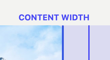
Can we use currentColor for the breakpoint text labels, so it works against dark backgrounds? Or if it's a popover that doesn't inherit anything useful, perhaps we should just use the Tooltip component for those labels.

@talldan
Copy link
Contributor Author

talldan commented Oct 25, 2022

As Jay notes, it's best if it appears (perhaps fades in quickly) when you scale above content width, but not when you're scaling down.
Can we use currentColor for the breakpoint text labels, so it works against dark backgrounds? Or if it's a popover that doesn't inherit anything useful, perhaps we should just use the Tooltip component for those labels.

Sounds good! I'll try to get to those improvements soon.

I noticed a few more cases that need to be handled. The entire post content can be justified in a template, and that changes how alignments work. I'm wondering what the best way of handling all those situations is. If the visualizer could use the same styling as the block list (replicate a block in a block list), that might be an interesting solution that would just work.

At the moment I've only really handled centered content.

I've also been working on a PR adjacent to this to improve how popovers work for these kind of components (#45137).

@talldan talldan changed the title Try showing a resize visualizer when using the drag handle to resize an image block Oct 27, 2022
@talldan
Copy link
Contributor Author

talldan commented Oct 27, 2022

This should be working better in terms of different layouts and justifications.

For example, you can put an image in a full width group, adjust the justification and content/wide sizes on the group, and when resizing the image it should show the alignment zones in the correct position.

I notice there are still some things to solve, like padding isn't taken into account, alignments in groups that are content width are a bit unusual, and all the other review feedback still needs to be worked on.

@jasmussen
Copy link
Contributor

Took it for a quick spin, this is fast coming together, impressive:

status

In smaller viewports such as for this example, the labels are clashing a bit. I wonder if we could make the labels appear as your resize handle nears the snap-point, so we only show one label at a time? What do you think? That might also make it clearer that a "snap" is about to happen if you release when the tooltip appears. 🤔

It might also make sense to use the Tooltip for these after all.

Nice progress!

@jameskoster
Copy link
Contributor

I think that's worth at try. Another option could be to simply omit 'width' from the labels. This has the benefit of clarifying the guides before you drag to reach them, but it's not bullet-proof and there will still be rare overlaps.

@victorberland
Copy link

I think one issue this may face is an "agressive jump" when the resizing goes from being just by one corner to filling up the left half as well and the alignwide class being added. Obviously this won't be an issue when the image is align center, but most of the time they're unset and therefore scale from the left and out.

Could it be an idea if the sizing was how it currently is (scaling by the corner) up until one hits the content width, and then after that have it scale from the center and then snap to alignwide and full? I think thay would provide a bit less "jumpy" experience. Any thoughts?

@talldan
Copy link
Contributor Author

talldan commented Oct 31, 2022

Quick update on today's changes:

  • I tried out using currentColor for the visualizer as a way to solve contrast issues, and that works quite well IMO.
  • The visualizer now appears behind the image (which instantly makes it more performant as it reduces compositing). The way I did this is a little bit hacky, so I'll need to come up with a proper solution.
  • Only the nearest alignment label is shown. This works really well too, but I also need to optimize and tidy up the code.
Kapture.2022-10-31.at.12.52.12.mp4

I think one issue this may face is an "agressive jump" when the resizing goes from being just by one corner to filling up the left half as well and the alignwide class being added.

@victorberland I also anticipate that this might be an issue. I don't think we'll know how bad it is until we get to the point where it's implemented, and then we can try a few things. Another idea is that we could show a kind of ghost version of the image. The other potential issue that comes to mind is that sometimes the user might not want the image center aligned when resizing.

@jasmussen
Copy link
Contributor

Nice, coming together fast!

I tried out using currentColor for the visualizer as a way to solve contrast issues, and that works quite well IMO.

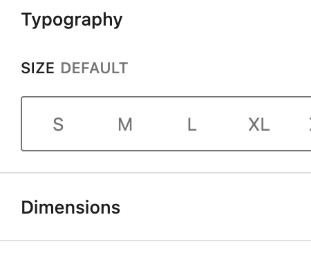
Nice! It if the all-caps label style is the one Jay is going for, it looks like the font is slightly too bold and large compared to what's in the sidebar:

Screenshot 2022-10-31 at 12 30 51

Screenshot 2022-10-31 at 12 31 01

Only the nearest alignment label is shown. This works really well too, but I also need to optimize and tidy up the code.

Feels great!

@annezazu annezazu mentioned this pull request Nov 1, 2022
57 tasks
Show alignment steps

Tidy up and add labels

Use a resize observer to handle resizes

Set a max width to avoid visualizer step appearing beyond screen edges

Only show visualizer while resizing

Use availableAlignments instead of hard coded array

Refactor away from block popover

Adjust sizing to parent/root block list

Move into separate component file

Move more code into effect for optimization

Remove export

Hack together a version that dynamically uses the parent block list layout

Bring back proper styles

Fix popover positioning

Tidy up css and naming

- Rename step to zone
- Use the unstyled variant

Use text color as the contrast color

Allow popover to render inline by overriding slot

Show nearest alignment zone label

- Register zones into a slot when they mount
- use `getDistanceToNearestEdge` to detect nearest zone to mouse pointer
- Make Popover render behind the image and receive mouse events
- Add CSS to only show highlighted zone

Show nearest zone to mouse by hooking into resizeable box events

Allow popover to render inline

Add unstyled variant to wrapping popover

Rename props

Rename prop

Take padding and margin of layout into account

Lessen opacity of background

Rename from blockList to layout

Reduce need for margin/padding on container

Throttle zone detection

Ensure popovers that reference iframe are positioned correctly by not applying padding to iframe

Fix zone highlighting when layout has padding

Remove spacing variable

Remove unused dep

Add a basic fade-in animation

Animate label

Update label style

Refactor

- Move ResizableImageControls to block editor package and rename to ResizableAlignmentControls
- Export ResizableAlignmentControls and remove export for BlockAlignmentVisualizer
- Move hardcoded alignments to image block

Use context for zones and switch to a map instead of a set for storing zone data

Add basic snapping

Fix incorrect prop name

Move nearest zone detection to event handler

Update re-resizeable

Detect snapping

Document code

Speed up iframe rendering

Avoid removing iframe head and body and reattaching them

Make iframe title a prop

Use custom snapping algorithm over resizable box algorithm

Reintroduce basic snapping while dragging

Set alignment on release of mouse

Allow snapping from left/right alignments

Fix snapping to content width for images that are larger than content width

Increase snap threshold

Refactor content width snapping fix to image block code

Try allowing resize handles on wide and full aligned images

Revert "Try allowing resize handles on wide and full aligned images"

This reverts commit f8402c2.

Revert "Update re-resizeable"

This reverts commit 7d7e231.

Add some really dodgy animation code

Revert "Add some really dodgy animation code"

This reverts commit a60d775.

Use a framer motion layout animation for snapping

Refactor and rename things

Remove unused resize observer

Refactor - separate popover code from layout code

Fix padding being applied to visualizer incorrectly

Move styles to the content.scss

Remove border from iframe

Switch to using the shadow dom instead of an iframe to encapsulate styles

Speed up animation

Simplify guide styles

Remove offset naming

Adjust layout popopover to use correct element

Try fixing layout block detection

Remove non-existant stylesheet import

Fix iframe offsetting

Remove buggy padding on cover element

Use a consistent value for no snapping

Use package-lock from trunk

Start implementation of new design

Hide old guides

Support content justifications for new visualization

Simplify guides code, remove use of LayoutStyles

Move snapping code into a hook

Move getOffsetRect to dom package and rename

Try: hide full and wide alignments at smaller container sizes

Fix snapping

Fix - show/hide block interface actions not usable outside dimensions panel

Hide block toolbar when resizing

Hide block border when using alignment visualizer
@talldan
Copy link
Contributor Author

talldan commented Apr 18, 2023

Thanks for all the feedback everyone. I'll respond to some of it. I think we also need to determine what the MVP is for this feature, especially with it now behind an experiment toggle.

First, I think we have some code in place that disables resizing of images when the alignment is set to wide or full, with this PR we should probably remove that and always allow resizing because otherwise, you feel like it's a bug, you just resized and the resize handle disappeared.

I was expecting the resize controls to still be available after an initial snap. That way I could resize it further, or change my mind if I wanted to

Unfortunately it's not just a matter of removing that code. The image would also first have to be unsnapped when the user starts dragging from full/wide alignments, otherwise the image will be resized from the wrong origin (full/wide position instead of content position). It's not trivial to implement, so I thought I'd leave it as a follow-up task to keep this PR as small as possible.

I've found myself wondering whether "align full" / "align width" and resizing should be just part of the same "width block support". Also I found myself wondering why resizing is an image block only feature, it should be just a generic feature part of the "width block support". (Ideally blocks don't have to write any code to support these things). I understand that this point is a big ask and probably out of scope of the current PR but was curious about your thoughts on this and whether we should continue in this direction after this PR?

I agree on all points (especially that it is a big ask 😄). I think it'd be good from a UX perspective to introduce more canvas tools like this.

I'd definitely be interested in trying it out on a few other blocks, and looking at making it part of the align supports. Interestingly the image is probably one of the most complicated in terms of the implementation, as it doesn't use the standard block alignment supports tools, and has extra image re-sizing logic when aligning.

I also noticed that in safari, resizing is very laggy, not sure if there's something we can do about it. Maybe some throttling...

I couldn't reproduce any performance issues in Safari (using an M1 Macbook Pro). I think I have an older computer I can try it on.

Perhaps it's me testing this in an awkward theme with wide and fullwide pretty close to each other, but the snap points being so close caused a little bit of overlapping when resizing between the two.

I've noticed it too. The position of full alignment is dependent on the viewport width. Perhaps it'd be best to hide 'wide' when it's too close to 'full'. At the moment I only hide it when they completely converge 🤔

It might be good to test this resizing with some complex demo content to make sure we test edgecases, like resizing an image inside a group, etc. In quick testing, I was able to snap to a wide breakpoint inside a content wide group, but honestly this might be an issue in trunk

The wide and full areas should be active based on the parent layout setting.

It seems in trunk that any inner block can be set to wider than the parent, but won't honor that alignment. This PR should match whatever the standard alignment tools do. I'll make an issue and follow up on it in another PR.

I'm also very certain it won't work in all cases—groups with padding has been a difficult one to solve, the layout system doesn't offer any clue of the layout bounding box, and I think that's needed. I would quite like to work through this in a separate PR before hacking around with the layout system—scoping the PR will make it much easier to review.

In the editor you can drag the image to somewhere in-between the snapping zones, but on the front-end the image is maxed out at parent block's width (content width if there is no parent block). This is a longstanding issue with resizing in the editor, but if we do the above (number three) then this could help reduce this visual conflict.

It seems unusual that this happens with freeform resizing. I can look into it, but if it happens in trunk it'll be a separate PR.

I don't find the tooltip indicating content/wide/full particularly helpful. Even if it were more present, I don't think it's necessary.

I think @jasmussen feels differently, so you two might need to discuss it 😄

I wonder if we can be more restrictive on the resize snapping. If you drag into the wide width area, it snaps to wide (instead of only at the far edges; the same for the full width areas. They UI already indicates this, but the interaction does not.

So when you drag over the entire segment, it snaps? I'll try it, I think that should be fairly easy to experiment with.

@youknowriad
Copy link
Contributor

Personaly, allowing to drag and "unsnap" when you're already in full/wide images feels like the biggest issue right now. As a user, it's not clear why you can't just continue resizing after you're done with your "first attempt".

@talldan
Copy link
Contributor Author

talldan commented Apr 18, 2023

Personaly, allowing to drag and "unsnap" when you're already in full/wide images feels like the biggest issue right now.

I'll start exploring it in a separate PR that we can either merge into this one or merge to trunk after this one - #49888

@jasmussen
Copy link
Contributor

I've noticed it too. The position of full alignment is dependent on the viewport width. Perhaps it'd be best to hide 'wide' when it's too close to 'full'. At the moment I only hide it when they completely converge 🤔

That could work as a plan B, but if I can do it from the button in the toolbar feels worth also doing it with resizing if at all possible. Could we set a minimum "snap hit area" that, if need be, pushes the preceding snap point inwards?

To be clear this might be best explored in a followup, I don't think of this as a blocker.

I don't find the tooltip indicating content/wide/full particularly helpful. Even if it were more present, I don't think it's necessary.
I think @jasmussen feels differently, so you two might need to discuss it 😄

I do indeed :D — I think the tooltips that appear when you are near a snap point are perfectly timed and contextually useful. I love them. But I also would not object to starting this experiment without them and adding them later. Or indeed the reverse, starting with them and removing later. Overall, it's not a strong opinion, and I'm happy to defer to someone who has.

@richtabor
Copy link
Member

I wonder if we can be more restrictive on the resize snapping. If you drag into the wide width area, it snaps to wide (instead of only at the far edges; the same for the full width areas. They UI already indicates this, but the interaction does not.

In the editor you can drag the image to somewhere in-between the snapping zones, but on the front-end the image is maxed out at parent block's width (content width if there is no parent block). This is a longstanding issue with resizing in the editor, but if we do the above (number three) then this could help reduce this visual conflict.

Perhaps as a follow-up we can try this UX. It would help prevent the awkward resizing past the content area issue.

@talldan
Copy link
Contributor Author

talldan commented Apr 20, 2023

Personaly, allowing to drag and "unsnap" when you're already in full/wide images feels like the biggest issue right now.

I haven't found a way to do this that isn't buggy. If the alignment is unset from 'full' or 'wide' as the user starts dragging, the ResizableBox component gets very glitchy (as we're essentially moving the ResizableBox while the user is dragging, and it doesn't handle it very well). The current state of the PR should demonstrate that - #49888.

My worry is that the only solution is to build a new ResizableBox component. I could also look at contributing a fix back to ResizableBox, but this is a real edge case.

@talldan
Copy link
Contributor Author

talldan commented May 2, 2023

I haven't found a way to do this that isn't buggy.

Still struggling with this one technically. I've been slowly working on an alternative implementation to ResizableBox that can handle wide and full alignments, but it's slow progress. I'll try to push a PR up to github soon.

@talldan talldan closed this Jul 1, 2024
Sign up for free to join this conversation on GitHub. Already have an account? Sign in to comment
Labels
[Block] Image Affects the Image Block Needs Design Feedback Needs general design feedback. [Type] Enhancement A suggestion for improvement.
9 participants