#52402 closed defect (bug) (fixed)
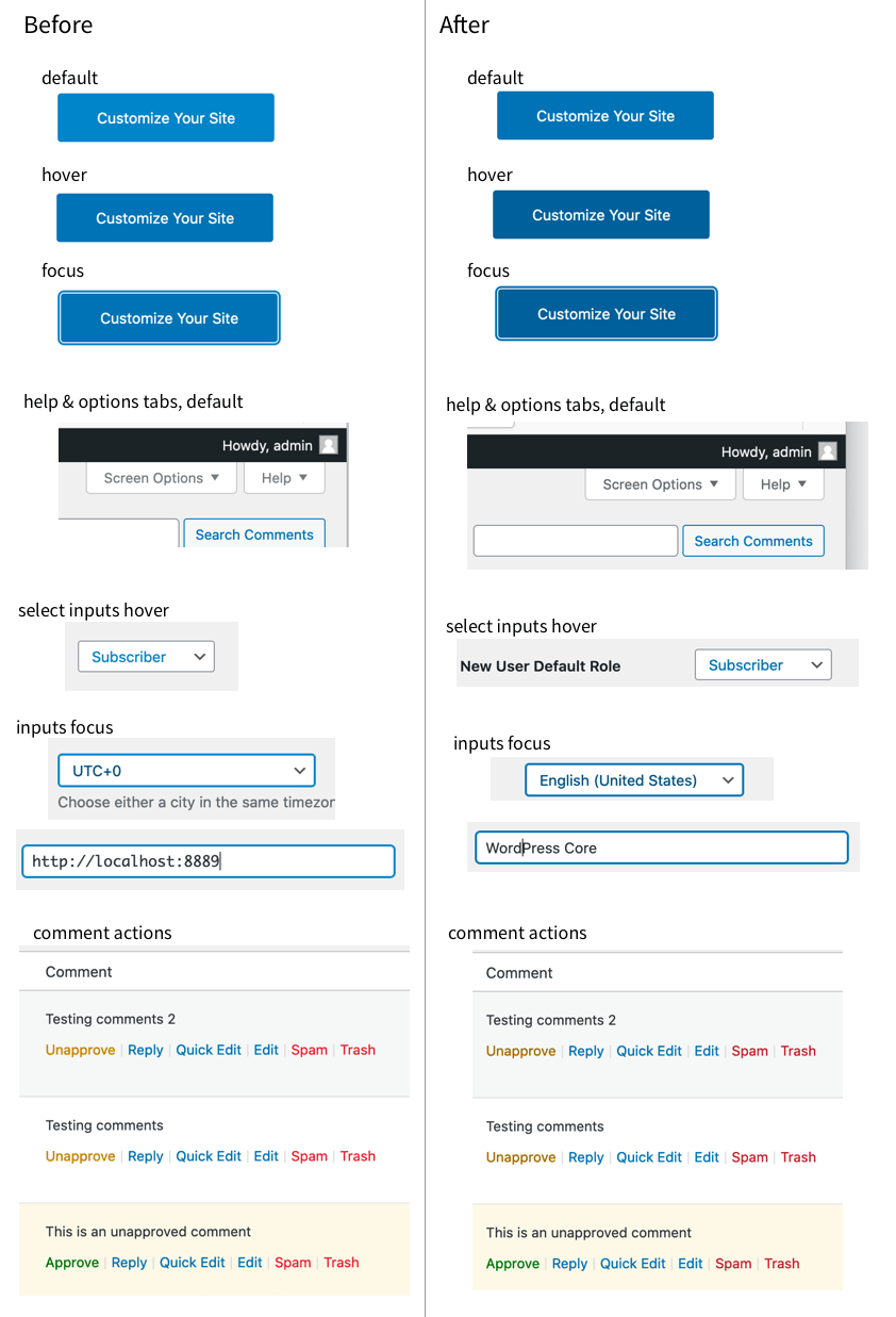
New Admin color palette: Improve color contrasts on primary buttons and help tabs
| Reported by: |
|
Owned by: |
|
|---|---|---|---|
| Milestone: | 5.7 | Priority: | normal |
| Severity: | normal | Version: | 5.7 |
| Component: | Administration | Keywords: | has-patch |
| Focuses: | accessibility, css | Cc: |
Description
Related: #49999
As noted by @joedolson:
Couple broadly applicable contrast issues noted with new color scheme:
1) Primary button color: 4.08:1 contrast.
2) Contextual help link: 4.20:1 contrast
Following @ryelle color palette, I'd suggest:
Primary buttons:
- Background color: replace
#2271b1with#135e96 - Border color: replace
#2271b1with#135e96 - Hover background color: replace
#135e96with#0a4b78 - Hover border color: replace
#135e96with#0a4b78
Help tab buttons:
- Font color: replace
#787c82with#646970
I tested those combinaisons. It works fine visually and it's AA compliant for both large and small text.
Change History (15)

This ticket was mentioned in PR #966 on WordPress/wordpress-develop by ryelle.
4 years ago
#2
- Keywords has-patch added; needs-patch removed
Trac ticket: https://core.trac.wordpress.org/ticket/52402
#3
 @
@
4 years ago
I've started a PR to correct the contrast issues - in addition to the buttons and contextual help tabs, I also fixed the select hover color & input focus to be darker blue, and updated the list table actions (delete & unapprove).
These new colors work on the beige and white backgrounds, but on the alternate grey, even the darker yellow only gets to 4.38 (that's #996b00 against #f6f7f7). The next-darker yellow feels too brown, so I'm wondering if we should tweak the palette color itself. This is the only place we use this color, so if we adjust it to #996800 it would pass while keeping a gold-yellow feel.
The other change in here is fixing the checkmark color - this was set in SVG, so it was missed by the automated script. Now the checkmark and radio button dot match again. These are both #4f94d4 - do they also need to have a 4.5+ contrast?

This ticket was mentioned in Slack in #accessibility by ryokuhi. View the logs.
4 years ago
#5
 @
@
4 years ago
User interface components only need to meet 3:1+ contrast standards, so you've got more flexibility there. If we can hit 4.0 or so there, that would be OK.
The yellow adjustment seems fine to me.
#6
 @
@
4 years ago
Thanks! I've updated the checkmark & radio to #3582c4 which has a 4.08 contrast against white. I also updated yellow-50 in the palette to 996800, which just clears the 4.5 contrast against the alternate background.
I happened to notice the UI helper classes would lack contrast, so I bumped up the blue there, too.

3 years ago
#7
I've updated the badge colors on Site Health & Privacy - there are helper classes for blue, orange, red, green, purple, and gray "badge" indicators. We no longer have a purple, so this is just a darker blue.
Are these colors decorative or informative? should they also have 3+ (or 4.5+) contrast? Only red and "purple" have 3+ right now.
Before:
<img width="209" alt="Screen Shot 2021-02-08 at 2 40 57 PM" src="https://user-images.githubusercontent.com/541093/107273789-88ffe680-6a1d-11eb-916e-b3fbd53d8a46.png">
After:
<img width="208" alt="Screen Shot 2021-02-08 at 2 47 01 PM" src="https://user-images.githubusercontent.com/541093/107273797-8bfad700-6a1d-11eb-85a7-a9bf6d5b0fb0.png">

joedolson commented on PR #966:
3 years ago
#8
Looking at the images posted for the badges, they look to me like they're supplemental. They do contain information, but they aren't the information themselves, and there's no dependency on recognizing the colors to get the relevant information. It does offer some degree of speed advantage in perceiving the relevance of issues, but that's about it. Per 1.4.11, the contrast requirements are established where the visual information is required to perceive states or information, and that's not the case here.
#9
 @
@
3 years ago
- Owner set to ryelle
- Resolution set to fixed
- Status changed from new to closed
In 50278:
#10
 @
@
3 years ago
I committed this so that it could be included in the beta 2 release, but if there's still work to do on contrast issues we can either re-open this or continue in another ticket. Thanks @joedolson & @audrasjb!

This ticket was mentioned in Slack in #accessibility by ryelle. View the logs.
3 years ago

This ticket was mentioned in Slack in #core by monikarao. View the logs.
3 years ago
#14
 @
@
3 years ago
The primary buttons' colors are not changed.
The help tab buttons' colors look as described in the ticket.
#15
 @
@
3 years ago
@Boniu91 The values in the description of the ticket were not accurate to the previous versions, the buttons used to be #3582c4. The primary button color should now be #2271b1 (contrast of 5.16), switching to #135e96 (6.84) on hover. The help tab text color should be #646970. Does that match what you're seeing?

For reference, here is a link to the 5.7 Admin color palette shared in #49999: https://codepen.io/ryelle/full/WNGVEjw