#40822 closed defect (bug) (fixed)
Addressing Proximity in the admin area
| Reported by: |
|
Owned by: |
|
|---|---|---|---|
| Milestone: | 6.4 | Priority: | normal |
| Severity: | normal | Version: | |
| Component: | Administration | Keywords: | a11y-task has-screenshots a11y-proximity changes-requested |
| Focuses: | ui, accessibility | Cc: |
Description
This ticket is to address proximity issues in the admin area as a whole.
New tickets should be created for individual issues as they are found and reported.
Background:
In web design, the principle of proximity states that related items should be placed close together. By the same token, if things are spaced farther apart they appear to have less relation to one another.
This principle is especially critical for users with low vision. It will even be addressed in the next draft of the WCAG guidelines! See Accessibility Requirements for People with Low Vision
Additionally, there will be ongoing education in Make WordPress Accessible to help better understand the issue so that problems become more apparent.
Attachments (2)
Change History (57)

This ticket was mentioned in Slack in #accessibility by trishasalas. View the logs.
7 years ago

This ticket was mentioned in Slack in #accessibility by afercia. View the logs.
7 years ago
#4
 @
@
7 years ago
- Keywords needs-screenshots added
- Milestone changed from Awaiting Review to Future Release
#5
 @
@
7 years ago
Some resources, highly recommended for designers and UI/UX folks:
Types of Low Vision
https://webaim.org/articles/visual/lowvision
W3C draft: Accessibility Requirements for People with Low Vision
3.6 Point of Regard and Proximity
https://www.w3.org/TR/low-vision-needs/#point-of-regard-and-proximity
Point of Regard and Proximity of Controls (straw test)
http://www.d.umn.edu/~lcarlson/wcagwg/point_of_regard/#straw_test_2
Youtube video (2 mins): the straw test in action, by Derek Featherstone
HCB University: Accessibility 101 "The Straw Test"
https://www.youtube.com/watch?v=S1j6CYT3kWA
Post about a similar accessibility session by Derek Featherstone:
Responsive Design & Accessibility
http://www.berndtgroup.net/thinking/blog/ux/responsive-design-and-accessibility
#6
 @
@
7 years ago
- Focuses ui added
- Keywords has-screenshots added; needs-screenshots removed
- Type changed from enhancement to defect (bug)
Some screenshots with clear examples of how UI controls can be very hard to discover for people with low vision, visual field loss, screen magnifier users, etc., due to lack of proximity:
Quick edit (same for Bulk edit):
Reply to comment (same for edit comment):
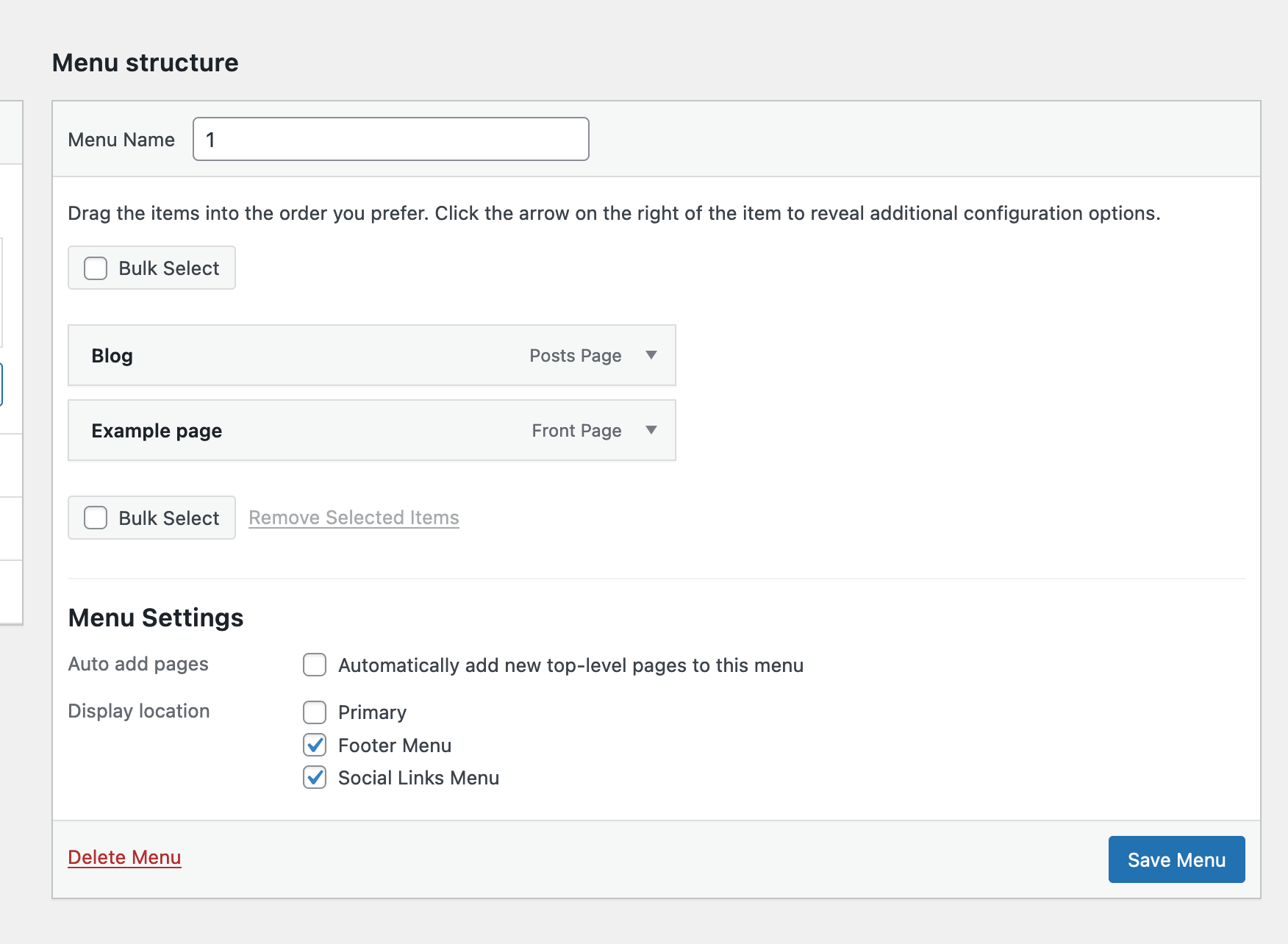
Save/Delete menu:
Appearance > Theme details: notice "Delete" is on the right:
Customizer > Theme details: notice the placement of controls is inverted compared to the Appearance screen. This forces users to "learn" a new interface and introduces inconsistency with no apparent reason:
Gutenberg (see the toolbar on a very large display):
Additionally, across the whole WordPress admin, the primary action button (the blue one) is placed inconsistently. Sometimes it's on the left, sometimes on the right. I guess this is mostly for historical reasons: in a so large project it's perfectly understandable to have some inconsistency across UI sections that were designed at different times. I seem to remember this was also discussed a few times but never fully addressed. It would be great to establish a solid, predictable, pattern and always have the primary action button where users expect.
Lastly, worth noting a new pattern was recently introduced in the edit term screen, see [40655]:
In this case, the placement of controls is far better for accessibility: the "delete" link is next to the update button and easily discoverable. I understand the concerns about avoiding unintentional clicks so I'd agree there should be some grade of separation between the primary action control and a Delete/Cancel control, but I'm confident this can be achieved respecting the proximity principle.

This ticket was mentioned in Slack in #accessibility by afercia. View the logs.
7 years ago
#9
 @
@
7 years ago
Based on https://www.lukew.com/ff/entry.asp?571, I think we should:
- Have the primary action (like update, etc.) on the left, as a primary button.
- If relevant, list secondary actions immediately to the right of the primary action, as secondary buttons.
- List all negative action (cancel, delete) next, as links.
In most cases, the actions should be left aligned, to line up with the forms. This would happen on Settings, bulk edit screens, edit term screens, etc.
In the case of things like the theme modal, actions should remain centered (since the content within the modal doesn't follow the same left-aligned linear path as forms do).
I don't know that these rules should apply to Gutenberg, where related actions are already grouped together — but I'll let @karmatosed or @joen chime in about it, since I haven't been super involved in that discussion.
#10
 @
@
7 years ago
Have the primary action (like update, etc.) on the left, as a primary button.
If relevant, list secondary actions immediately to the right of the primary action, as secondary buttons.
List all negative action (cancel, delete) next, as links.
The above is more or less what Gutenberg is following. We have a slight variation on actions outside of forms or assumed forms. Our actions are grouped together also which adds a different context in some cases, a strong example of that is an ellipsis (more) menu.

This ticket was mentioned in Slack in #design by kumikocmorita. View the logs.
6 years ago

This ticket was mentioned in Slack in #design by melchoyce. View the logs.
6 years ago
#13
 @
@
6 years ago
We looked at this in our design triage session today - The new pattern looks great but for accessibility the buttons should not be at opposite sides of the screen - what is useful is:
1) making sure the distance between buttons (or links) is sufficient to avoid clicking wrongly
2)consider making the clickable area of the links large enough too...
It can be tested to meet mobile standards here: https://search.google.com/test/mobile-friendly
Hope this is helpful. My thinking is that the buttons should be centered in the order of hierarchy
Thoughts?
#14
follow-up:
↓ 17
 @
@
6 years ago
@cathibosco1 sure thanks :)
so ideally the patch would be updated to exclude the change in button alignment
Maybe wrong ticket? This ticket is a general tracking ticket for the proximity of controls and illustrates various examples, including the theme details modal. It doesn't have a patch attached :)
As per the details, I totally agree with the pattern detailed by @melchoyce in the previous comment https://core.trac.wordpress.org/ticket/40822#comment:9 also considering, as @karmatosed said, that's also what Gutenberg does.
I understand the concern about avoiding clicks on the wrong button, but probably that should be addressed increasing the clickable area, as mobile operating systems do (see screenshot below). I guess it should be addressed separately though, as part of a buttons redesign.
#16
 @
@
6 years ago
Quoting from the latest W3C "Accessibility Requirements for People with Low Vision" draft
(Editor's Draft 03 January 2019, at the time of writing)
http://w3c.github.io/low-vision-a11y-tf/requirements.html#proximity-of-related-information
[Edit] Update – on May 31 2019, it is now "W3C Editor's Draft 02 May 2019"
Proximity of Related Information
People with limited field of vision or who use large text have little in their field of view at one time. If related information is not close together, they can have trouble knowing about it, seeing it, and using it. In most cases, it is best if:
- Related information — such as labels and controls, instructions for data fields, matching tests in two columns, and feedback — is in close proximity.
- Feedback is in close proximity to the user’s visual focus.
- Dialog boxes and other such pop-up messages appear over the users' point of regard.
- Users are informed of new information that may be outside of their view — such as a new browser tab opening in the background.
#17
in reply to:
↑ 14
 @
@
6 years ago
Thank you for finding my error @aferica
Replying to afercia:
@cathibosco1 sure thanks :)
so ideally the patch would be updated to exclude the change in button alignment
Maybe wrong ticket? This ticket is a general tracking ticket for the proximity of controls and illustrates various examples, including the theme details modal. It doesn't have a patch attached :)
As per the details, I totally agree with the pattern detailed by @melchoyce in the previous comment https://core.trac.wordpress.org/ticket/40822#comment:9 also considering, as @karmatosed said, that's also what Gutenberg does.
I understand the concern about avoiding clicks on the wrong button, but probably that should be addressed increasing the clickable area, as mobile operating systems do (see screenshot below). I guess it should be addressed separately though, as part of a buttons redesign.

This ticket was mentioned in Slack in #accessibility by afercia. View the logs.
5 years ago

This ticket was mentioned in Slack in #design by estelaris. View the logs.
4 years ago
#21
 @
@
4 years ago
- Keywords good-first-bug added; ui-feedback removed
This ticket seems to have focused in on the proximity of buttons within wp-admin. My recommendation is to make the changes recommended above. This requires development at this point. I'm going to mark this as a good first bug for someone to move the buttons closer together.
#22
 @
@
4 years ago
So how would I go about taking this as my "good first bug"?
I have wordpress running locally (forked the wordpress-develop git repo) and already worked on the quick edit/bulk edit screens.
I am totally new to Core Contributing, so I would like that someone checks the CSS so far, as I am not sure how you handle linting, syntax, colours etc.
How do I attach an image here, so that you can see the current work?
How does the branching work and what name should the branch be? What should the commit message look like?
Any help is appreciated.

This ticket was mentioned in PR #601 on WordPress/wordpress-develop by landwire.
4 years ago
#23
- Keywords has-patch added
Styled the quick edit and bulk edit screen only for now. Feedback welcome.
Trac ticket: https://core.trac.wordpress.org/ticket/40822

This ticket was mentioned in Slack in #core by monsenhor. View the logs.
22 months ago

21 months ago
#27
Can be closed, fixed in https://core.trac.wordpress.org/changeset/53023

This ticket was mentioned in PR #3542 on WordPress/wordpress-develop by @kebbet.
21 months ago
#28
#29
 @
@
21 months ago
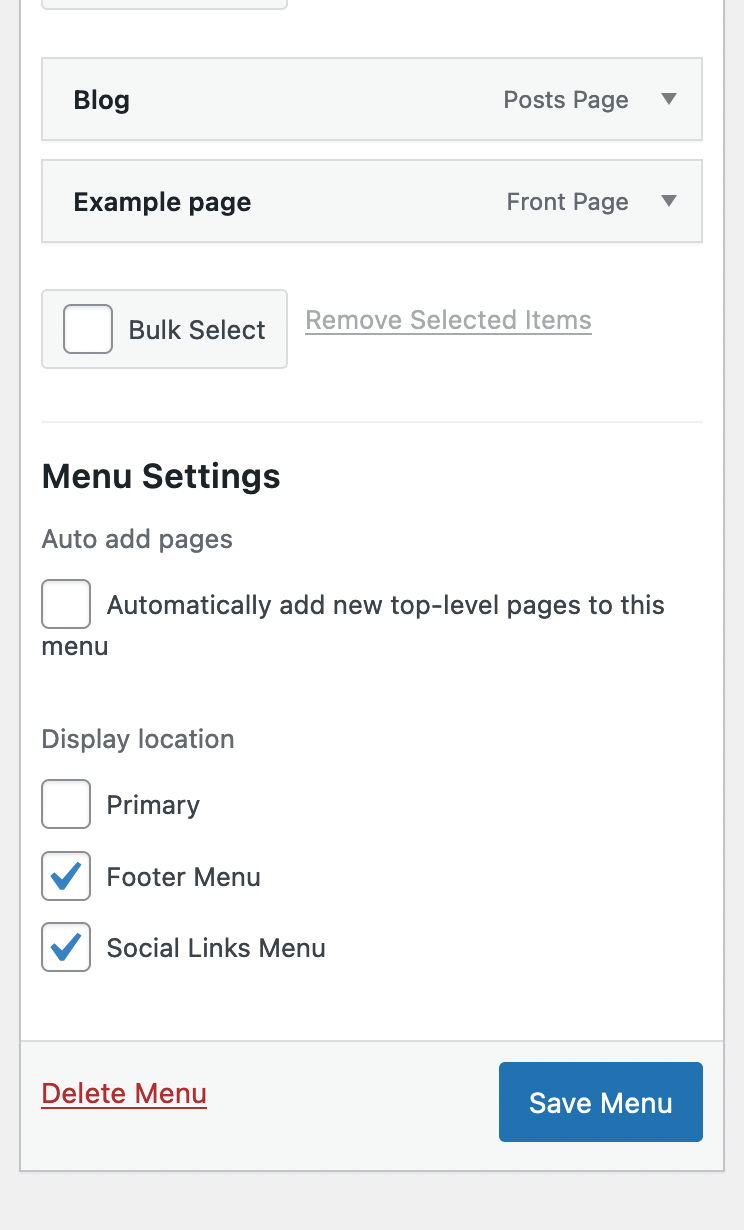
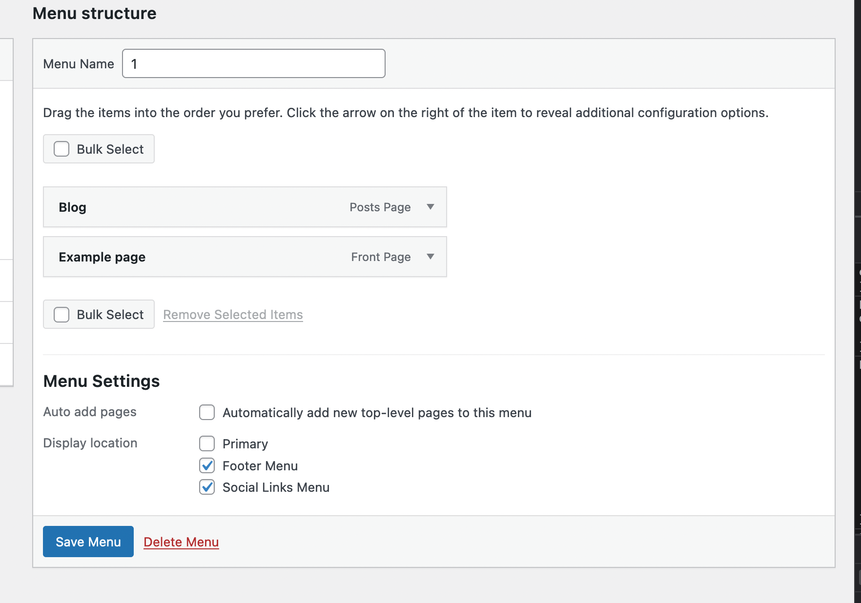
3542 (https://github.com/WordPress/wordpress-develop/pull/3542) groups menu actions to the left (as in edit category or quick edit). See attached screenshots

This ticket was mentioned in Slack in #core by chaion07. View the logs.
14 months ago
#35
 @
@
14 months ago
- Keywords needs-testing-info added
Hi @kebbet,
could you please clarify the scope of the ticket and provide information for testing 🙏
#36
 @
@
14 months ago
Hi @oglekler,
Thanks for the ping. Reading back on the ticket, I think my PR should be a separate ticket, as this ticket is for the general scope. The description of it states New tickets should be created for individual issues as they are found and reported.
That way it is easier to mark tasks done.

This ticket was mentioned in Slack in #accessibility by joedolson. View the logs.
14 months ago

@sabernhardt commented on PR #3542:
14 months ago
#38
I reopened Trac 56594 to address this on that ticket.

This ticket was mentioned in Slack in #accessibility by joedolson. View the logs.
14 months ago

This ticket was mentioned in Slack in #accessibility by joedolson. View the logs.
13 months ago
#41
 @
@
13 months ago
- Milestone changed from 6.3 to 6.4
Moving this to 6.4. The first step on this should be to isolate each individual change as a separate ticket. Each scenario will need a separate and independent solution, so these shouldn't be committed as a group.

This ticket was mentioned in Slack in #accessibility by amberhinds. View the logs.
12 months ago

This ticket was mentioned in Slack in #core by marybaum. View the logs.
11 months ago
#45
 @
@
11 months ago
- Keywords changes-requested added; good-first-bug has-patch needs-testing-info removed
August 29 bug-scrub attendees agree with Joe and Olga that this needs splitting up.
#46
 @
@
11 months ago
a good example of non proximity in Gutenberg (that have to be fixed to avoid) https://github.com/WordPress/gutenberg/issues/47446

This ticket was mentioned in Slack in #accessibility by joedolson. View the logs.
11 months ago
#48
 @
@
11 months ago
There are two items in this ticket remaining to be completed: the theme details panel in both the installer and the customizer. All other core items have been resolved.
Gutenberg issues should be raised separately in the Github repository.

This ticket was mentioned in Slack in #core by marybaum. View the logs.
11 months ago

This ticket was mentioned in Slack in #accessibility by joedolson. View the logs.
11 months ago
#54
 @
@
11 months ago
- Resolution set to fixed
- Status changed from accepted to closed
With [56639], all of the core issues raised in this ticket have been resolved. Any outstanding Gutenberg issues should be raised in Github, and any additional core issues should open new tickets.

11 months ago
#55
Commited in https://core.trac.wordpress.org/changeset/56449


It would be nice to add some screenshots and references. Moving to future release as per today's accessibility bug scrub.