
A little over a year ago we published the results of an experiment: a new article design that didn’t look like the rest of our stories. It had an airy layout that gave clarity to the text, with new typefaces and colors, and it was published entirely outside of our CMS. Over the past year we’ve been using that article design to publish more stories as we’ve developed the complete new look we’re unveiling today. But we haven’t been calling this process a redesign—instead, I asked everyone to call it Redux. That’s because all the while the project has been a Trojan horse.
Slate has been sorely in need of a visual update to bring our look up to the level of our stories, but rather than just focus on a redesign of the website, we wanted to redesign the way we work. Sure, on the other end of that we’d have a new home page and logo, but we wanted to build a process for working together that brought everyone to the same table—editorial, design, development, product, and sales.
We used that initial article design as a sandbox to test assumptions about collaborating together while we also worked out the technical, design, and business needs for a new Slate. And as I noted at the time, the website was the testbed, but the goal was to tackle the project holistically for all the places Slate appears:
Slate is not simply our website. The site is one place where Slate lives, but Slate exists in a variety of places, from social platforms like Facebook, to your podcast app, to the public spaces where we host live events. So rather than making this a monolithic redesign project, in which we look for a single design answer that will work wherever Slate lives, we are starting with a small, though important, corner of the magazine. In rethinking how we produce and design the big, splashy pieces we publish at the top of the week, we’re gathering information about what works—and how we work—and setting ourselves up to take those lessons to other parts of the whole.
After that first article published, we tested, refined, and gradually started publishing more. This small corner of the site allowed us to iterate and experiment in public before opening up the project to the next big goal: a makeover for Slate the brand.
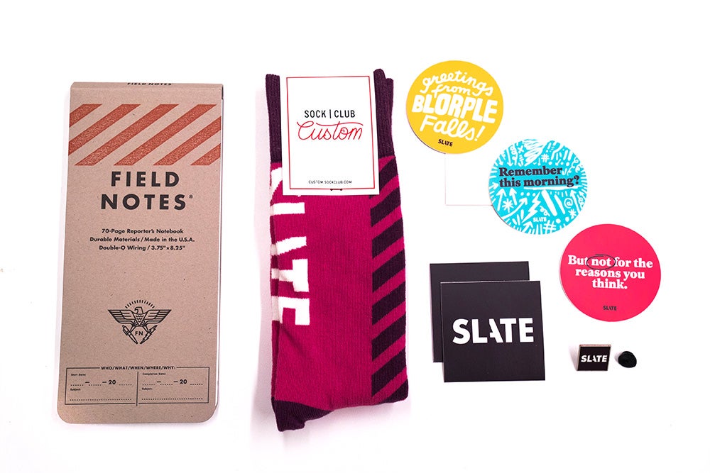
As part of this work, we knew we’d need to not just touch up our branding but reimagine it. We brought in the excellent design firm Gretel to help us do it. Gretel helped us establish a unified conceptual approach to our design work, in addition to all the needed artifacts like logos, color and type palettes, and a design toolkit.
To put edges around the efforts, we needed to define ourselves: Slate is a guide and companion. We strive to be reliable and bullshit-free. We prize curiosity, wit, and chasing those moments of surprise in a story.
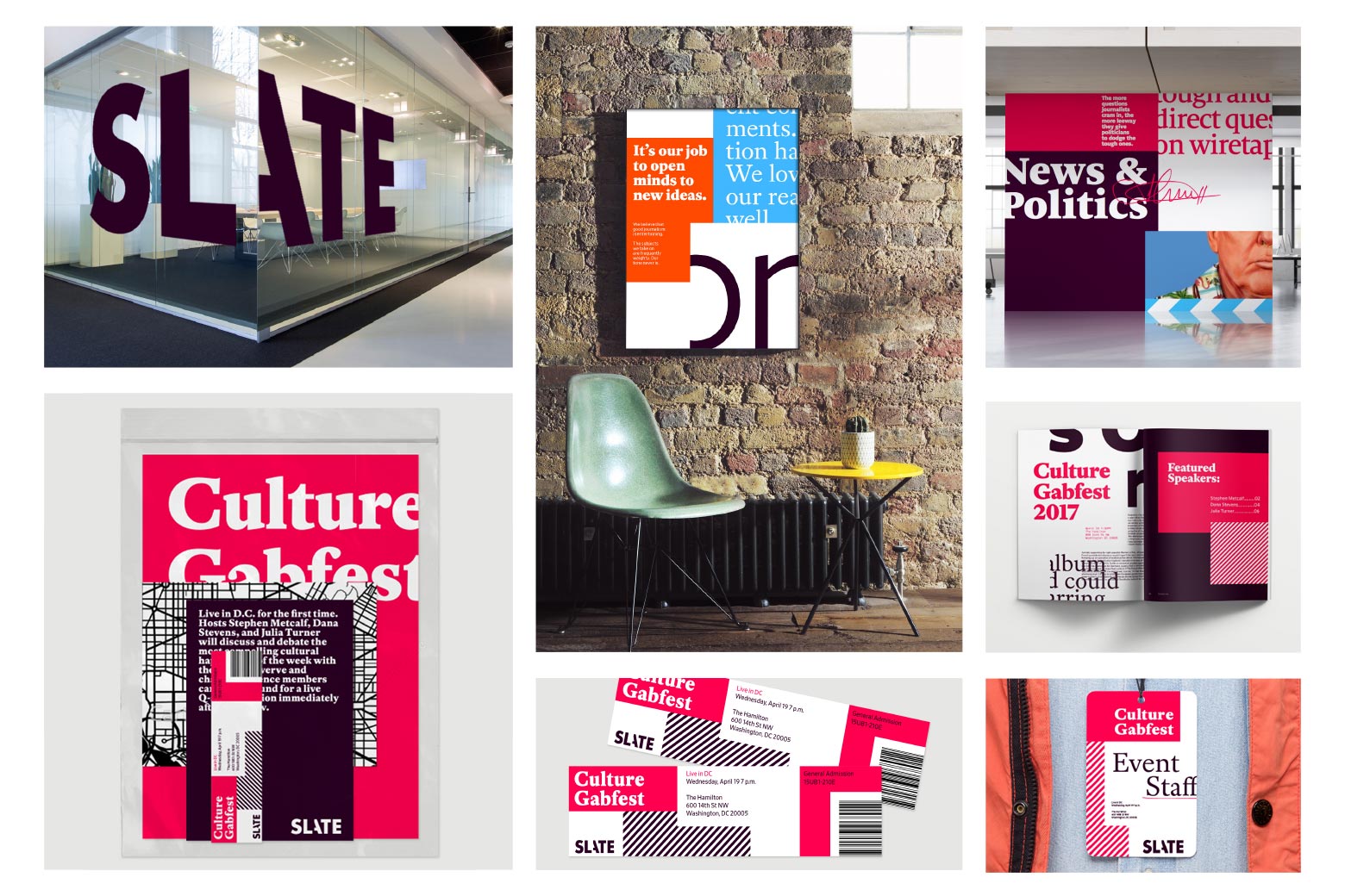
Our design direction seeks to embody these qualities by visualizing some cues of the story-making process. We want to show how materials and research come together—sometimes literally by allowing elements to overlap and pile on top of one another—and how the editor’s hand is a part of that, sometimes emphasizing a point or creating marginalia.
Sometimes these cues are loud, as in the art for a story. Other times it might be a subtle hand-drawn element in the interface of the website. These visual moments help us make our work feel like Slate, wherever it appears.
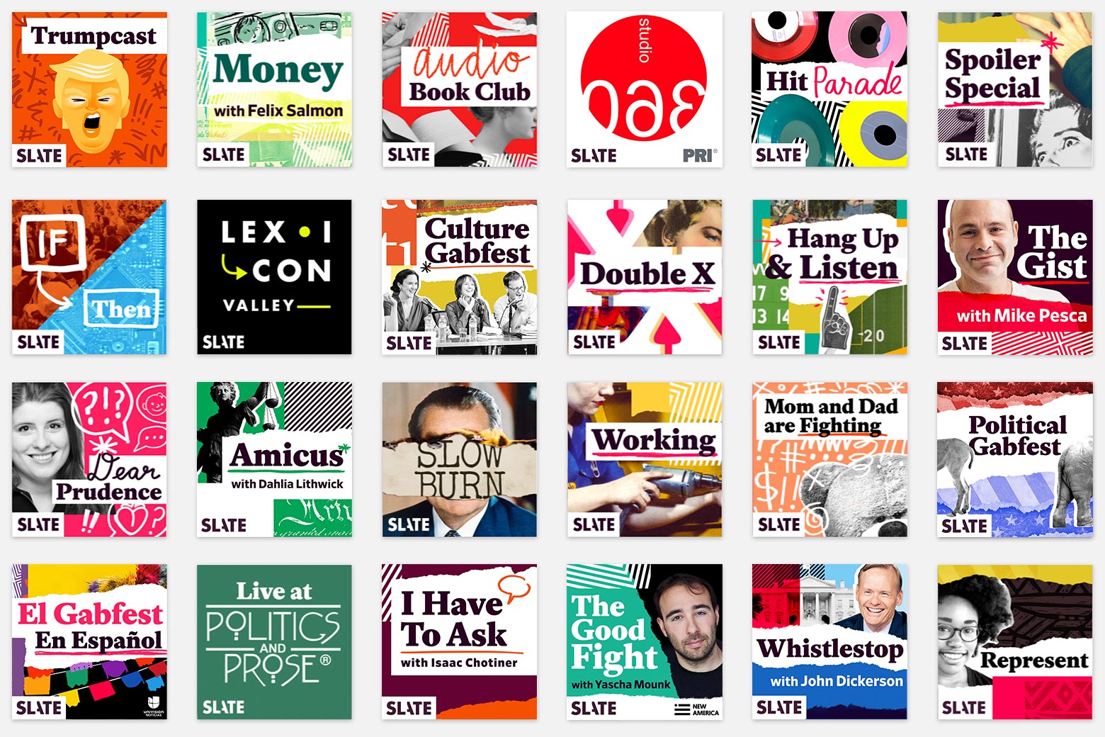
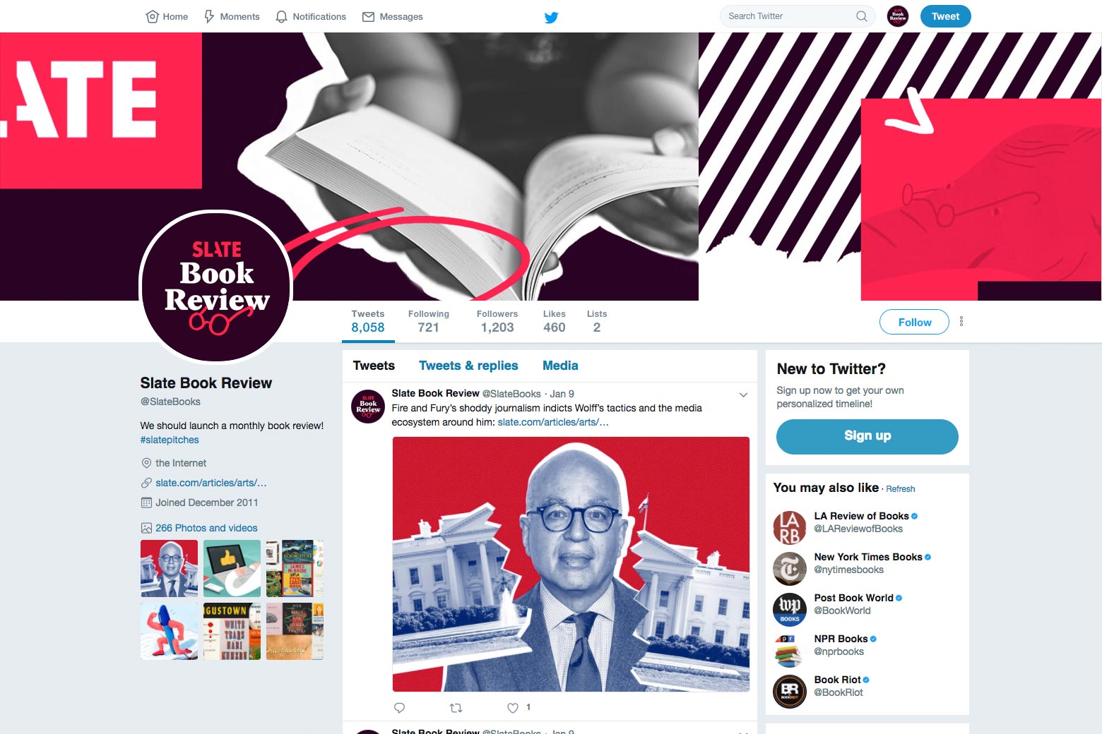
We took that toolkit from our engagement with Gretel and spent much of 2017 translating it into the designs you see now: our new site, new Slate podcast covers, new social pages, and more.
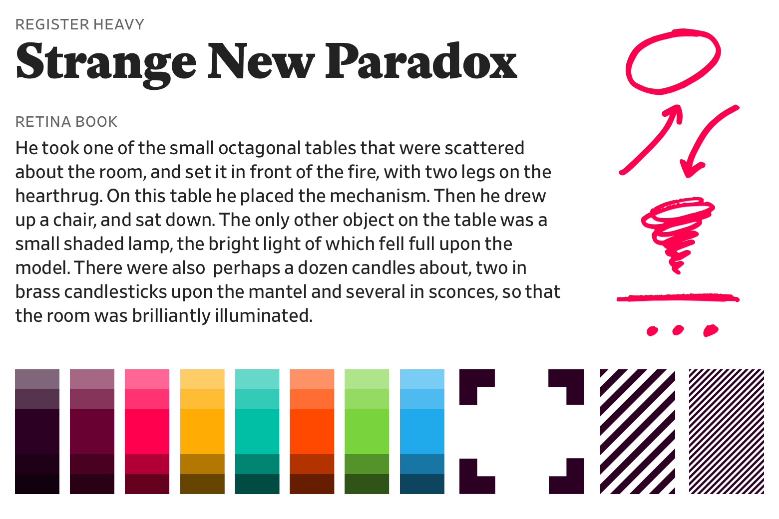
We’re also employing some lovely new typefaces: Retina from Frere-Jones Type for body text and supporting copy and Register from A2-TYPE for headlines. Both typefaces have a delightful idiosyncrasy to them, economical in their proportions while featuring a trove of considered details. I find Retina to be a pleasure to read. For color we’ve doubled down on our past maroon, refining it and bringing both a darker maroon and some bright supporting colors to the mix.
We’re still doing lots of great in-house photo and illustration, and these new design devices will only give us more opportunities for expression. As we move ahead, we’re building in distinct visual cues to each of Slate’s verticals to give them their own sense of place and brand.
Just as the initial Redux efforts allowed us to experiment in public, we plan to refine and adapt in public too. We’ve already redefined how we think about advertising and the importance of the little details like URL design. We have lots left to migrate and do, but the work we’ve created for today’s launch provides a cohesive picture of who we are.
Over the months to come, we will continue refining our approach to visuals for articles, our code and user experience for the site, and all branding efforts. We didn’t set out to reach a finish line, but to make a sustainable process that welcomes change and improvement.
My chief role in Redux—apart from getting everyone to go along with my name for it and working on the design of the website—was to be an instigator and barrier-remover. And while this process started small it soon grew to include many incredible folks from all corners of Slate. I feel so lucky to work with this talented team, and I’d like to mention them all here:
Design
Holly Allen, Lisa Larson-Walker, Derreck Johnson, Natalie Matthews-Ramo, Jackie Donner, Tommy Pham, Sharon Wong, Jason Santa Maria
Development
Jess Eldredge, Chase Felker, Kate Hill, Kim Le, Jon Lechliter, Erin Nichols, John Whittington, Jonathan Zuckerman, Greg Lavallee
Product and Research
Anna Gilbert, Anna Hovland, Heidi Moon, Chris Schieffer, Josh Yazman, David Stern, Dan Check
Business
Caroline Albanese, Mia Birkhead, Artur Strumilowski, Travis Morrison, Charlie Kammerer
Editorial
Bill Carey, Lowen Liu, Chad Lorenz, Megan Wiegand, Abby McIntyre, John Swansburg, Julia Turner