-
Notifications
You must be signed in to change notification settings - Fork 4.1k
New issue
Have a question about this project? Sign up for a free GitHub account to open an issue and contact its maintainers and the community.
By clicking “Sign up for GitHub”, you agree to our terms of service and privacy statement. We’ll occasionally send you account related emails.
Already on GitHub? Sign in to your account
Low Resolution Images in Large Featured Image Blocks #49561
Comments
|
Hi @tomjn. Thanks for reporting. I don't seem to be able to replicate using 6.2 and the Twenty Twenty-Three theme.
Are there any steps that I am missing? Perhaps, I am not understanding this:
Thanks, and I look forward to hearing from you! |
In the generated HTML, did the I get very inconsistent results in WP 6.2, e.g. this works fine because 640x360 is similar to the size of the DOM node once responsive styling has been applied: <img width="640" height="360" src="https://example.com/wp-content/uploads/image-640x360.jpg" class="attachment-large size-large wp-post-image" alt="XXXXX" decoding="async" srcset="https://example.com/wp-content/uploads/image-640x360.jpg 640w, https://example.com/wp-content/uploads/image-300x169.jpg 300w, https://example.com/wp-content/uploads/image-768x432.jpg 768w, https://example.com/wp-content/uploads/image-150x84.jpg 150w, https://example.com/wp-content/uploads/image-750x422.jpg 750w, https://example.com/wp-content/uploads/image-540x304.jpg 540w, https://example.com/wp-content/uploads/image-263x148.jpg 263w, https://example.com/wp-content/uploads/image-116x65.jpg 116w, https://example.com/wp-content/uploads/image.jpg 1280w" sizes="(max-width: 640px) 100vw, 640px">However there is also a thumbnail with the same 640x360 that's displayed as a 78x78px square. Imagine if the reverse happened though, and it tried to use a thumbnail size of 78x78 that was then blown up to 640x360 and you have the issue I've reported. For example, one of the articles has this markup generated from the same blocks in the same template part: <figure class="wp-block-post-featured-image">
<noscript>
<img width="150" height="84"
src="https://example.com/wp-content/uploads/image-150x84.jpg"
class="attachment-post-thumbnail size-post-thumbnail wp-post-image" alt="" decoding="async"
srcset="https://example.com/wp-content/uploads/image-150x84.jpg 150w, https://example.com/wp-content/uploads/image-300x169.jpg 300w, https://example.com/wp-content/uploads/image-640x360.jpg 640w, https://example.com/wp-content/uploads/image-768x432.jpg 768w, https://example.com/wp-content/uploads/image-1536x864.jpg 1536w, https://example.com/wp-content/uploads/image-750x422.jpg 750w, https://example.com/wp-content/uploads/image-540x304.jpg 540w, https://example.com/wp-content/uploads/image-263x148.jpg 263w, https://example.com/wp-content/uploads/image-116x65.jpg 116w, https://example.com/wp-content/uploads/image.jpg 1920w"
sizes="(max-width: 150px) 100vw, 150px" />
</noscript>
<img width="150" height="84"
src="https://example.com/wp-content/uploads/image-150x84.jpg"
data-src="https://example.com/wp-content/uploads/image-150x84.jpg"
class="attachment-post-thumbnail size-post-thumbnail wp-post-image lazyloaded" alt="" decoding="async"
data-srcset="https://example.com/wp-content/uploads/image-150x84.jpg 150w, https://example.com/wp-content/uploads/image-300x169.jpg 300w, https://example.com/wp-content/uploads/image-640x360.jpg 640w, https://example.com/wp-content/uploads/image-768x432.jpg 768w, https://example.com/wp-content/uploads/image-1536x864.jpg 1536w, https://example.com/wp-content/uploads/image-750x422.jpg 750w, https://example.com/wp-content/uploads/image-540x304.jpg 540w, https://example.com/wp-content/uploads/image-263x148.jpg 263w, https://example.com/wp-content/uploads/image-116x65.jpg 116w, https://example.com/wp-content/uploads/image.jpg 1920w"
data-sizes="(max-width: 150px) 100vw, 150px" sizes="(max-width: 150px) 100vw, 150px"
srcset="https://example.com/wp-content/uploads/image-150x84.jpg 150w, https://example.com/wp-content/uploads/image-300x169.jpg 300w, https://example.com/wp-content/uploads/image-640x360.jpg 640w, https://example.com/wp-content/uploads/image-768x432.jpg 768w, https://example.com/wp-content/uploads/image-1536x864.jpg 1536w, https://example.com/wp-content/uploads/image-750x422.jpg 750w, https://example.com/wp-content/uploads/image-540x304.jpg 540w, https://example.com/wp-content/uploads/image-263x148.jpg 263w, https://example.com/wp-content/uploads/image-116x65.jpg 116w, https://example.com/wp-content/uploads/image.jpg 1920w">
</figure>While the I've started filtering featured image blocks to force the |
|
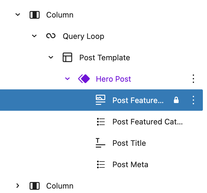
Also noting that the block comments do not contain a width or height attribute, e.g. <!-- wp:post-featured-image {"isLink":true,"sizeSlug":"full","lock":{"move":true,"remove":true},"className":"is-style-hero"} /--> |
|
Setting a height and width is causing chaos, as now the image is no longer responsive, and a tonne of inline styles are overriding my <figure style="width:745px;height:420px;" class="is-style-hero wp-block-post-featured-image">
<a href="https://example/" target="_self" style="height:420px">Now depending on where I am the featured image is overflowing into the sidebar because of this |
I am seeing this too. I added my testing notes here: #48988 (comment) |


Description
The featured image block uses a
srcsetand sets the height and width of theimgtag to small default resolutions unless you explicitly enter them in the sidebar.However on a theme that uses dynamic CSS widths this means that the thumbnail size is used for all featured images, even those blown up to cover the screen.
In the past the
sizeSlugattribute would fix this, but it has no UI now and is erased on save.Step-by-step reproduction instructions
Screenshots, screen recording, code snippet
No response
Environment info
WordPress 6.2
Please confirm that you have searched existing issues in the repo.
Yes
Please confirm that you have tested with all plugins deactivated except Gutenberg.
Yes
The text was updated successfully, but these errors were encountered: