-
Notifications
You must be signed in to change notification settings - Fork 4.1k
New issue
Have a question about this project? Sign up for a free GitHub account to open an issue and contact its maintainers and the community.
By clicking “Sign up for GitHub”, you agree to our terms of service and privacy statement. We’ll occasionally send you account related emails.
Already on GitHub? Sign in to your account
Button blocks have no default interaction states and per block element rules aren't applied #48965
Comments
|
The only solution I've been able to come up with is to write raw CSS |
|
I had this exact problem today as well, when trying to adopt core blocks more over something like custom ACF blocks. It looks like when choosing a background colour in the editor, it adds an Important tag in the CSS to the class it adds. Then, when you go to add a hover state background colour in theme.json, nothing happens because it doesn't add one then to override it. You can manually add an important tag but it is horrible and hacky. The sooner hover styles come to the editor, the better. They should already be there IMO as a button without anything is kind of useless really. |
|
I was trying to modify just the |
|
@tomdevisser I'd also flag this with accessibility labels |
|
Fair point @tomjn |
|
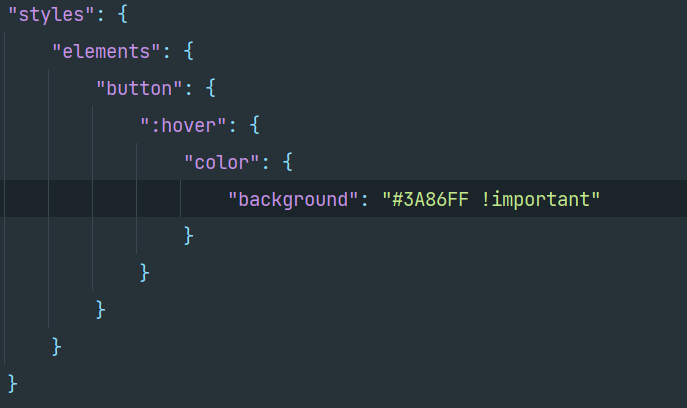
Button and link states can be styled in theme.json but all theme.json styles are defaults, changes made in the editor overrides the defaults. |
|
I was attempting this: "styles": {
"blocks": {
"core/button": {
"border": {
"radius": "8px"
},
"color": {
"background": "var(--wp--preset--color--primary)",
"text": "var(--wp--preset--color--white)"
},
"elements": {
"button": {
"color": {
"background": "var(--wp--preset--color--primary)"
},
":hover": {
"color": {
"background": "var(--wp--preset--color--hover)"
}
},
":active": {
"color": {
"background": "var(--wp--preset--color--pressed)"
}
}I also tried the
@carolinan @phil-sola after testing this worked, but now all buttons everywhere have that styling. This is closer to what my goal though :) |
|
I've adjusted the ticket to reflect this |
|
Agreed @tomjn, it affects all buttons everywhere doing this which actually isn't what I want & probably anyone would want. There needs to be settings for this in the editor for core buttons to be usable IMO. The default states are already there, so adding pseudo state settings should be a priority and I'd love to see this make its way into core |
|
I have also been struggling to figure out the "proper/intended" way to build out the button blocks. There doesn't seem to be any way to combine block styles, colours, and interactive states in any obvious way that also works well. These are the issues that I run into currently:
These issues aren't specific to the button block, but in my experience it's where they are the most obvious. Most of the time I just want the user to be able to select a block style for the button (Filled, Outline, etc.) and choose a colour for the button from the provided palette, while I handle the text colour and all the interactive states in the theme stylesheet. It doesn't feel right that you need to add styles for interactive states that can't be controlled in the editor to theme.json, especially when changing the block style and/or colours is more than likely going to impact how those states are displayed. 1. The !important FlagIt looks like the colour styles were done in this way because the colours are applied using a global selector like 2. Specificity & Load OrderIn the editor, button styles have a higher specificity than they do on the front-end (as many other blocks do) because selectors are prefaced with You'd still have issues with load order of styles though because the In my opinion, the theme styles should always take precedence. Especially if the block editor is going to be including opinionated defaults that aren't explicitly declared by the theme in theme.json. 3. Theme.jsonThese new default block styles, combined with the issues above, are resulting in new issues like a new block style for a button block appearing without a border in the editor because the default block styles for the button have removed borders. The current implementation only seems to work if you have a single button block with no block styles or variants, and where the interactive styles are not dependent on changing the background or text colours. That, or you don't give users access to the colour options for the button block. Neither seem very realistic for your average website. It seems like if the editor supports colours, block variants, and block styles, then theme.json needs to reasonably support those as well. On the flip side, if theme.json supports adding styles for hover, focus, etc., then the editor needs to support them too. |
|
Variations can be styled in theme.json, so the outline can be added back: |
|
Thanks @carolinan, that's good to know. Edit: Was confused by the term "variations" in the JSON referring to block styles and not block variants. |
|
I did not understand: that's not how you choose between the default and outline styles. You don't need to delete anything. |
|
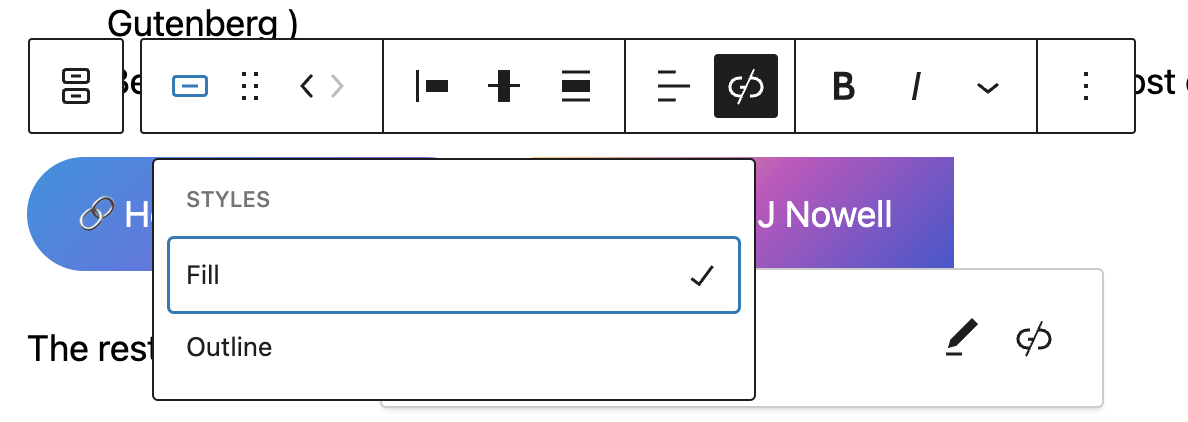
@carolinan I think you meant to refer to block styles not variants? The naming of the make post and the API implies that it's block variants that are being styled, not block styles, I think that's where the confusion came from. @grantgeard i think you've also misunderstood, Carolina's already stated that you can't register new styles/variants via But you've also ignored that the really longwinded way of changing the block is not the only way to do it and is actually the most difficult to discover. Both styles and variants can easily be switched in 2 clicks using the toolbar, a feature that's been in the block editor since the very beginning: And if it's not a block style, block variations have the same menu and can even transform into completely different blocks: There's even an API in block registration for how to convert from or to a different block But this is all offtopic anyway, I can set the |
|
@tomjn you are correct, I was confused by the term "variations" being used in reference to block styles and not block variants. I'm obviously aware of how to change block styles and am also familiar with the transform menu, but I have never seen the transform menu presented as an option for the button block specifically. I'll review how I register my variants to see if that's something I've missed, but would prefer to be using styles for buttons regardless. Agree this is getting off topic. The difficulties styling the buttons and states seem to be there regardless of whether you use the default block, a block style, or a block variant. |
|
They are called block style variations in theme.json and custom blocks styles when you register them in a plugin or theme: and I have brought up that this is confusing. |
|
@Ren2049 that's unrelated to the issue, please raise a new bug for the theme this is happening in, most likely on WP Trac. This issue is for button block interaction states such as hover/focus/active/etc |
|
@tomjn, can I ask about this part of your issue desciption?
Are you referring to adding per-block CSS styles? I am currently doing this adding per-block styles, as seen in this video: Screen.Capture.on.2023-05-22.at.12-56-31.mp4I have the feeling that you were not referring to this but I thought it was worth clarifying. Thank you! |
|
I don't consider writing custom CSS to be a solution, and that only applies to a singular button not all buttons. Afterall as a developer I could fire up an entire SCSS webpack toolchain to solve this outside the site editor. Whereas this is a site editor issue. You can't set the hover/focus/active states of buttons in full site editing. It's possible via manually editing |
|
I agree that this is not a practical solution for all users, I just wanted to make sure I understood.
For what it worth, adding style that way to the Button Block in Global Styles will affect all instances of the button block on the site. Again, not and ideal solution by any standards, but a reasonably quick workaround. I thought it was worth mentioning it in case it helps someone who's currently running into this problem.
Thank you for clarifying. I would like to see this added to the UI as soon as possible too :) |


Description
TLDR: Button blocks have no interaction styling, and it can't be added via the site editor
You can set the background and text colour of a button etc etc but there is no way to change the buttons hover/focus/active/etc states.
You can also add
theme.jsonrules that override all button elements, but it can't be done on a per block basis.This means buttons are entirely static and the only clues they aren't images is that the cursor changes. On top of that, they have no default hover/focus styling to aid accessibility.
Step-by-step reproduction instructions
Screenshots, screen recording, code snippet
No response
Environment info
WP 6.1
Please confirm that you have searched existing issues in the repo.
Yes
Please confirm that you have tested with all plugins deactivated except Gutenberg.
Yes
The text was updated successfully, but these errors were encountered: