Superhero shows are a weird subgenre of sci-fi. The super-powers and how the superheroes use them in pursuit of their world-saving goals are often the point, and so often skimp on the sci part of sci-fi. The Amazon original The Boys is no different, where the core novum is a chemical (compound V) that gives people superpowers.
I love the show. Though it’s definitely for adults with its violence and psychopathy and depravity, I think it’s closer to what would happen if humans had superhuman powers in a world of late-stage capitalism, enshittification of everything, and wannabe fascists. I’ve been a fan since it first aired. (And can’t wait to dive into the comics after the show wraps.)
It hasn’t really had many interfaces of note across the series. And the one I’m going to talk about in this post isn’t a “big” interface. But it was bad, so I’m coming out of my hiatus to talk about it, and then to make an appeal similar to what I did when I reviewed Idiocracy in 2019.
In the Season 4 finale—hastily renamed “Season 4 Finale” instead of “Assassination Run” after the July 13 assassination attempt of Donald Trump—co-founders of The Boys, Grace Mallory and Butcher, invite the young supe Ryan to an underground bunker with three goals in mind.
Give him some time with Butcher who, as a kind of stepfather to Ryan, wants to see him before he dies. (Butcher is dying from a “sentient tumor” that developed from his overuse of “Temp V”.)
Convince Ryan to turn against his father, Homelander.
Entrap Ryan if he refuses.
It’s this last goal that involves the interface, because sure enough, Ryan is highly conflicted at the idea of killing his father after Butcher explains “You’re the only one who can stop him.”
“You’re the only one who can stop him.” —Butcher
As Ryan tries to leave to think things through, Grace blocks his way, saying “You can’t leave.” Ryan uses his super vision to observe that the walls of the room they’re in are 6 feet thick. Grace tries to explain, “This is the CIA Hazlet Safehouse, designed to hold people like you. I could seal us in here, flood the room with halothene, and we’d all take a nice, long nap.” As Ryan gets more agitated and threatens to leave anyway, she reaches out to a big, red momentary button mounted to the concrete wall beside her, presumably to release the aerosolized anesthesia.
And that’s it. That’s the interface. Because in a show that is very compellingly written, this is bad design.
It’s obvious
Being a big, red panic button, it might as well have a spotlight on it and a neon sign blinking “Press here to suppress.” Any supe worth their salt will recognize it as a threat and seek to disable it. I trust it would have a Normally Closed circuit, so that ripping the button out of the wall or severing the conduit would trip it, but a supe with Ryan or Homelander’s x-ray vision could just follow the circuit back to discover the nature of the halothane system and work from there. Much better is a system that wouldn’t call attention to itself.
It’s hard to get to
It’s hard to tell the complete room layout from the scene. It looks half hospital recovery room, half storage room, and I suspect is a converted supe prison cell (with windows, though?) The button appears to be just inside…the bathroom? Out of sight of the main part of the room, sure, so kind of hidden unless the supe needs to ever pee, but also harder to get to. A single button at around elbow-height works when a near-average-height person is upright and able to reach out to press it. But if you’ve just been knocked down, or had your arm laser-severed, or I don’t know, been body slammed across the room away from that button, you’re screwed. Even a ceiling-to-floor crash bar doesn’t work because it still requires your being within arms reach of that one spot. Better is a system that does not depend on where anyone is in the room for activation.
It works at human response speed
This is world with fast and mind-control supes. It doesn’t make sense to rely on human response times to activate it. Better is a semi-automated system that monitors everything and can respond in microseconds when data trends suspiciously.
Between its being obvious, hard to get to, and requiring manual activation I think nearly every single supe in the show would find it trivial to stop that button from being pressed if they wanted.
The scene could have been written more smartly—without sacrificing the efficiency of the beat—with something like this…
Grace
This is the CIA Hazlet Safehouse, designed to hold people like you. If you try to leave…
Cut to an arc shot of a supe-monitoring display. On the side, a live transcript of the conversation types out Grace’s words as she speaks them. In the center, infrared video of them in the room with overlays for each of them labeled SUPE or human, live vital signs, and a line showing their AI-predicted movements.
Grace (voiceover)
…or any of our vital signs crash…
Cut back to the actors
Grace
…the room is flooded with halothane and we all take a nice, long nap.
Zoom in to Ryan’s face as his eyes dart around and his breathing intensifies.
Cut to interface reading “escape prediction” and a number rising to 75, 80, 85. At 90 it turns red and a soft alarm goes off.
Cut to an extreme close up of Ryan’s ear to show he hears this alarm.
This isn’t obvious to the supe, works faster than a human could, and doesn’t rely on a human being in a specific spot.
Now instead of this, we could have Ryan brag about what a bad-ass he is and escape before the system can react, but this moment is constructed in the original to show that Ryan isn’t just an arrogant mini-Homelander. He’s a conflicted adolescent with an adolescent’s poor impulse control, and he panicked seeing her reach for the button. Having an alarm sets that same stage for him to panic. Note that I don’t think it’s good design for a system to tip its hand before it enacts control measures—as this does with the alarm—but it would be more forgivable than the dumb button, which just paints the CIA as incompetent and undermines the diegesis.
OK, that said, this next bit goes out to my fellow Americans:
One of the reasons I have wanted to talk about this show is not just the fascism of the villains, but how it illustrates the corrupting effect of power, and that’s directly related to the coming American election.
With Biden dropping out of the race yesterday, and the Democratic National Convention a month away, I can’t yet formally lean on the merits of the Democratic candidate to make a case for weeks to come. (Though, go go go, Kamala!) But the case against the Republican party almost makes itself.
What we are facing as a nation with this election is existential. The Supreme Court has outrageously ruled that a president is unaccountable for his actions while in office. A dictator’s wet dream. And Trump has declared publicly that he will be a dictator “on day one,” but it’s easy to see that he means “as of day one”. What malignant narcissist willingly gives up power once he has it? His many ties to the wretched Heritage Foundation and its deeply, deeply disturbing Project 2025 (see this video and this one where he directly praises this group and their plan) tell us that if he is elected and his cronies have their way, we fall towards an extremist religious-nationalism that puts The Boys to shame and spells the end of the ideals and institutions that were the reason the United States was invented in the first place. The American Experiment is on the brink.
But to quote the ACLU, despair and resignation are not a strategy. We have to America-up and enact a strategy. Please, please…
Expose the Extremism
Get familiar with the extremist plans (the Christianization and militarization of public school, cutting overtime protections for 4.3 million people, banning labor unions, privatizing Medicare, replacing a million experts with loyalist lackies, putting the DOJ under presidential control, close NOAA and end free weather reports, categorizing LGBTQ+ folks as pederasts and instating a death penalty for it, trying to pass a constitutional amendment to make abortion illegal, and much more) and share those often and loudly on your social media platforms of choice. Especially reach out to anyone on the fence, in a swing state (Arizona, Georgia, Michigan, Pennsylvania, and Wisconsin), or who thinks they should just sit this one out because the (current) candidates are so old or not doing enough of what they want. We cannot afford “protest votes.”
Volunteer
If you don’t have money to spare (and with the current income inequality plaguing the nation that’s likely to be most of us) you can donate time and effort. If you’re in a solidly-colored state, you can join texting and letter-writing campaigns to those in swing states. If you’re in a swing state (Arizona, Georgia, Michigan, Pennsylvania, and Wisconsin), you can help canvas directly to voters still deciding. (How they’re still undecided is utterly alien to me, but here we are.) Here are just a few places you can opt to volunteer.
If you do have money to spare, spare it. Give to progressive and Democratic causes that will use that buying power to get ads, get the word out, and support the vote. Dig deep because I know we’ve heard it before, but this one is critical.
Most importantly, have a plan to vote. Register if you’re not. If you are, double-check your voter registration status because they are purged just before elections, often bumping democrats for the most trivial of reasons. Vote by mail if you are overseas or if getting time off on the day of might be a problem. Find your polling location. Make a plan with others to go vote together. Charge your phone and bring water in case there are long lines. (And many bastards have worked very hard to ensure there will be long lines.) Get calendar reminders for voting deadlines sent directly to you.
If everyone gets out there and activates the vote, we can avoid giving the absolutely wrong people the power they should not have. You’re the only one who can stop him.
So I missed synchronizing the Fritzes with the Oscars. By like, a lot. A lot a lot. That hype curve has come and gone. (In my defense, it’s been an intensely busy year.) I don’t think providing nominees and then waiting to reveal winners makes sense now, so I’ll just talk about them. It was another year where there weren’t a lot of noteworthy speculative interfaces, from an interaction design point of view. This is true enough that I didn’t have enough candidates to fill out my usual three categories of Believable, Narrative, and Overall. So, I’m just going to do a round-up of some of the best interfaces as I saw them, and at the end, name an absolute favorite.
The Kitchen
In a dystopian London, the rich have eliminated all public housing but one last block known as The Kitchen. Izi and Benji live there and are drawn together by the death of Benji’s mother, who turns out to be one of Izi’s romantic partners from the past. The film is full of technology, but the one part that really struck me was the Life After Life service where Izi works and where Benji’s mom’s funeral happens. It’s reminiscent of the Soylent Green suicide service, but much better done, better conceived. The film has a sci-fi setting, but don’t expect easy answers and Marvel-esque plot here. This film about relationships amid struggle and ends quite ambiguously.
The funerary interfaces are mostly translucent cyans with pinstripe dividing lines to organize everything. In the non-funerary the cyan is replaced with bits of saturated red. Everything funerary and non- feels as if it has the same art direction, which lends to reading the interfaces extradiegetically, but maybe that’s part of the point?
Pod Generation
This dark movie considers what happens if we gestated babies in technological wombs called pods. The interactions with the pod are all some corporate version of intuitive, as if Apple had designed them. (Though the swipe-down to reveal is exactly backwards. Wouldn’t an eyelid or window shade metaphor be more natural? Maybe they were going for an oven metaphor, like bun in the oven? But cooking a child implications? No, it’s just wrong.)
The design is largely an exaggeration of Apple’s understated aesthetic, except for the insane, giant floral eyeball that is the AI therapist. I love how much it reads like a weirdcore titan and the characters are nonplussed, telegraphing how much the citizens of this world have normalized to inhumanity. I have to give a major ding to the iPad interface by which parents take care of their fetuses, as its art direction is a mismatch to everything else in the film and seems quite rudimentary, like a Flash app circa 1998.
Before I get to the best interfaces of the year, let’s take a moment to appreciate two trends I saw emerging in 2023. That of hyperminimalist interfaces and of interface-related comedy.
Hyperminimalist interfaces
This year I noticed that many movies are telling stories with very minimal interfaces. As in, you can barely call them designed since they’re so very minimalist. This feels like a deliberate contrast to the overwhelming spectacle that permeates, say, the MCU. They certainly reduce the thing down to just the cause and effect that are important to the story. Following are some examples that illustrate this hyperminimalism.
Fingernails—fingernail-tester.No One Will Save You—observation pod.57 Seconds—time ring.Landscape with Invisible Hand—translation device (there on the desk under the alien’s hand)
This could be a cost-saving tactic, but per the default New Criticism stance of this blog, we’ll take it as a design choice and note it’s trending.
Shout-out: Interface Comedy
I want to give a special shout-out to interface-related comedy over the past year.
Smoking Causes Coughing
The first comes from the French gonzo horror sci-fi Smoking Causes Coughing. In a nested story told by a barracuda that is on a grill being cooked, Tony is the harried manager of a log-processing plant whose day is ruined by her nephew’s somehow becoming stuck in an industrial wood shredder. Over the scene she attempts to reverse the motor, failing each time, partly owing to the unlabeled interface and bad documentation. It’s admittedly not sci-fi, just in a sci-fi film, and a very gory, very hilarious bit of interface humor in an schizoid film.
Guardians of the Galaxy 3
The second is Guardians of the Galaxy 3. About a fifth of the way into the movie, the team spacewalks from the Milano to the surface of Orgocorp to infiltrate it. Once on the surface, Peter, who still pines for alternate-timeline Gamora, tries to strike up a private conversation with her. The suits have a forearm interface featuring a single row of colored stay-state buttons that roughly match the colors of the spacesuits they’re wearing. Quill presses the blue one and tries in vain to rekindle the spark between him and Gamora in a private conversation. But then a minute into the conversation, Mantis cuts in…
Mantis
Peter you know this is an open line, right?
Peter
What?
Mantis
We’re listening to everything you’re saying.
Drax
And it is painful.
Quill
And you’re just telling me now‽
Nebula
We were hoping it would stop on its own.
Peter
But I switched it over to private!
Mantis
What color button did you push?
Peter
Blue! For the blue suit!
Drax
Oh no.
Nebula
Blue is the open line for everyone.
Mantis
Orange is for blue.
Peter
What‽
Mantis
Black is for orange. Yellow is for green. Green is for red. And red is for yellow.
Drax
No, yellow is for yellow. Green is for red. Red is for green.
Mantis
I don’t think so.
Drax
Try it then.
Mantis (screaming)
HELLO!
Peter writhes in pain
Mantis
You were right.
Peter
How the hell and I supposed to know all of that?
XXXXX
Drax
Seems intuitive.
The Marvels
A third comedy bit happens in The Marvels, when Kamala Khan is nerding out over Monica Rambeau’s translucent S.H.I.E.L.D. tablet. She says…
Khan
Is this the new iPad? I haven’t seen it yet.
Rambeau
I wish.
Khan
Wait, if this is all top secret information, why is it on a clear case?
Anyway, I want to give a shout-out to the writers for demonstrating with these comedy bits some self-awareness and good-natured self-owning of tropes. I see you and appreciate you. You are so valid.
Best Interfaces of 2023
But my favorite interfaces of 2023 come from Spider-Man: Across the Spider-Verse. The interfaces throughout are highly stylized (so might be tough to perform the detailed analysis, which is this site’s bread-and-butter) but play the plot points perfectly.
In Across the Spider-Verse, while dealing difficulties with his home life and chasing down a new supervillain called The Spot, Miles Morales learns about The Society. The Society is a group of (thousands? Tens of thousands? of) Spider-people of every stripe and sort from across the Multiverse, whose overriding mission is to protect “canon” events in each universe that, no matter how painful, they believe are necessary to the fabric of reality from unraveling. It’s full of awesome interfaces.
Lyla is the general artificial intelligence that has a persistent volumetric avatar. She’s sassy and disagreeable and stylish and never runs, just teleports.
The wrist interfaces—called the Multiversal Gizmo—worn by members of The Society all present highly-contextual information with most-likely actions presented as buttons, and, as needed, volumetric alerts. Also note that Miguel’s Gizmo is longer, signaling his higher status within The Society.
Of special note is volumetric display that Spider Gwen uses to reconstruct the events at the Alchemax laboratory. The interface is so smart, telegraphs its complex functioning quickly and effectively, and describes a use that builds on conceivable but far-future applications of inference. The little dial that pops up allowing her to control time of the playback reminds me of Eye of Agamatto (though sadly I didn’t see evidence of the important speculative time-control details I’d provided in that analysis). The in-situ volumetric reconstruction reminds me of some of the speculative interfaces I’d proposed in the review of Deckard’s photo inspector from Blade Runner, and so was a big thrill to see.
All of the interfaces have style, are believable for the diegesis, and contribute to the narrative with efficiency. Congratulations to the team crafting these interfaces, and if you haven’t seen it yet, what are you waiting for? Go see it. It’s in a lot of places and the interfaces are awesome. (For full disclosure, I get no kickback from these referral links.)
Editor’s Note: Longtime fans of this site may be familiar with its “tag line,” “Stop watching sci-fi. Start using it.” So I was thrilled when a friend told me they had seen Astrid present how she had made an instrument from a Star Trek episode real! Please welcome Astrid as she tells us about the journey and lessons learned from making something from a favorite sci-fi show real. —Christopher
I’ve been watching Star Trek for as long as I can remember. Though it’s always been in the air of culture, it wasn’t until March 2020—when we were all stuck at home with Netflix and nothing else to do—that I watched all of it from the beginning.
Discovering Trek Instruments
I’m a designer and music researcher, and I specialise in interfaces for music. When I started this Great Rewatch with my husband (who is an enormous Trek fan, so nothing pleased him more) I started noting every musical instrument I saw. What grabbed me was they were so different from the instruments I write about, design, make, and look at, because none of these instruments, you know, actually worked. They were pure speculation, free even of the conventions of the last couple of decades since computers became small and powerful enough that digital musical instruments started to become a common thing on Kickstarter. I got excited every time I saw a new one.
the Algolian percussion instrumentthe Enaran telepathic instrumentMr Homn playing the Betazoid chimeNella Deren plays her roll-up piano
What struck me the most about these instruments is that how they worked didn’t ever seem to enter into the mind of the person who dreamed them up. This sure is a departure for me, as I’ve spent more than ten years designing instruments and worrying about the subtleties of sensors, signal processing, power requirements, material response, fabrication techniques, sound design, and countless other factors that come into play when you make novel digital musical instruments. The instruments in Star Trek struck me as anarchic, because it was clear the designers didn’t consider at all how they would work, or, if they did, they just weren’t concerned. Some examples: Tiny instruments make enormous sounds. Instruments are “telepathic”. Things resonate by defying the laws of physics. Some basic sound design is tossed in at the end, and bam, job done.
Some previous instrument design projects. From left: Moai (electronic percussion), Keppi (electronic percussion), Gliss (synth module interaction, as part of the Bela.io team)
I couldn’t get over how different this was to the design process I was used to. Of course, this is because the people designing these instruments weren’t making “musical instruments” the way we know them, as functional cultural objects that produce sound of some kind. Rather, Trek instruments are storytelling devices, alluring objects that have a narrative and character function, and the sound they make and how they might work is completely secondary. These instruments have a number of storytelling purposes, but most of all they serve to show that alien civilisations are as complex, creative and culturally sophisticated as humans’.
This was striking, because I was used to the opposite; so often the technical aspects of an instrument—and there are many, from synthesis to sensors—always somehow become the most significant determining factor in an instruments’ final form.
The Aldean Instrument
There was one instrument that especially intrigued me, the “unnamed Aldean instrument” from Season 1, Episode 16 of Star Trek: The Next Generation, “When the Bough Breaks”. This instrument is a light-up disc that is played by laying hands on it, through which it translates your thoughts to sound. In this episode the children of the Enterprise are kidnapped by a race of people who can’t reproduce (spoiler alert: it was an environmental toxin, they’re fine now) and the children are distributed among various families. One girl is sent to a family of very kind musicians, and the grandfather teaches her to play this instrument. When she puts her hands on it, lays her fingers over the edge and is very calm it plays some twinkly noise, but then she gets anxious when she remembers she’s been kidnapped, and it makes a burst of horrible noise.
This instrument was fascinating for a lot of reasons. It looked so cool with the light-up sides and round shape, and it was only on screen for about four tantalising seconds. Unlike other instruments that were a bit ridiculous, I kept thinking about this one because it was uniquely beautiful, and it seemed like a lot of thought went into it.
I researched the designers of Trek instruments and this instrument was the only one that had a design credit: Andrew Probert. Andrew is a prolific production designer who’s worked mainly in science fiction, and he’s been active for decades, designing everything from the bridge on the Enterprise to the Delorian in Back to the Future. He’s still working, his work is fantastic, and he has a website, so I emailed him and asked him what he could tell me about the design process.
He got back to me straight away and said he couldn’t remember anything about it, but he dug out his production sketch for me:
The sketch was so gloriously beautiful that I couldn’t resist building it. I had so many questions that you can’t answer, except through bringing it into reality: How would I make it work like it did in the show? How would I make it come alive slowly, and require calmness? How was I going to make that shape? Wait, this thing is supposed to translate moods, what does that even mean? How was I going to achieve the function and presence that this instrument had in the show, and what would I learn?
Building the Aldean Instrument
Translating moods
When I discussed this project with people, the question I got asked most often was “So how are you going to make it read someone’s mind?”
While the instrument doesn’t read minds, the idea of translating moods gave me pause and eventually led me to think of affective computing, an area of computing that was originated by a woman named—brace yourself—Rosalind Picard. Picard says that affective computing refers to computing that relates to, arises from, or deliberately impacts emotions.
Affective computing considers two variable and intersecting factors: Arousal (on a scale of “inactive” to “active”), and valence (on a scale from “unpleasant” to “pleasant”). A lot of research has been done on how various emotions fall into this two-dimensional space, and how emotional states can be inferred by sensing these two factors.
I realised that, to make this instrument work the way it did in the show, the valence/arousal state that the instrument was sensing was much simpler. In the show, the little girl is calm (and the instrument plays some sparkly sound), and then she’s not (and the instrument emits a burst of noise). If this instrument just sensed arousal through how hard it was being gripped and valence through how much the instrument was moving, this creates an interaction space that still has a lot of possibility.
The instrument playing requires calmness, and I could sense how much they were moving around with an accelerometer, by calculating quantity of motion. If the instrument was moved suddenly or violently it could make a burst of noise. For valence—pleasantness to unpleasantness—I could sense how hard the person was gripping the instrument using a Trill Bar sensor. The Trill Bar can sense up to five individual touches, as well as the size of those touches (in other words, how hard those fingers are pressing).
Both the touch sensing and the accelerometer data would be processed by a Bela Mini, a tiny but powerful computer that could process the sensor data, as well as provide the audio playback.
Making the body
I got to work first with the body of the instrument. I often prototype 3D shapes using layers of paper that are laser cut and sandwiched together, as it allows for a gradual, hands-on process that allows adjustments throughout. After a few days with a laser cutter and some cut and paste circuitry, I had something that lit up that I could attach the sensing system to.
Putting it together
I attached the Bela Mini to the underside of the instrument body, and embedded the Trill Bar sensor on the underside of the hand grip, so I could sense when someone’s hand was on the instrument.
As I set out to recreate how the instrument looked and sounded in the show, I wanted to make a faithful reproduction of the sound design, despite the sound design being pretty basic.
The sound is a four-part major chord harmony. I recreated the sound in Ableton Live, with each part of the harmony as a separate sample. I also made a burst of noise.
When the instrument is being held gently and there are no sudden movements, it can play; this doesn’t mean stillness, just a lack of chaos. As the player places their fingers over the instrument’s edge, each of their four fingers will be sensed and trigger one part of the harmony. The harder that finger presses, the louder that voice is.
This process was just as interesting as I suspected, for a number of reasons.
Firstly, de-emphasising technology in the process of making a technological object presented a fresh way of thinking. Instead of worrying about what I could add, whether the interaction was enough, or what other sensors I had access to (and thereby making the design a product of those technical decisions), I was able instead to be led by the material and object factors in this design process. This is an inverse of what usually happens, and I certainly am going to consciously invert this process more often from now on.
Secondly, thinking about what this instrument needed to do, say and mean, and extract the technological factors from there, made the technical aspects much simpler. I found myself working artistic muscles that aren’t always active in designing technology, because there’s often some kind of pressure, real or imagined, to make the technical aspects more complex. In this situation, the most important thing was supporting what this was in the show, which was an object that told a story. When I thought along those lines, the two axes of sensing were an obvious, and refreshingly simple direction to take.
Third, one of the difficult things about designing instruments is that, thanks to tiny and powerful computers, they can sound like anything you can imagine. There’s no size limitations for sound, no physical bodies to resonate, no material factors that affect the acoustic physics that create a noise. This freedom is often overwhelming, and it’s hard to make sound design choices that make sense. However, because I was working backwards from thinking about how this instrument was presented in the plot of the episode, I had something to attach these decisions to. I recreated the show’s simplistic sound design, but I’ve since designed sound worlds for it that support this calm, gentle, but very much alive nature that the Aldean instrument would have, when I imagine it played in its normal context.
Not only physically recreating the shape an instrument from Star Trek, but making it function as an instrument showed me that bringing imaginary things into reality is a process that offers the creator a fresh perspective, whether designing fantastical or earthly interfaces.
These examples, although fictional, demonstrate that “3D” can be used in different ways.
In Jurassic Park and Hackers, 3D graphics are used to create a richer display with more information density, though it is not photorealistic. The Jurassic Park file browser is primarily a symbolic 2D representation of the file system hierarchy, projected onto a perspective ground plane to make more elements visible at once. The third dimension is used to indicate the number of sub elements or their size. In Hackers, the City of Text towers most likely represent the actual contents of each physical disk drive in the corresponding real world location, and the pulses and colors indicate levels of activity or threat.
The Corridor in Disclosure, and its VirtuGood 6500 close copy in Community, instead create a more photorealistic virtual world. The file system becomes a building or landscape, and the users are embodied within the virtual world as an avatar. Like the pre-computer memory palace, this should take advantage of the human ability to remember and navigate our way around. But The Corridor blows it by putting all the files within one room, and representing them as sheets of paper within identical filing cabinets. Walking through the 3D architecture becomes a pretty but time wasting diversion.
I’m personally disappointed not to find any true computer memory palaces, whether fictional or real. As mentioned in the introduction, an essential characteristic of the memory palace is that each item be stored in a unique location, visually distinct from any other. None of the 3D file systems I’ve been able to find do this, instead using generic icons throughout. Computers are actually quite good at creating almost infinite variations in appearance, e.g. fractals in 2D and various CGI landscapes and underwater environments in 3D. A computer memory palace would at least be more interesting to look at.
Where are they today?
Since the 1990s the 3D file browser has seemingly faded away, both in reality and in film/TV. Let’s (briefly) think about why.
The SGI 3D file browser shown in Jurassic Park was not the only one to be released as a real piece of software. Although personal computers could easily run such a 3D file browser by the year 2000, and mobile phones a few years later, the systems we actually use have remained two dimensional. The only widespread use of 3D spatial organisation that I’m aware of is the Apple Time Machine backup software, which uses distance from the viewer to represent increasing age. It’s a linear sequence of 2D desktops rather than allowing true three dimensional movement in any direction. Even native 3D systems like the Oculus Quest present the user a 2D GUI wrapped around the user in a cylinder.
We don’t have our files arranged into 3D buildings or worlds, but there have been other developments since the first 2D file browsers. Keyword search is now built into most GUI desktops. Photo collections can be viewed by timeline, or by geographical location; and music collections arranged by genre, artist, or album. So one likely reason why we don’t have real world 3D file browsers is that in themselves they don’t provide enough of an advantage over the existing 2D GUIs to make changing worthwhile.
User interfaces in film and TV are not constrained by reality or practicality so their absence must be due to other reasons. Sometimes real world interface trends affect what we see on the screen, for instance the replacement of command line interfaces by graphical, but for file browsing we’re still using the 2D GUI browsers from the 1990s. And it’s not because of technical difficulty or expense, because we’ve seen that 1990 feature-film 3D effects can now be created in the budget of a sitcom episode. An example is the 2008 film Iron Man, already mentioned for using a 3D trashcan within Tony Stark’s CAD software system. Later in the film, Pepper needs to copy some files from the corporate PC of evil executive Obadiah Stane. As in the earlier films covered in this review, Stark Industries is portrayed as an advanced technology company so this PC also has a custom GUI created for the film. Here though there is only a very slight use of 3D to arrange flat file icons in order, otherwise it closely resembles existing 2D desktops. The filmmakers could have inserted a 3D file browser with perhaps volumetric projection to match Tony’s 3D CAD system but chose not to.
Pepper selects a folder in the text list at left and it is also highlighted in the graphical list of overlaid translucent icons at right. Iron Man (2008)
Copying computer files (or more dramatically “the data”) still happens in science fiction or near future film settings, but also has become more common in everyday life with the spread of personal computers and now smartphones worldwide. In my opinion, this is the most likely reason why we don’t see 3D and VR file browsers any more: we the audience know how to copy files and search for them, and won’t be impressed by attempts to make it “high tech” with fanciful user interfaces. File systems and browsers have become, well, boring. So we can look back on these cinematic dalliances with 3D file management fondly, but recognize it as a thing we tried for a while, and learned from, but eventually put down.
We interrupt the 3D file browsing series for this Santa-holiday one-off post. If you’re trapped somewhere needing design-and-Santa-related distraction, here’s a bunch of words, images, and links for you.
Longtime readers may recall the Who Did it Better? Santa Claus edition from 2020, in which I took a look at speculative interfaces that help Santa Claus do his Saintly Nick business. (If not, check it out at the link above, especially if you need a refresher on the core myth.) Earlier this year a dear friend mentioned Rise the Guardians as an additional candidate. So I watched it, and hereby add it as an addendum to that study. I might make it a habit to do every year, because they aren’t going to stop making Santa movies anytime soon.
Spoiler alert: There aren’t many interfaces, and they don’t fare well, but the joy is in the analysis, so let’s dive in.
Quick plot recap
Children around the world are protected by a group called the Guardians:
North (Santa)
Tooth (the Tooth Fairy)
(the Easter) Bunnymund
Sandman
…all appointed by the mysterious Man in the Moon. Who is just the moon, communicating via moonbeams.
Pictured: A plot-critical character peering in through the shutter like some kind of celestial stalker.
One day, an ancient foe named Pitch Black returns, who plots to get all the children to stop believing in the guardians, thereby robbing them of their power and clearing the way for his fear-mongering world domination. In response, the Man in the Moon names a new Guardian to help defeat him: Jack Frost. Jack initially resists, but over the course of the film and the help of one special child, Jack comes around, learns to care, and helps defeat Pitch. Children around the world believe in him, and he formally joins the ranks of the Guardians.
Our heroes face off against Pitch. Sandman is Disney-dead at this point in the story, and so not pictured.
n.b. Santa’s are only a subset of the film’s devices
The abilities of the Guardians are a blend of innate magic and magic items, fueled with *vaguely gestures at childhood belief* and not a lot of observable cause-and-effect interfaces. For instance, when Pitch breaks Jack’s magic crook, Jack just holds the pieces and wills it back whole with glowy sparkliness and grunting psychic effort despite never having done anything like this before. No interfaces there. Magic things don’t really befit the usual sort of analysis done on this blog. But North does have three interfaces to do his gift-giving duties that bear the cold light of examination, you heartless, Vulcan bastards. (Yaaay! My people!)
Snow globes
Sleigh dashboard
The Belief Globe
(Tooth and her hummingbird-like Baby Teeth helpers have some proper interfaces as well, but are kind of creepy and this post is about Santa tech. Maybe I’ll do teeth tech interfaces later. Maybe March 6.)
Snow globes
These handheld spheres look like the popular winter decorations, but with no base by which they can rest on a surface. Instead they are kept loose in the user’s pocket until they are needed. By shaking it and speaking a destination, a preview of the destination appears on the inside, surrounded by swirls of “snow.” Then by pitching it like a baseball, the globe disappears in a puff, replaced with a circular portal to that destination. Move or toss something through, and the portal closes behind.
Two of North’s yetis use a snow globe to open a portal to the arctic citadel, and toss North’s sack (with a kidnapped Jack inside) through.
…the destination has a unique and easily identifiable landmark to display in the globe
…the appearance of the destination is already known to the user, so the visual helps confirm the selection
But change any one of these, and it starts to fail. Consider if North, in the course of doing his Santa-ly duties, had to jump to a “San José.” There are at least 334 San Josés around the world. Very few of which have identifiable landmarks. How does North know the one that’s being visualized is the right one? He might have eidetic memory because of Рождество Христово magic or something, but these tools are used by the yetis, too, and I doubt they have that same gift.
How would it help them disambiguate? If the displayed destination is not the right one, how does the user provide more specificity to get to the right one? What if they only know the name? How does the snow globe help them narrow things down from 334 to 1? Since the globe disappears on use, and pockets have a limited capacity, the cost for getting it wrong can be quite high. The yetis might very well have to walk back to the North Pole should they run out.
Maybe, maybe, there are only a limited number of destinations possible, but then you’d expect some reference on the globe itself to help a user know that.
Pictured in the globe: a San José from Google Earth, and I’ll send a free PDF copy of the book to the first person who names which San José correctly, because I’m fairly confident it’s nigh-impossible.
It’s also worth noting that there’s no indication how the portals know when it’s OK to close, rather than say, chopping the traveler in half or leaving them stranded. Is it time-based? Where’s the countdown? Is it dependent on a code word or thought? How does the user know whether the code word has been received or rejected? Does the portal close as soon as a single, “whole object” passes through? Theseus would like a word. There’s no interface in evidence, so it must be “smart,” but as we know, “smart” is not always smart, and design is critical for making users more confident and avoiding costly errors. There are far too many unanswered questions to give this any stamp of approval.
Sleigh dashboard
North has a sleigh of course. It has a dashboard with some controls. One of these controls we see in use is a lever, whose purpose is a mystery. It can’t be a booster, since the motile force here is rangiferine, not mechanical. The control is shaped like an engine control lever on a boat or a thrust control on an airplane. After the switch is thrown, the camera cuts to a very blurry shot of the sleigh’s undercarriage where, if something happens, I can’t discern what is it. Maybe the runners go from flat to vertical, for a more ice-skating-like experience? Exacerbating our lack of information, the control is unlabeled, so it’s hard for a new user to know what it does, or what state it’s in, or what the options are. It has no safety mechanism, so depending on the force required, might be easily accidentally activated. Cannot recommend this, either.
This does…nothing? Are those arrows on the side meaningful? It’s hard to say.But hey it’s activated now…good?Can anyone tell what’s happened here? See around 00:28:00 in the movie.
The major element in the dashboard is a large globe inset in its center. It’s roughly shoulder-width in diameter. We never see it in use, but it bears great resemblance to the Belief Globe (see below). I want to believe it’s a you-are-here navigation device that automatically orients to match the position and bearing of the sleigh, because that might be useful. And it would be an awesome opportunity for a super-charming brass location indicator, mounted to a quarter-meridian arm. But I suspect this device is actually meant to be a miniaturized copy of the Belief Globe, which would not be useful for reasons you’ll read in the next section.
North and Jack chuckle at Bunnymund’s terror of flying. Fear is so funny.
The Belief Globe
This display is not explicitly named over the course of the movie, but I have to call it something. It is a huge globe that mechanically rotates in the center of North’s arctic fortress. It is covered with beautiful, arcane symbols and Cyrillic writing (North is Russian—this movie was from the halcyon days between the end of the Cold War and its horrific current genocidal landgrab attempts against Ukraine), and displays tiny points of light all over it.
Tooth, explaining the globe to Jack, says, “Each of those lights is a child.” North explains further, “A child who believes.” But some of the dots are bigger and others brighter. It’s unclear what information those variables are meant to convey. Older kids? Degree of belief? Relative niceness? We don’t see anyone looking into individual dots, which, if that’s not possible, really means that this device, diegetically, just shows where the Guardians might want to focus their activities, conspicuously, to bolster Belief in that geographical area.
And belief seems to be at critical levels. I asked chatGPT to count the dots in the second image in the gallery above. It estimated 39,674 dots and that that pictured chunk of South America to be about 12% of the world’s total landmass, excluding Antarctica. South America has around 5% of the world’s total population, which extrapolates out to a total 725,280 dots we would expect to see across the world. According to populationpyramid.com, global population in 2012—the time this film was released—was 7.2 billion, with 1.91 billion being 14 years old or younger (a generous age for childlike belief, since the average age of losing faith in a “real” Santa tends to be around 10 years old in the USA, but let’s run with it.)
I am delighted that this happens to look like a morbid, morbid Christmas tree.
That means that in the world of the Guardians, only 4 out of 100 children believe in any of them to begin with, even before Pitch comes a-calling. This would have been so easy to fix in the script. Have Tooth say, “These lights represent children who believe.” The plural would have left it ambiguous.
But I’ve digressed.
North has a viewing deck which seems custom-built for observing the globe, and which gives us an important perspective for analysis.
This over-the-yeti-shoulder shot helps point out a major failing of this display: visibility of the information.
With the globe anchored in place at the poles and the observation deck so low, this makes the dots in the southern hemisphere much more prominent in the viewers’ sight, introducing an availability bias. It looks like anything above 50N latitude is just…out of sight, and that includes significant populations in Europe as well as North’s own fortress. (We’ll see in the Control Panel that there’s a miniature globe mounted there that provides a view of the Northern Hemisphere, but we don’t see lights on it, and it would be a bad idea to split the information across two sources of differing scales, anyway. So let’s hope that’s not its intended purpose.)
There is an easy fix for the orientation problem, and it of course comes from the world of globe-making. By attaching the poles of the globe to a full meridian that encircles the globe, and then attaching the full meridian to a half meridian at the equator, you create a gimbal that allows the globe to rotate to any orientation.
This is called a full-swing mount, and it would allow arbitrary inspection of any point on the globe. It would be lovely to see writ large and mechanical in the film.
This display also privileges land in a possibly-misleading way, in the same way that election maps can. Let’s all recall that land doesn’t vote, but this kind of implies otherwise.
Same image as above, repeated for easy reference.
For example, on the Belief Globe, it looks like Australian kids are way behind in Belief metrics than New Zealand kids, but Australia has a density of 3.4 inhabitants per square kilometer compared to New Zealand’s 19.1, and this map doesn’t make that easy to understand. Proportion of per capita belief would be a better metric for delivering actionable Santa insight.
Like this, but inverse. From Colin Mathers on Medium.
Even better would be to show change in belief over time (“боже мой!” North might shout, “Bunny! Get to Czech Republic, немедленно!”), though information over time is notoriously difficult to do on a geographical map.
Various shots of the control panel.
But even if we solve the orientation and representation problems, putting the information on a globe means at least half of it is out of sight at any given time. In the yeticam view above, what’s going on in Bermuda? You don’t know! It does revolve slowly, but by my own rough estimation at the speed we see in this scene, it would take around 6 minutes for this globe to make a complete, sidereal rotation, which is way, way beyond the vigilance threshold limit required to put that picture together holistically in your mind. If the whole picture is important (and I’m asserting that it is), the information display should be a map rather than a globe.
Eh…it’s a crappy Midjourney comp, but you get the gist.
You don’t want to lose the charming magical-Soviet machine feeling of it, but with a world map, maybe you have some mechanics that physically simulate the day/night cycle? And since the Man in the Moon is so important to this story, maybe the lunar cycle as well? Or you could make some mechanical interactive fisheye focus effect, which would be even more spectacular. (Please, somebody, do this.)
I also have to note that having Belief hold such a prominent place in this command and control room seems really self-serving. That much real estate is dedicated to telling you how much gas you have in the tank? There are plenty of additional things that a Santa and his team would want to keep track of that would be of as much importance: Days until Christmas, location of kids at risk of losing belief, percentage of toys complete, bowl-full-of-jelly BMI score, naughty/nice balance in the world, current value of elf pension fund, just to name a few. These could be split-flap displays for nostalgia and lovely clacking audio opportunities.
Globe Control Panel
On the observation deck, North has a control panel of sorts. There are two parts whose functions we can infer, a trackball and a Bat-Guardian-Signal, but most of it—like the levers and joysticks with lit toggle buttons—we cannot. Let’s look at the two whose purpose we can infer.
The trackball
The trackball is a miniature Belief Globe, inset on the right hand of the control panel. It is quite similar to the trackballs we see in Arthur Christmas (2011, the year before) and The Christmas Chronicles (2018, six years later). If it controls the orientation of the Belief Globe, and its movement is constrained similarly to how the globe is, a user hoping to focus on Mauritius would have to memorize that it is due south of Oman, and do the same for the entirety of the southern hemisphere.
I hope you‘ve memorized your world geography, mate.
It should also be constrained to left-right movement like the thing being controlled, as if on a hidden inclination mount. But this looks like a free-spin trackball, so could use a knob in the pole and maybe a meridian arm to help signal its constraint. It should also be well-mapped to the globe as the observer sees it. It is not. Compare the orientation of the Globe to the trackball in the screen shot. They do not match.
All told, a pretty underthought component.
Bat-Guardian-Signal
Early in the film, when North realizes Pitch is back, he grabs the control in the far lower-right-hand corner. He twists it 90 degrees counterclockwise and pushes down. The ice-like octagonal button below begins to glow brightly.
This sets the Belief Globe to glowing with aurora lights, that extend out across the globe and alert the Guardians, signaling them to report to Commissioner Gordon North’s compound at once. Mentioned here only out of a sense of completeness, this control is germane to North’s being leader of a team rather than any of his Santa duties. It’s unlabeled, it can’t possibly have the global reach that it needs, and I’m not sure why the Globe was selected to be the source of the aurora, but meh, it’s just not that important in this context.
Final score: Lump of Coal
We have to keep in mind this is a movie for kids, and kids won’t be put off by any of these interface failings. But for our overthinking design-nerd purposes in reviewing the Santa tech, these just don’t hold up. Because of this, Rise of the Guardian’s Santa tech poses zero threat to dethroning The Santa Chronicle’s lovely Santa interfaces. But good to remind ourselves of the principles to which we should be paying attention.
Enjoy the movie for the fun voice acting, the awesome character design, the gorgeous Sandman visuals, and any nearby kids’ sense of wonder, but don’t worry about the interfaces as anything to admire or mimic in the real world.
Also screw this one homophobic elf. Violence is not an acceptable response to cheek kissing, especially in a country like Russia where that is the norm, and especially-especially in a movie catering to children.
Happy holidays, however you celebrate, to most everyone except you, asshole elf.
Our last 3D file browsing system is from much later and in a different format. It appears in the TV series Community, season 6, episode 2, “Lawnmower Maintenance and Postnatal Care”. Thanks to the scifiinterfaces reader known by the handle djempirical for this recommendation.
Community is a TV sitcom rather than a film, with short, 25-minute episodes. The setting is a small Colorado USA community college at the time of broadcast, the years 2009 to 2015, where the characters are staff and students. The series is usually described as a cult classic rather than mainstream, with lots of geeky references and shout outs (it’s very quotable). While there are plot arcs across seasons, the episodes are largely standalone. I didn’t know anything about Community when I watched this particular episode but still enjoyed it.
There are significant differences in presentation and style from our earlier films. Community is made and set twenty years later, and so both characters and audience are assumed to be familiar with personal computers, smart phones, the Internet; and to at least have some idea of what virtual reality is. The earlier films treated computer systems with respect or even awe, while here the new technology is a target to make fun of.
The characters in Community use technology, but it is not usually central to the story, unlike for example The IT Crowd or Silicon Valley. This episode is one of the exceptions. Another is episode 5.8, “App Development and Condiments”, which I strongly recommend to anyone interested in social media.
This particular episode has two plotlines, only one of which involves computers and interfaces. The easily influenced Dean of Greendale Community College has spent $5,000 (US) on a new virtual reality system called a “VirtuGood 6500”. (That the characters consider this expensive shows how much technology has changed in twenty years. Old timers like myself who remember the price tags on those elegant SGI 3D workstations mutter about kids today not knowing how good they have it.) College administrator Francesca and teacher Jeff first try to persuade Dean Pelton to locate the serial number of the system within the virtual reality world, which they need to return the system for a refund. When that fails, they must try to persuade the Dean to leave VR and return to the real world.
Note to those unfamiliar with the show: Though the Dean has a full name, in the show and amongst the fandom, he is known as “the Dean,” and so we’ll be referring to him as such.
VirtuGood 6500 Virtual Reality World
The first scene with the new virtual reality system shows the Dean entering virtual reality for the first time.
He wears gloves and a very large headset, which are wired to a small computer worn in the middle of the back.
The Dean’s first experience of virtual reality. He is watching his hands rezz up. Community (2016)
There is a ring around the body at waist level, sliding vertically along guide posts. It is not just a barrier to protect against falling off the platform, because the Dean is wearing a seatbelt-style harness that connects him to the ring. He stands, in socks not shoes, on a smooth plastic platform base.
Jeff and Francesca read the instructions and watch the Dean. Community (2016)
While he is fiddling with straps and cables, Francesca and Jeff are reading the instructions in a 20 cm thick binder. The instructions for a new user are “When entering virtual reality you should calibrate the system by looking at your own hands, then turning them over and looking at the backs of them with a sense of wonder.” This is the first of several references to Disclosure and other earlier films.
Externally, the VR system indicates it is active by lighting up red LEDs around the front edge of the headset and around the waist ring. Internally, the system rezzes up the background from grayscale to color, and then rezzes up the hands of the avatar.
Neither the avatar nor the world are photorealistic, but since this is 2015, the graphics are much better than any similar system from the 1990s would be — even when made on a sitcom budget, rather than a feature film.
The Dean, represented by his blue avatar, arrives in the virtual world. Community (2016)
The ground plane is a polished hexagonal grid and the sky is an abstract purple pattern. Classical pillars are scattered around the landscape. A pterosaur flies overhead for no obvious reason, perhaps a reference to the old W Industries Dactyl Nightmare VR game.
Finding the serial number
The sequence we’re interested in happens just after the Dean’s initial forays into setting the timezone and clock, both of which require a complicated full-body gestural interface. Meanwhile, Francesca is reading the gigantic manual and finds that they can’t return the system for a refund without the serial number, which is stored within the virtual world.
Francesca and Jeff know that the Dean won’t want to return the VR system, so ask him to look for the file without revealing why they want it. The conversation highlights how bizarre the metaphors of this virtual world are:
Jeff
Go to…settings.
Dean
Is that in the volcano or the cobbler’s workshop?
Jeff
It’s a monastery.
The Dean turns his body around, which he can do because all the cables are connected to the computer on his back, not to the platform. He “walks” and then “runs” in place like a mime artist, body weight supported by the harness and waist ring. Since there aren’t any sensors attached to his legs or feet, there must be cameras or pressure sensors in the base. The avatar of the Dean runs across the landscape to the Settings monastery.
The Dean reaches the monastery. Community (2016)
The gates automatically open as he approaches. Inside, there is a checkerboard floor rather than hexagons, more pillars around the walls, and a central pool of green water.
The Dean enters the interior of the monastery. Community (2016)
At the far wall is a Disclosure–style filing cabinet, but this one is gigantic. It is so big that the Dean actually has to climb up to the drawer he wants.
The Dean climbs the filing cabinet to find a particular drawer. Community (2016)
At least these cabinets have permanent labels, unlike Disclosure’s. Inside are, again, Disclosure-style individual files.
The Dean opens one drawer in the filing cabinet. Community (2016)
The Dean finds the serial number file and holds it up. Jeff asks him to print it “by dragging it to the accessories and peripherals castle and planting it in the printer garden”. But the Dean has guessed the real reason why Francesca and Jeff want the file, so instead throws the file into the air and tries to delete it. He first makes a pushing gesture, palm out, which casts a beam at the file while he shouts “Delete”.
The Dean shoots a ray at the document. Community (2016)
In response the system pops up a giant text panel and also speaks the response in a slightly artificial voice, saying, “Selected”.
Dean Pelton receives system feedback that is text and speech, rather than graphical. Community (2016)
Since the file wasn’t deleted, we can assume that it can’t process voice input. He next mimes holding a bow and pulling an arrow back. A virtual bow and arrow appear, which he uses to shoot the file.
The Dean shoots an arrow at the document. Community (2016)
The arrow doesn’t do what he wants either, sorting the file. Finally he jumps into the air, catches the file, and drops to the ground. He then holds the file underwater, using both hands, in the central fountain. The file appears to struggle slightly and bubbles appear.
The Dean holds the serial number document under water. Community (2016)
The bubbles stop, the file sinks and disappears, and the system responds “DELETED”.
The Dean has foiled the plan to return the system for a refund, and he stays in virtual reality. Francesca sends Jeff to appeal directly to “the architect” (a shout-out to The Matrix), local VR designer and manufacturer Elroy. There’s more quotable dialogue here, such as this description of a task which we didn’t see:
“In order to copy a file, you have to throw a fireball at it. Then absorb the fire, then drop the flaming file into a crystal lake, then take out both copies and throw them into the side of a mountain.”
Jeff is unsuccessful and returns to Greendale, but Elroy is sufficiently moved to change his mind. Elroy visits Greendale with his own VR system, a more compact and apparently wireless headset and gloves, and enters the virtual world himself, demonstrating that this is also a multi-user system.
Elroy, after summoning a storm and growing to giant size, intimidates the Dean Pelton. Community (2016)
Elroy distracts the Dean in the virtual world, giving Jeff in the real world the opportunity to disconnect him. Elroy refunds the $5,000 and takes the VirtuGood 6500 away since we never see it again. The Dean is apparently cured of his VR addiction, although a closing shot does show him experimenting with one of those cardboard headsets for a phone.
Tagged: 3D rendering, ALL CAPS, HUD, Virtual Reality, addiction, architecture, avatar, big label, blue, direct manipulation, disposal, doorway, failure, furniture, gestural interface, gray, green, grid, hand, identification number, interaction, laser, mental models, mnemonic load, monster, navigating, plastic, point to select, poking fun, purple, sans serif, sense making, storage, touch, touch gesture, voice feedback, weapon, workflow
Analysis
In this episode, virtual reality and the 3D file system are deliberately portrayed as ridiculous for comedic effect. This doesn’t make it unworthy of analysis. For example, there’s this throw away line from Francesca to Jeff after the Dean has been in virtual reality for a few hours:
“He joked about wanting a pee jar earlier, and it’s gradually becoming less of a joke.”
It’s funny but also raises a real issue. Players of online computer games may do so for marathon sessions lasting many hours, and there are stories about the truly dedicated using bottles and buckets rather than getting up and leaving to use a toilet. What will virtual reality participants wearing headsets and gloves do? Wear space-suit style tubing? This is something that the serious VR literature rarely discusses, even when predicting how much time we’ll all be spending in virtual reality in the future.
How believable is the interface?
The VirtuGood 6500 is very believable for 2015. The headset is too large, perhaps because the props maker needed the extra space to keep the glowing lights and any batteries away from the actor’s face. Otherwise the headset and gloves are standard for VR, and using a backpack computer is an excellent design, removing the problem of entanglement as the user moves around.
On first viewing, I assumed that the supporting waist ring and smooth platform base were entirely fictional and built to keep costs down. Then while researching this review I found the Virtuix Omni, a VR treadmill where the user is supported by a waist level ring and walks or runs in place on a smooth surface. The only difference is that the Omni requires special shoes.
The virtual world, or at least the filing system, are also believable. The 3D graphics are well within the capabilities of a 2015 PC. The gestures we see are clear and easily distinguishable from one another. The mapping of gestures to actions may be silly, but not technically difficult.
How well does the interface inform the narrative of the story?
The 3D file browsing interface works very well within the narrative since the objective of this plotline is to make fun of it. The virtual world is full of bizarre visual elements such as the pillars that don’t support anything. The gestures performed by users are dramatic and completely mismatched with the intended tasks.
This particular system was deliberately designed to be bad, but poorly designed visual metaphors and difficult to discover gestural interfaces are not unknown in the real world. It’s a useful reminder that virtual reality systems will not automatically be easier and more intuitive to use simply because they more closely mimic the real world or are more immersive.
How well does the interface equip the character to achieve their goals?
This is another awful file browser. Even the Dean, a virtual reality enthusiast, is thwarted in his first two attempts to delete a file.
However it does succeed in the broader goal of making the user feel good. The Dean enjoys virtual reality and the sensation of power so much that he refuses to leave. It’s usually not recommended for mass market software but there is satisfaction in mastering an obscure interface that other people can’t.
Our third film is from 1995, directed by Iain Softley.
Hackers is about a group of teenage computer hackers, of the ethical / playful type who are driven by curiosity and cause no harm — well, not to anyone who doesn’t deserve it. One of these hackers breaks into the “Gibson” computer system of a high profile company and partially downloads what he thinks is an unimportant file as proof of his success. However this file is actually a disguised worm program, created by the company’s own chief of computer security to defraud the company of millions of dollars. The security chief tries to frame the hackers for various computer crimes to cover his tracks, so the hackers must break back into the system to download the full worm program and reveal the true culprit.
The film was made in the time before Facebook when it was common to have an online identity, or at least an online handle (nick), distinct from the real world. Our teenage hacker protagonists are:
Crash Override, real name Dade.
Acid Burn, real name Kate.
Cereal Killer, Lord Nikon, and Phantom Phreak, real names not given.
Joey, the most junior, who doesn’t have a handle yet.
As hackers they don’t have a corporate budget, so use a variety of personal computers rather than the expensive SGI workstations we saw in the previous films. And since it’s the 1990s, their network connections are made with modems over the analog phone system and important files will fit on 1.44 megabyte floppy disks.
The Gibson, though, is described as “big iron”, a corporate supercomputer. Again this was the 1990s when a supercomputer would be a single very big and very expensive computer, not thousands of PC CPUs and GPUs jammed into racks as in the early 21st C. A befitting such an advanced piece of technology it has a three dimensional file browsing interface which is on display both times the Gibson is hacked.
First run
The first hack starts at about 24 minutes. Junior hacker Joey has been challenged by his friends to break into something important such as a Gibson. The scene starts with Joey sitting in front of his Macintosh personal computer and reviewing a list of what appear to be logon or network names and phone numbers. The camera flies through a stylised cyberspace representation of the computer network, the city streets, then the physical rooms of the target company (which we will learn is Ellingson Minerals), and finally past a computer operator sitting at a desk in the server room and into the 3D file system. This single “shot” actually switches a few times between the digital and real worlds, a stylistic choice repeated throughout the film. Although never named in the film this file system is the “City of Text” according to the closing credits.
Joey looks down on the City of Text. Hackers (1995)
The file system is represented as a virtual cityscape of skyscraper-like blocks. The ground plane looks like a printed circuit board with purple traces (lines). The towers are simple box shapes, all the same size, as if constructed from blue tinted glass or acrylic plastic. Each of the four sides and the top shows a column of text in white lettering, apparently the names of directories or files. Because the tower sides are transparent the reverse facing text on the far sides is also visible, cluttering the display.
This 3D file system is the most dynamic of those in this review. Joey flies among the towers rather than walking, with exaggerated banking and tilting as he turns and dives. At ground level we can see some simple line graphics at the left as well as text.
Joey flies through the City of Text, banking as he changes direction. Hackers (1995)
The city of text is even busier due to animation effects. Highlight bars move up and down the text lists on some panes. Occasionally a list is cleared and redrawn top to bottom, while others cycle between two sets of text. White pulses flow along the purple ground lanes and fly between the towers. These animations do not seem to be interface elements. They could be an indicator of overall activity with more pulses per second meaning more data being accessed, like the blinking LED on your Ethernet port or disk drive. Or they could be a screensaver, as it was important on the CRT displays of the 1990s to not display a static image for long periods as it would “burn in” and become permanent.
Next there is a very important camera move, at least for analysing the user interface. So far the presentation has been fullscreen and obviously artificial. Now the camera pulls back slightly to show that this City of Text is what Joey is seeing on the screen of his Macintosh computer. Other shots later in the film will make it clear that this is truly interactive, he is the one controlling the viewpoint.
Joey looks at a particular list of directories/files on one face of a skyscraper. Hackers (1995)
I’ll discuss how this might work later in the analysis section. For now it’s enough to remember that this is a true file browser, the 3D equivalent of the Macintosh Finder or Windows File Explorer.
While Joey is exploring, we cut to the company server room. This unusual activity has triggered an alarm so the computer operator telephones the company security chief at home. At this stage we don’t know that he’s evil, but he does demand to be addressed by his hacker handle “The Plague” which doesn’t inspire confidence. (The alarm itself shows that a superuser / root / administrator account is in use by displaying the password for everyone to see on a giant screen. But we’re not going to talk about that.)
Joey wants to prove he has hacked the Gibson by downloading a file, but by the ethics of the group it shouldn’t be something valuable. He selects what he thinks will be harmless, the garbage or trash directory on a particular tower. It’s not very clear but there is another column of text to the right which is dimmed out.
Joey selects the GARBAGE directory and a list of contents appears. Hackers (1995)
There’s a triangle to the right of the GARBAGE label indicating that it is a directory, and when selected a second column of text shows the files within it. When Joey selects one of these the system displays what today would be called a Live Tile in Windows, or File Preview in the Mac Finder. But in this advanced system it’s an elaborate animation of graphics and mathematical notation.
Joey decides this is the file he wants and starts a download. Since he’s dialled in through an old analog phone modem, this is a slow process and will eventually be interrupted when Joey’s mother switches his Macintosh off to force him to get some sleep.
Joey looks at the animation representing the file he has chosen. Hackers (1995)
Physical View
Back in the server room of Ellingson Minerals and while Joey is still searching, the security chief AKA “The Plague” arrives. And here we clearly see that there is also a physical 3D representation of the file system.
The Plague makes a dramatic entrance into the physical City of Text. Hackers (1995)
Just like the virtual display it is made up of rectangular towers made of blue tinted glass or plastic, arranged on a grid pattern like city skyscrapers. Each is about 3 metres high and about 50cm wide and deep. Again matching the virtual display, there is white text on all the visible sides, being updated and highlighted. However there is one noticeable difference, the bottom of each tower is solid black.
What are the towers for? Hackers is from 1995, when hard drives and networked file servers were shoebox- to pizza-box-sized, so one or two would fit into the base of each tower. The physical displays could be just blinkenlights, an impressive but not particularly useful visual display, but in a later shot there’s a technician in the background looking at one of the towers and making notes on a pad, so they are intended to show something useful. My assumption is that each tower displays information about the actual files being stored inside, mirroring the virtual city of text shown online.
When he reaches the operator’s desk, The Plague switches the big wall display to the same 3D virtual file system.
The Plague on the left and the night shift operator watch what Joey is doing on a giant wall screen. Hackers (1995)
He uses an “echo terminal” command to see exactly what Joey is doing, so sees the same garbage directory and that the file is being copied. We’ll later learn that this seemingly harmless file is actually the worm program created by The Plague, and that discovering it had been copied was a severe shock. Here he arranges for the phone connection to be traced and Joey questioned by his government friends in the US Secret Service (which at the time was responsible for investigating some computer security incidents and crimes), setting in motion the main plot elements.
After various twists and turns our teenage hackers are resolved to hack into the Gibson again to obtain a full copy of the worm program which will prove their innocence. But they also know that The Plague knows they know about the worm, Ellingson Minerals is alerted, and the US Secret Service are watching them. This second hacking run starts at about 1 hour 20 minutes.
The first step is to evade the secret service agents by a combination of rollerblading and hacking the traffic lights. (Scenes like this are why I enjoy the film so much.) Four of our laptop-wielding hackers dial in through public phone booths. The plan is that Crash will look for the file while Acid, Nikon, and Joey will distract the security systems, and they are expecting additional hacker help from around the world.
We see a repeat of the earlier shot flying through the streets and building into the City of Text, although this time on Crash’s Macintosh Powerbook.
Crash enters the City of Text. Hackers (1995)
It seems busier with many more pulses travelling back and forth between towers, presumably because this is during a workday.
The other three start launching malware attacks on the Gibson. Since the hacking attempt has been anticipated, The Plague is in the building and arrives almost immediately.
The Plague walks through the physical City of Text as the attack begins. Hackers (1995)
The physical tower display now shows a couple of blocks with red sides. This could indicate the presence of malware, or just that those sections of the file system are imposing a heavy CPU or IO load due to the malware attacks.
This time The Plague is assisted by a full team of technicians. He primarily uses a “System Command Shell” within a larger display that presumably shows processor and memory usage. It’s not the file system, but has a similar design style and is too cool not to show:
The Plague views system operations on a giant screen, components under attack highlighted in red on the right. Hackers (1995)
Most of the shots show the malware effects and The Plague responding, but Crash is searching for the worm. His City of Text towers show various “garbage” directories highlighted in purple, one after the other.
Crash checks the first garbage directory, in purple. Other possible matches in cyan on towers to the right. Hackers (1995)
What’s happening here? Most likely Crash has typed in a search wildcard string and the file browser is showing the matching files and folders.
Why are there multiple garbage directories? Our desktop GUIs always show a single trashcan, but under the hood there is more than one. A multiuser system needs at least one per user, because otherwise files deleted by Very Important People working with Very Sensitive Information would be visible, or at least the file names visible, to everyone else. Portable storage devices, floppy disks in Hackers and USB drives today, need their own trashcan because the user might still expect to be able to undelete files even if it has been moved to another computer. For the same reason a networked drive needs its own trashcan that isn’t stored on the connecting computer. So Crash really does have to search for the right garbage directory in this giant system.
As hackers from around the world join in, the malware effects intensify. More tower faces, both physical and digital, are red. The entire color palette of the City of Text becomes darker.
Crash flies through the City of Text, a skyscraper under siege. Hackers (1995)
This could be an automatic effect when the Gibson system performance drops below some threshold, or activated by the security team as the digital equivalent of traffic cones around a door. Anyone familiar with the normal appearance of the City of Text can see at a glance that something is wrong and, presumably, that they should log out or at least not try to do anything important.
Crash finds the right file and starts downloading, but The Plague hasn’t been fully distracted and uses his System Command Shell to disconnect Crash’s laptop entirely. Rather than log back in, Crash tells Joey to download the worm and gives him the full path to the correct garbage directory, which for the curious is root/.workspace/.garbage (the periods are significant, meaning these names should not normally be displayed to non-technical users).
We don’t see how Joey enters this into the file browser but there is no reason it should be difficult. Macintosh Finder windows have a clickable text search box, and both the Ubuntu Desktop Shell and Microsoft Windows start screen will automatically start searching for files and folders that match any typed text.
Joey downloads the worm, this time all of it. The combined malware attacks crash The Gibson. Unfortunately the secret service agents arrive just in time to arrest them, but all ends well with The Plague being exposed and arrested and our hacker protagonists released.
Tagged: 3D rendering, animation, architecture, big screens, blue, bright is more, call to action, color cue, command and control, control room, crisis, cyan, dark, defense, flashing, flowing, flying, glow, hacking, industrial espionage, keyboard, mission, motion cue, navigating, nerdsourcing, personal computer, red, red is warning, search, search, status indicator, threshold alert, translucency, translucent display, trap, trash, wall mounted, yellow
Analysis
How believable is the interface?
The City of Text has two key differences from the other 3D file browsers we’ve seen so far.
It must operate over a network connection, specifically over a phone modem connection, which in the 1990s would be much slower than any Ethernet LAN.
This 3D view is being rendered on personal computers, not specialised 3D workstations.
Despite these constraints, the City of Text remains reasonably plausible.
Would the City of Text require more bandwidth than was available? What effect would we expect from a slow network connection? It’s a problem when copying files, upload or download, but much less so for browsing a file system. The information being passed from the Gibson to the 3D file browser is just a list of names in each directory and a minimal set of attributes for each, not the file contents. In 1995 2D file browsers on personal computers were already showing icons, small raster images, for each file which took up more memory than the file names. The City of Text doesn’t, so the file data would certainly fit in the bandwidth available.
The flying viewpoint doesn’t require much bandwidth either. There is no avatar or other representation of the user, just an abstract viewpoint. Only 9 numbers are needed to describe where you are and what you’re looking at in 3D space, and predictive techniques developed for games and simulations can reduce the network bandwidth required even more.
Networked file systems and file browsers already existed in 1995, for example FTP and Gopher, although with pure text interfaces rather than 3D or even 2D graphics. The only missing component would be the 3D viewpoint coordinates.
PCs in the 1990s, especially laptops, rarely had any kind of 3D graphics acceleration and would not have been able to run the Jurassic Park or Disclosure 3D file browsers. The City of Text, though, is much less technically demanding even though it displays many more file and folder names.
Notice that there is no hidden surface removal, where the front sides of a 3D object hide those that are further away. There’s no lighting, with everything rendered in flat colors that don’t depend on the direction of the sun or other light sources, and no shadows. There are no images or textures, just straight lines and plain text. And finally everything is laid out on an axis-aligned grid; meaning all the graphics are straight up/down, left/right, or forwards/back; and all the towers and text are the same size. Similar shortcuts were used in 1990s PC games and demo scene animations, such as the original Doom in which players could look from side to side but not up or down.
I’m not saying that the City of Text on a 1990s PC or laptop would be easy, especially on Joey’s Macintosh LC, but it is plausible.
Alas the worm animation shown when that particular file is selected is not possible. We see fractal graphics and mathematical notation in 3D, and it’s a full screen image rather than a simple file icon. Whether it’s a pre-rendered animation or being generated on the fly there’s way too much to push through a modem connection, even though at the time “full screen” meant a lot less pixels than now in the 21st C.
The physical towers were also not possible. Three metre high flat screen displays didn’t exist in 1995, and I don’t see how that many projectors could be installed in the ceiling without interfering with each other.
How well does the interface inform the narrative of the story?
Hackers is a film all about computers and the people who work with them, and therefore must solve the problem (which still exists today) of making what is happening visible and understandable to a non-technical audience. Director Iain Softley said he wanted a metaphorical representation of how the characters perceived the digital world, not a realistic one. Some scenes use stylised 2D graphics and compositing to create a psychedelic look, while the 3D file browser is meant to be a virtual equivalent to the physical city of New York where Hackers is set. At least for some viewers, myself included, it works.
The worm animation also works well. Joey is looking for an interesting file, a trophy, and the animation makes it clear that this is indeed an extraordinary file without needing to show the code.
The physical towers, though, are rather silly. The City of Text is meant to be metaphorical, a mental landscape created by hackers, so we don’t need a physical version.
How well does the interface equip the character to achieve their goals?
The City of Text is very well suited to the character goals, because they are exploring the digital world. Looking cool and having fun are what’s important, not being efficient.
Now if you’ll excuse me, I have a rollerblading lesson before the next review…
Our next 3D file browsing system is from the 1994 film Disclosure. Thanks to site reader Patrick H Lauke for the suggestion.
Like Jurassic Park, Disclosure is based on a Michael Crichton novel, although this time without any dinosaurs. (Would-be scriptwriters should compare the relative success of these two films when planning a study program.) The plot of the film is corporate infighting within Digicom, manufacturer of high tech CD-ROM drives—it was the 1990s—and also virtual reality systems. Tom Sanders, executive in charge of the CD-ROM production line, is being set up to take the blame for manufacturing failures that are really the fault of cost-cutting measures by rival executive Meredith Johnson.
The Corridor: Hardware Interface
The virtual reality system is introduced at about 40 minutes, using the narrative device of a product demonstration within the company to explain to the attendees what it does. The scene is nicely done, conveying all the important points we need to know in two minutes. (To be clear, some of the images used here come from a later scene in the film, but it’s the same system in both.)
The process of entangling yourself with the necessary hardware and software is quite distinct from interacting with the VR itself, so let’s discuss these separately, starting with the physical interface.
Tom wearing VR headset and one glove, being scanned. Disclosure (1994)
In Disclosure the virtual reality user wears a headset and one glove, all connected by cables to the computer system. Like most virtual reality systems, the headset is responsible for visual display, audio, and head movement tracking; the glove for hand movement and gesture tracking.
There are two “laser scanners” on the walls. These are the planar blue lights, which scan the user’s body at startup. After that they track body motion, although since the user still has to wear a glove, the scanners presumably just track approximate body movement and orientation without fine detail.
Lastly, the user stands on a concave hexagonal plate covered in embedded white balls, which allows the user to “walk” on the spot.
Closeup of user standing on curved surface of white balls. Disclosure (1994)
Searching for Evidence
The scene we’re most interested in takes place later in the film, the evening before a vital presentation which will determine Tom’s future. He needs to search the company computer files for evidence against Meredith, but discovers that his normal account has been blocked from access. He knows though that the virtual reality demonstrator is on display in a nearby hotel suite, and also knows about the demonstrator having unlimited access. He sneaks into the hotel suite to use The Corridor. Tom is under a certain amount of time pressure because a couple of company VIPs and their guests are downstairs in the hotel and might return at any time.
The first step for Tom is to launch the virtual reality system. This is done from an Indy workstation, using the regular Unix command line.
The command line to start the virtual reality system. Disclosure (1994)
Next he moves over to the VR space itself. He puts on the glove but not the headset, presses a key on the keyboard (of the VR computer, not the workstation), and stands still for a moment while he is scanned from top to bottom.
Real world Tom, wearing one VR glove, waits while the scanners map his body. Disclosure (1994)
On the left is the Indy workstation used to start the VR system. In the middle is the external monitor which will, in a moment, show the third person view of the VR user as seen earlier during the product demonstration.
Now that Tom has been scanned into the system, he puts on the headset and enters the virtual space.
The Corridor: Virtual Interface
“The Corridor,” as you’ve no doubt guessed, is a three dimensional file browsing program. It is so named because the user will walk down a corridor in a virtual building, the walls lined with “file cabinets” containing the actual computer files.
Three important aspects of The Corridor were mentioned during the product demonstration earlier in the film. They’ll help structure our tour of this interface, so let’s review them now, as they all come up in our discussion of the interfaces.
There is a voice-activated help system, which will summon a virtual “Angel” assistant.
Since the computers themselves are part of a multi-user network with shared storage, there can be more than one user “inside” The Corridor at a time. Users who do not have access to the virtual reality system will appear as wireframe body shapes with a 2D photo where the head should be.
There are no access controls and so the virtual reality user, despite being a guest or demo account, has unlimited access to all the company files. This is spectacularly bad design, but necessary for the plot.
With those bits of system exposition complete, now we can switch to Tom’s own first person view of the virtual reality environment.
Virtual world Tom watches his hands rezzing up, right hand with glove. Disclosure (1994)
There isn’t a real background yet, just abstract streaks. The avatar hands are rezzing up, and note that the right hand wearing the glove has a different appearance to the left. This mimics the real world, so eases the transition for the user.
Overlaid on the virtual reality view is a Digicom label at the bottom and four corner brackets which are never explained, although they do resemble those used in cameras to indicate the preferred viewing area.
To the left is a small axis indicator, the three green lines labeled X, Y, and Z. These show up in many 3D applications because, silly though it sounds, it is easy in a 3D computer environment to lose track of directions or even which way is up. A common fix for the user being unable to see anything is just to turn 180 degrees around.
We then switch to a third person view of Tom’s avatar in the virtual world.
Tom is fully rezzed up, within cloud of visual static. Disclosure (1994)
This is an almost photographic-quality image. To remind the viewers that this is in the virtual world rather than real, the avatar follows the visual convention described in chapter 4 of Make It So for volumetric projections, with scan lines and occasional flickers. An interesting choice is that the avatar also wears a “headset”, but it is translucent so we can see the face.
Now that he’s in the virtual reality, Tom has one more action needed to enter The Corridor. He pushes a big button floating before him in space.
Tom presses one button on a floating control panel. Disclosure (1994)
This seems unnecessary, but we can assume that in the future of this platform, there will be more programs to choose from.
The Corridor rezzes up, the streaks assembling into wireframe components which then slide together as the surfaces are shaded. Tom doesn’t have to wait for the process to complete before he starts walking, which suggests that this is a Level Of Detail (LOD) implementation where parts of the building are not rendered in detail until the user is close enough for it to be worth doing.
Tom enters The Corridor. Nearby floor and walls are fully rendered, the more distant section is not complete. Disclosure (1994)
The architecture is classical, rendered with the slightly artificial-looking computer shading that is common in 3D computer environments because it needs much less computation than trying for full photorealism.
Instead of a corridor this is an entire multistory building. It is large and empty, and as Tom is walking bits of architecture reshape themselves, rather like the interior of Hogwarts in Harry Potter.
Although there are paintings on some of the walls, there aren’t any signs, labels, or even room numbers. Tom has to wander around looking for the files, at one point nearly “falling” off the edge of the floor down an internal air well. Finally he steps into one archway room entrance and file cabinets appear in the walls.
Tom enters a room full of cabinets. Disclosure (1994)
Unlike the classical architecture around him, these cabinets are very modern looking with glowing blue light lines. Tom has found what he is looking for, so now begins to manipulate files rather than browsing.
Virtual Filing Cabinets
The four nearest cabinets according to the titles above are
Communications
Operations
System Control
Research Data.
There are ten file drawers in each. The drawers are unmarked, but labels only appear when the user looks directly at it, so Tom has to move his head to centre each drawer in turn to find the one he wants.
Tom looks at one particular drawer to make the title appear. Disclosure (1994)
The fourth drawer Tom looks at is labeled “Malaysia”. He touches it with the gloved hand and it slides out from the wall.
Tom withdraws his hand as the drawer slides open. Disclosure (1994)
Inside are five “folders” which, again, are opened by touching. The folder slides up, and then three sheets, each looking like a printed document, slide up and fan out.
Axis indicator on left, pointing down. One document sliding up from a folder. Disclosure (1994)
Note the tilted axis indicator at the left. The Y axis, representing a line extending upwards from the top of Tom’s head, is now leaning towards the horizontal because Tom is looking down at the file drawer. In the shot below, both the folder and then the individual documents are moving up so Tom’s gaze is now back to more or less level.
Close up of three “pages” within a virtual document. Disclosure (1994)
At this point the film cuts away from Tom. Rival executive Meredith, having been foiled in her first attempt at discrediting Tom, has decided to cover her tracks by deleting all the incriminating files. Meredith enters her office and logs on to her Indy workstation. She is using a Command Line Interface (CLI) shell, not the standard SGI Unix shell but a custom Digicom program that also has a graphical menu. (Since it isn’t three dimensional it isn’t interesting enough to show here.)
Tom uses the gloved hand to push the sheets one by one to the side after scanning the content.
Tom scrolling through the pages of one folder by swiping with two fingers. Disclosure (1994)
Quick note: This is harder than it looks in virtual reality. In a 2D GUI moving the mouse over an interface element is obvious. In three dimensions the user also has to move their hand forwards or backwards to get their hand (or finger) in the right place, and unless there is some kind of haptic feedback it isn’t obvious to the user that they’ve made contact.
Tom now receives a nasty surprise.
The shot below shows Tom’s photorealistic avatar at the left, standing in front of the open file cabinet. The green shape on the right is the avatar of Meredith who is logged in to a regular workstation. Without the laser scanners and cameras her avatar is a generic wireframe female humanoid with a face photograph stuck on top. This is excellent design, making The Corridor usable across a range of different hardware capabilities.
Tom sees the Meredith avatar appear. Disclosure (1994)
Why does The Corridor system place her avatar here? A multiuser computer system, or even just a networked file server, obviously has to know who is logged on. Unix systems in general and command line shells also track which directory the user is “in”, the current working directory. Meredith is using her CLI interface to delete files in a particular directory so The Corridor can position her avatar in the corresponding virtual reality location. Or rather, the avatar glides into position rather than suddenly popping into existence: Tom is only surprised because the documents blocked his virtual view.
Quick note: While this is plausible, there are technical complications. Command line users often open more than one shell at a time in different directories. In such a case, what would The Corridor do? Duplicate the wireframe avatar in each location? In the real world we can’t be in more than one place at a time, would doing so contradict the virtual reality metaphor?
There is an asymmetry here in that Tom knows Meredith is “in the system” but not vice versa. Meredith could in theory use CLI commands to find out who else is logged on and whether anyone was running The Corridor, but she would need to actively seek out that information and has no reason to do so. It didn’t occur to Tom either, but he doesn’t need to think about it, the virtual reality environment conveys more information about the system by default.
We briefly cut away to Meredith confirming her CLI delete command. Tom sees this as the file drawer lid emitting beams of light which rotate down. These beams first erase the floating sheets, then the folders in the drawer. The drawer itself now has a red “DELETED” label and slides back into the wall.
Tom watches Meredith deleting the files in an open drawer. Disclosure (1994)
Tom steps further into the room. The same red labels appear on the other file drawers even though they are currently closed.
Tom watches Meredith deleting other, unopened, drawers. Disclosure (1994)
Talking to an Angel
Tom now switches to using the system voice interface, saying “Angel I need help” to bring up the virtual reality assistant. Like everything else we’ve seen in this VR system the “angel” rezzes up from a point cloud, although much more quickly than the architecture: people who need help tend to be more impatient and less interested in pausing to admire special effects.
The voice assistant as it appears within VR. Disclosure (1994)
Just in case the user is now looking in the wrong direction the angel also announces “Help is here” in a very natural sounding voice.
The angel is rendered with white robe, halo, harp, and rapidly beating wings. This is horribly clichéd, but a help system needs to be reassuring in appearance as well as function. An angel appearing as a winged flying serpent or wheel of fire would be more original and authentic (yes, really: Biblically Accurate Angels) but users fleeing in terror would seriously impact the customer satisfaction scores.
Now Tom has a short but interesting conversation with the angel, beginning with a question:
Tom
Is there any way to stop these files from being deleted?
Angel
I’m sorry, you are not level five.
Tom
Angel, you’re supposed to protect the files!
Angel
Access control is restricted to level five.
Tom has made the mistake, as described in chapter 9 Anthropomorphism of the book, of ascribing more agency to this software program than it actually has. He thinks he is engaged in a conversational interface (chapter 6 Sonic Interfaces) with a fully autonomous system, which should therefore be interested in and care about the wellbeing of the entire system. Which it doesn’t, because this is just a limited-command voice interface to a guide.
Even though this is obviously scripted, rather than a genuine error I think this raises an interesting question for real world interface designers: do users expect that an interface with higher visual quality/fidelity will be more realistic in other aspects as well? If a voice interface assistant has a simple polyhedron with no attempt at photorealism (say, like Bit in Tron) or with zoomorphism (say, like the search bear in Until the End of the World) will users adjust their expectations for speech recognition downwards? I’m not aware of any research that might answer this question. Readers?
Despite Tom’s frustration, the angel has given an excellent answer – for a guide. A very simple help program would have recited the command(s) that could be used to protect files against deletion. Which would have frustrated Tom even more when he tried to use one and got some kind of permission denied error. This program has checked whether the user can actually use commands before responding.
This does contradict the earlier VR demonstration where we were told that the user had unlimited access. I would explain this as being “unlimited read access, not write”, but the presenter didn’t think it worthwhile to go into such detail for the mostly non-technical audience.
Tom is now aware that he is under even more time pressure as the Meredith avatar is still moving around the room. Realising his mistake, he uses the voice interface as a query language.
“Show me all communications with Malaysia.” “Telephone or video?” “Video.”
This brings up a more conventional looking GUI window because not everything in virtual reality needs to be three-dimensional. It’s always tempting for a 3D programmer to re-implement everything, but it’s also possible to embed 2D GUI applications into a virtual world.
Tom looks at a conventional 2D display of file icons inside VR. Disclosure (1994)
The window shows a thumbnail icon for each recorded video conference call. This isn’t very helpful, so Tom again decides that a voice query will be much faster than looking at each one in turn.
“Show me, uh, the last transmission involving Meredith.”
There’s a short 2D transition effect swapping the thumbnail icon display for the video call itself, which starts playing at just the right point for plot purposes.
Tom watches a previously recorded video call made by Meredith (right). Disclosure (1994)
While Tom is watching and listening, Meredith is still typing commands. The camera orbits around behind the video conference call window so we can see the Meredith avatar approach, which also shows us that this window is slightly three dimensional, the content floating a short distance in front of the frame. The film then cuts away briefly to show Meredith confirming her “kill all” command. The video conference recordings are deleted, including the one Tom is watching.
Tom is informed that Meredith (seen here in the background as a wireframe avatar) is deleting the video call. Disclosure (1994)
This is also the moment when the downstairs VIPs return to the hotel suite, so the scene ends with Tom managing to sneak out without being detected.
Virtual reality has saved the day for Tom. The documents and video conference calls have been deleted by Meredith, but he knows that they once existed and has a colleague retrieve the files he needs from the backup tapes. (Which is good writing: the majority of companies shown in film and TV never seem to have backups for files, no matter how vital.) Meredith doesn’t know that he knows, so he has the upper hand to expose her plot.
Analysis
How believable is the interface?
I won’t spend much time on the hardware, since our focus is on file browsing in three dimensions. From top to bottom, the virtual reality system starts as believable and becomes less so.
Hardware
The headset and glove look like real VR equipment, believable in 1994 and still so today. Having only one glove is unusual, and makes impossible some of the common gesture actions described in chapter 5 of Make It So, which require both hands.
The “laser scanners” that create the 3D geometry and texture maps for the 3D avatar and perform real time body tracking would more likely be cameras, but that would not sound as cool.
And lastly the walking platform apparently requires our user to stand on large marbles or ball bearings and stay balanced while wearing a headset. Uh…maybe…no. Apologetics fails me. To me it looks like it would be uncomfortable to walk on, almost like deterrent paving.
Software
The Corridor, unlike the 3D file browser used in Jurassic Park, is a special effect created for the film. It was a mostly-plausible, near future system in 1994, except for the photorealistic avatar. Usually this site doesn’t discuss historical context (the “new criticism” stance), but I think in this case it helps to explain how this interface would have appeared to audiences almost two decades ago.
I’ll start with the 3D graphics of the virtual building. My initial impression was that The Corridor could have been created as an interactive program in 1994, but that was my memory compressing the decade. During the 1990s 3D computer graphics, both interactive and CGI, improved at a phenomenal rate. The virtual building would not have been interactive in 1994, was possible on the most powerful systems six years later in 2000, and looks rather old-fashioned compared to what the game consoles of the 21st C can achieve.
For the voice interface I made the opposite mistake. Voice interfaces on phones and home computing appliances have become common in the second decade of the 21st C, but in reality are much older. Apple Macintosh computers in 1994 had text-to-speech synthesis with natural sounding voices and limited vocabulary voice command recognition. (And without needing an Internet connection!) So the voice interface in the scene is believable.
The multi-user aspects of The Corridor were possible in 1994. The wireframe avatars for users not in virtual reality are unflattering or perhaps creepy, but not technically difficult. As a first iteration of a prototype system it’s a good attempt to span a range of hardware capabilities.
The virtual reality avatar, though, is not believable for the 1990s and would be difficult today. Photographs of the body, made during the startup scan, could be used as a texture map for the VR avatar. But live video of the face would be much more difficult, especially when the face is partly obscured by a headset.
How well does the interface inform the narrative of the story?
The virtual reality system in itself is useful to the overall narrative because it makes the Digicom company seem high tech. Even in 1994 CD-ROM drives weren’t very interesting.
The Corridor is essential to the tension of the scene where Tom uses it to find the files, because otherwise the scene would be much shorter and really boring. If we ignore the virtual reality these are the interface actions:
Tom reads an email.
Meredith deletes the folder containing those emails.
Tom finds a folder full of recorded video calls.
Tom watches one recorded video call.
Meredith deletes the folder containing the video calls.
Imagine how this would have looked if both were using a conventional 2D GUI, such as the Macintosh Finder or MS Windows Explorer. Double click, press and drag, double click…done.
The Corridor slows down Tom’s actions and makes them far more visible and understandable. Thanks to the virtual reality avatar we don’t have to watch an actor push a mouse around. We see him moving and swiping, be surprised and react; and the voice interface adds extra emotion and some useful exposition. It also helps with the plot, giving Tom awareness of what Meredith is doing without having to actively spy on her, or look at some kind of logs or recordings later on.
Meredith, though, can’t use the VR system because then she’d be aware of Tom as well. Using a conventional workstation visually distinguishes and separates Meredith from Tom in the scene.
So overall, though the “action” is pretty mundane, it’s crucial to the plot, and the VR interface helps make this interesting and more engaging.
How well does the interface equip the character to achieve their goals?
As described in the film itself, The Corridor is a prototype for demonstrating virtual reality. As a file browser it’s awful, but since Tom has lost all his normal privileges this is the only system available, and he does manage to eventually find the files he needs.
At the start of the scene, Tom spends quite some time wandering around a vast multi-storey building without a map, room numbers, or even coordinates overlaid on his virtual view. Which seems rather pointless because all the files are in one room anyway. As previously discussed for Johnny Mnemonic, walking or flying everywhere in your file system seems like a good idea at first, but often becomes tedious over time. Many actual and some fictional 3D worlds give users the ability to teleport directly to any desired location.
Then the file drawers in each cabinet have no labels either, so Tom has to look carefully at each one in turn. There is so much more the interface could be doing to help him with his task, and even help the users of the VR demo learn and explore its technology as well.
Contrast this with Meredith, who uses her command line interface and 2D GUI to go through files like a chainsaw.
Tom becomes much more efficient with the voice interface. Which is just as well, because if he hadn’t, Meredith would have deleted the video conference recordings while he was still staring at virtual filing cabinets. However neither the voice interface nor the corresponding file display need three dimensional graphics.
There is hope for version 2.0 of The Corridor, even restricting ourselves to 1994 capabilities. The first and most obvious is to copy 2D GUI file browsers, or the 3D file browser from Jurassic Park, and show the corresponding text name next to each graphical file or folder object. The voice interface is so good that it should be turned on by default without requiring the angel. And finally add some kind of map overlay with a you are here moving dot, like the maps that players in 3D games such as Doom could display with a keystroke.
Film making challenge: VR on screen
Virtual reality (or augmented reality systems such as Hololens) provide a better viewing experience for 3D graphics by creating the illusion of real three dimensional space rather than a 2D monitor. But it is always a first person view and unlike conventional 2D monitors nobody else can usually see what the VR user is seeing without a deliberate mirroring/debugging display. This is an important difference from other advanced or speculative technologies that film makers might choose to include. Showing a character wielding a laser pistol instead of a revolver or driving a hover car instead of a wheeled car hardly changes how to stage a scene, but VR does.
So, how can we show virtual reality in film?
There’s the first-person view corresponding to what the virtual reality user is seeing themselves. (Well, half of what they see since it’s not stereographic, but it’s cinema VR, so close enough.) This is like watching a screencast of someone else playing a first person computer game, the original active experience of the user becoming passive viewing by the audience. Most people can imagine themselves in the driving seat of a car and thus make sense of the turns and changes of speed in a first person car chase, but the film audience probably won’t be familiar with the VR system depicted and will therefore have trouble understanding what is happening. There’s also the problem that viewing someone else’s first-person view, shifting and changing in response to their movements rather than your own, can make people disoriented or nauseated.
A third-person view is better for showing the audience the character and the context in which they act. But not the diegetic real-world third-person view, which would be the character wearing a geeky headset and poking at invisible objects. As seen in Disclosure, the third person view should be within the virtual reality.
But in doing that, now there is a new problem: the avatar in virtual reality representing the real character. If the avatar is too simple the audience may not identify it with the real world character and it will be difficult to show body language and emotion. More realistic CGI avatars are increasingly expensive and risk falling into the Uncanny Valley. Since these films are science fiction rather than factual, the easy solution is to declare that virtual reality has achieved the goal of being entirely photorealistic and just film real actors and sets. Adding the occasional ripple or blur to the real world footage to remind the audience that it’s meant to be virtual reality, again as seen in Disclosure, is relatively cheap and quick. So, solving all these problems results in the cinematic trope we can call Extradiegetic Avatars, which are third-person, highly-lifelike “renderings” of characters, with a telltale Hologram Projection Imperfection for audience readability, that may or may not be possible within the world of the film itself.
Our first example is a single scene from Jurassic Park, set entirely in the control room of Isla Nublar. Apologies in advance for repeating some material already covered by the book and website, but it is necessary to focus on the aspects that are of interest to this study.
Drs. Sattler and Grant enter the control room along with Lex and Tim. Jurassic Park (1993)
The eponymous Jurassic Park is heavily automated, with the entire park designed to be controlled from the computer systems in this room. Villainous computer system designer Nedry took advantage of this to shut down systems across the entire park, releasing all the dinosaurs, to cover his industrial espionage. Most of the park staff had already been evacuated due to a storm warning, and the small team of core technical staff who remained have, by this point in the film, all been killed by dinosaurs. (Including Nedry—who, had he been given time for extrospection, would probably have rethought those aspects of his plan concerning the release of carnivorous dinosaurs.)
Four of the survivors have gathered in the control room after managing to restore the power, but must still restart the various computer systems. They have discovered that the computer control extends down to door locks, which are consequently not working and have suddenly become the number one priority due to the velociraptors trying to break in.
Our interface user is Lex, a teenage visitor, being given an advance tour of the park before its official opening. The others are Dr Grant, paleontologist; Dr Sattler, paleobotanist; and Lex’s younger brother Tim, dinosaur enthusiast. As a self -described computer hacker Lex is easily the best person qualified to work with the computers as everyone else in the room only has expertise in subjects more than sixty-six million years old.
Lex sitting before the computer and looking at the /usr directory in the 3D file browser. Jurassic Park (1993)
The computers were all rebooted when the power came back on but the programs that control Jurassic Park did not automatically restart. Dr. Sattler spent a moment in front of the computer with Lex, but all she seemed to do is deactivate the screen saver. It’s up to Lex to find and start whatever program runs the security systems for the control room.
Backworlding aside: Unix-savvy viewers might be wondering why these control programs, since they are critical to the park functionality, don’t automatically start when the computer is rebooted. I hazard that perhaps normally they would, but Nedry turned this off to ensure that no-one could undo his sabotage before he got back. The file system of the computer is rendered as a tree, with directory names (/usr in the image above) shown as text labels, the contents of each directory shown as LEGO-like blocks, and lines linking directories to subdirectories.
The park directory, and two levels of subdirectories in the distance. Jurassic Park (1993)
Most of the information is drawn on a flat two-dimensional plane. The third dimension is used to present information about the number of, and perhaps sizes, of the files in each directory. Note in the image above that the different directories below the foremost park block have different sized heights and areas.
Rendering this plane in perspective, rather than as a conventional 2D window, means that areas closest to the viewpoint can be seen in detail, but there is still some information given about the directories further away. In the image above, the subdirectory of park on the right is clearly smaller than the others, even though we can’t make out the actual name, and also has a number of larger subdirectories.
Up close we can see that each file can have its own icon on top, presumably representing the type of file.
Individual blue files within one directory, and subdirectories beyond. Jurassic Park (1993)
The viewpoint stays at a constant height above the ground plane. Moving around is done with the mouse, using it as a game-style directional controller when the mouse button is held down rather than as an absolute pointing device. It is almost “walking” rather than “flying” but there is a slight banking effect when Lex changes direction.
Closeup of Lex’s hand on the mouse, pressing the left mouse button. Jurassic Park (1993)
Here Lex has browsed through the hierarchy and discovered a promising file. She selects it, but we don’t see how, and a spotlight or sunbeam indicates the selection.
The “Visitors Center” icon highlighted by a beam from above. Jurassic Park (1993)
This is the last of the 3D interactions. The 3D file browser is just a file browser, not an entire operating system or virtual environment, so opening a file or program will open a new interface.
Tagged: 3D, 3D rendering, blue, cathode ray tube, color, comparison, constant movement, control room, cyan, desk, direct manipulation, disambiguation, finger press, flight control, flying, green, icon, interaction design, light, lighting, map, missing information, motion cue, navigating, pink, point to select, projection rays, selection, sense making, stress, up is more
When Lex runs this program (again, we don’t see how) it is in fact the security system controller for the visitor centre, including the control room. This has a conventional 2D GUI interface and she immediately switches everything on.
The 2D GUI. Security window in green on left, boot progress screen in blue on right. Jurassic Park (1993)
Success! Well, it would be if the control room did not also have very large windows which are apparently not velociraptor-proof. But the subsequent events, and interfaces, are not our concern.
Analysis
This isn’t a report card, since those are given to complete films or properties, not individual interfaces. But we can ask the same questions.
How believable is the interface?
In this case, very believable. The 3D file browser seen in the film is a real program that was shipped with the computers used in the film. It was created by the manufacturer Silicon Graphics as a demonstration of 3D capabilities, not as an effect just for this film.
How well does the interface inform the narrative of the story?
It supports the narrative, but isn’t essential — there’s plenty of drama and tension due to the velociraptors at the door, and the scene would probably still work if the camera only showed Lex, not the interface. The major contribution of using the 3D file browser is to keep the technology of Jurassic Park seemingly a little more advanced than normal for the time. Apart from dinosaurs, both the book and the film try not to introduce obviously science fictional elements. A 2D file browser (they did exist for Unix computers at the time, including the SGI computers shown in the film) would have been recognisable but boring. The 3D file browser looks advanced while still being understandable.
How well does the interface equip the characters to achieve their goals?
The most interesting question, to which the answer is that it works very well. One problem, visible in the film, is that because the labels are rendered on the 2D ground plane, users have to navigate close to a file or a folder to read its name. Rotating the names to vertical and to always face the user (“billboarding”) would have made them recognisable from further away.
Both at the time of the film and today some computer people will argue that Lex can’t be a real computer hacker because she doesn’t use the command line interface. Graphical user interfaces are considered demeaning. I disagree. Lex is in a situation familiar to many system administrators, having to restore computer functionality after an unexpected power loss. (Although the velociraptors at the door are a little more hostile than your typical user demanding to know when the system will be back up.) Earlier in the film we saw Ray Arnold, one of the technical staff, trying to restore the system and he was using the command line interface.
Ray Arnold sitting before SGI computer, typing into blue command line window. Jurassic Park (1993)
So why does Lex use the 3D file browser? Because, unlike Ray Arnold, she doesn’t know which programs to run. Rebooting the computers is not enough. The various programs that control Jurassic Park are all custom pieces of software developed by Nedry, and nothing we’ve seen indicates that he would have been considerate enough to write a user guide or reference manual or even descriptive file names. Everyone who might have known which programs do what is either dead or off the island.
Lex needs an interface that lets her quickly search through hundreds or even thousands of files without being able to specify precise search criteria. For a problem involving recognition, “you’ll know it when you see it”, a graphical user interface is superior to a command line.
Film making challenge: diegetic computers
Writing for SciFiInterfaces can be quite educational. Chris asked me to write about the “diegetic” aspects of rendering 3D graphics in film, and I agreed to do so without actually knowing what that meant. Fortunately for me it isn’t complicated. Diegetic images or sounds belong to what we see in the scene itself, for instance characters and their dialog or hearing the music a violinist who is on-screen is playing; while non-diegetic are those that are clearly artefacts of watching a film, such as subtitles, voice overs, or the creepy violin music that is playing as a character explores a haunted house—we don’t imagine there is some violinist in there with them.
So, SciFiinterfaces.com focuses on the diegetic computer interfaces used by characters within the film or TV show itself. We’ve just been discussing the 3D file browser in Jurassic Park. Which, since it was a real interactive program, just meant pointing a camera at the actor and the computer screen, right?
It’s not that easy. Our human eyes and brain do an enormous amount of interpolation and interpretation of what we actually see. There’s the persistence of vision effect that allows us to watch a film in a cinema and see it as fluid motion, even though for a significant percentage of the time we’re actually looking at a blank wall while the projector shutter is closed. Cameras, whether film or digital, take discrete snapshots and are not so easily fooled, leading to various odd effects. One example that’s been known since the early days of filmmaking is that at certain speeds spoked wheels can appear to be rotating far more slowly than expected, or even to be rotating backwards.
Jurassic Park was made in the days when television sets and computer monitors used Cathode Ray Tube (CRT) technology. A CRT cannot display an entire frame at once, instead starting at the top left and drawing pixels line by line (“scan lines”) to the bottom. Just as the top line of pixels fades out, the new frame begins. At 50 or 60 frames a second we see only continuous moving images thanks to our persistence of vision; but a camera, usually running at 24 frames a second, will capture a dark line moving slowly down the screen and the images themselves will flicker. This was a common sight in TV news reports and sometimes in films of the time, when computer monitors were in the background. Here’s a shot from the 1995 film The Net where the new frames have been half-drawn:
View from above of computer expo. The two stacked monitors center right are not genlocked, showing crawl lines. The Net (1995)
One technique that avoids this is to film the computer interface in isolation and composite the graphics into the footage afterwards. This is very easy in the 21st century with all digital processing but Jurassic Park was made in the days of optical compositing, which is more expensive and limits the number of images that can be combined before losing picture quality.
So to shoot CRT monitors with their graphics live, the camera shutter opening must be synchronised to the start of each frame. In TV studios and film sets this is done with genlocking, connecting all the monitors and cameras via cables to a single electronic timing signal. This was apparently the technique used in Jurassic Park, with impressive results. In one control room scene the camera pans across at least eight different monitors, and none of them are flickering.
It helps to ground our critique if we consider speculative interfaces in light of real-world interfaces that support similar goals, so let’s look at some.
The two dimensional desktop metaphor developed at Xerox PARC in the 1970s and still present on personal computers today was explicitly based on the real world of offices, with desktops, sheets of paper, folders, and even trashcans. What familiar three dimensional storage systems in the real world could we use as a basis for comparison and inspiration?
The desktop GUI. Photo credit: Xerox PARC
At the small scale are kitchens and garages, which have cupboards and shelves and wall hooks. Just as some computer desktops are tidy and others are not, some people will scatter implements and ingredients in a seemingly random fashion that only makes sense to them while others insist on everything being in the right place. At the larger scale are office buildings and warehouses, with aisles and floors and rooms.
These all “work” through the use of containers for storage and spatial memory. They help the user by grouping a very large set of findable things into a smaller number of containers, and keeping those containers in a consistent physical location. In the kitchen example, you don’t have to remember where every plate or utensil is. You know they are on the upper right shelf where the plates go, or in the second drawer down where the utensils go. There is still an organization task for the containers, but it’s a smaller problem.
There’s a more exotic candidate though, the memory palace.
For those who haven’t encountered the concept before, it is a mental discipline that improves memory recall by associating particular memories with rooms or other spatial locations in an imaginary building. As well as the “3rd floor, south corridor, room 43” coordinates, each room or memory is also associated with a particular visual design element as an additional recall cue. So, for example, if you had to remember the first elements in the Periodic Table in order, you might imagine a tiny dirigible, filled with hydrogen, flying around the front door of your home. Open the door and behind it you see helium-filled balloons welcoming you home, etc. This is an old technology, in the sense that it has been known for at least a couple of thousand years.
Fun aside: Memory palaces have been portrayed in some contemporary TV shows, for example Sherlock and The Tunnel. The shot below is just one small location in the wonderfully detailed interior mental landscape used by a character in season three of Sherlock. (I would love to expand on this particular memory palace, but doing so would massively spoil the episode for anyone who hasn’t seen it.)
No description because I don’t want to spoil it. Sherlock, series 3 episode 3, “His Last Vow” (2014).
In fiction set in the present day, memory palaces are only used by characters with exceptional mental abilities for, as author John Crowley explains in the fantasy novel Little, Big (William Morrow Paperbacks, 2016): “The whole process was immensely complicated and tedious and was for the most part rendered obsolete by the invention of the filing-cabinet.”
A computer-based, three-dimensional file browser and storage system could have all the strengths of the memory palace without the disadvantages. Like a memory palace it would have the advantage over real world buildings of being infinitely extensible, unlimited by gravity or other physical considerations, and requiring no actual physical effort or materials to create. Unlike a memory palace it would retain the useful real world characteristic that if you forgot where something was you could still find it by just searching every single location.
So let’s keep these models in mind—the kitchen, the garage, and the memory palace—as we look at our fictional 3D file browsing examples, starting in the next post with Jurassic Park.

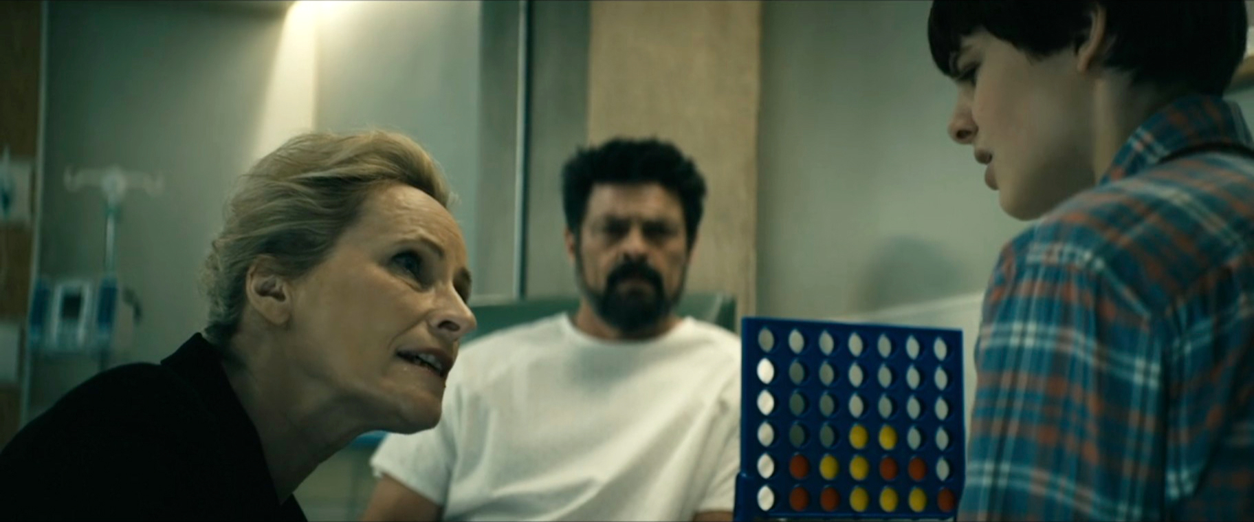


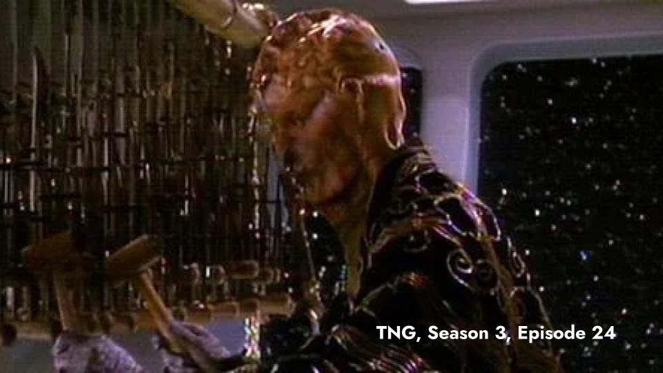


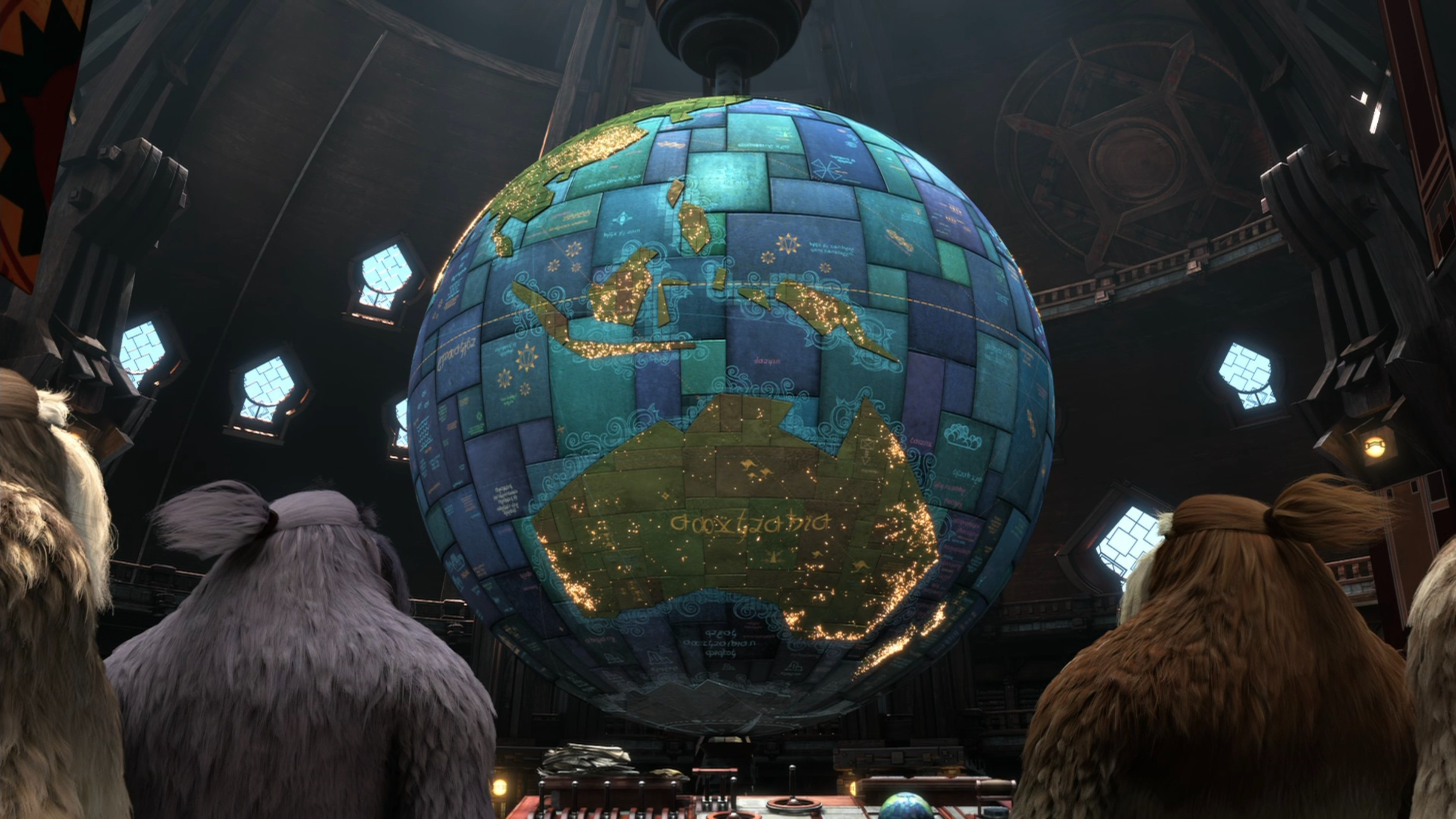


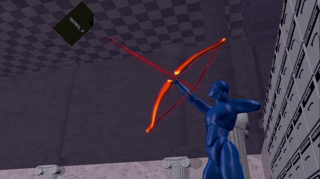


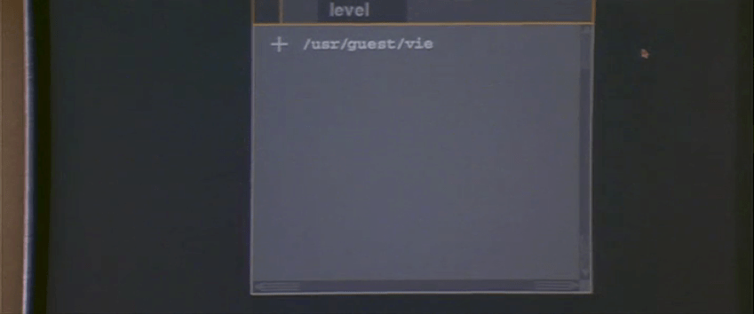


